I’ve been watching the use of the S&P/Case-Shiller/Futures Tool for about a week now and I thought that putting together a short tutorial might help others in getting the most use out of it.
First, I’m no expert on housing futures or any futures for that matter.
If you want to know more about how to trade housing derivatives or just want to follow the goings on of housing derivatives market, check out the Housing Derivatives Blog.
It’s important to keep in mind that the tool displays BOTH the "actual" reported values of the S&P/Case-Shiller Indices (CSI) as well as the "expected" future values given by the daily trading of housing futures at the Chicago Mercantile Exchange (CME).
The CME housing futures are based on the CSI so the futures contracts essentially predict where the indices will be at set points off in the future.
Since the CSI is derived from actual home sales information, the indices are an analogue of changes to actual home prices.
If the future expectations, given by the futures contracts, are for a decline of 5% to a particular CSI, then the prediction is essentially that home prices will decline 5% in the associated housing market.
Keep in mind that the CSI are now regarded by economists, traders and financial institutions as the most accurate home price indices available.
Tool Overview
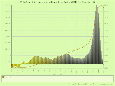
By default, the tool displays the complete Composite CSI series which ranges from 1987 to the present day (see the view directly below .. click for actual chart).
Additionally, it shows the year-over-year changes to the series on a monthly basis, i.e. the percent change to index values when comparing a given months result against the same month the prior year.
The left y-axis is labeled with the year-over-year percentage change value and the right y-axis is labeled with the index value.
That is the reason for the “empty” columns for the first year of each series as there is not a prior year of data to compare against.
As it stands, this “default” view is useful for seeing how the overall index has changed throughout its existence and for gauging how abnormal the latest run-up of home prices have been given a fairly lengthy historical context but for viewing the future predictions we need to narrow the view down to just the last year or so and add the futures contracts we wish to see.
The following instructions will provide a step-by-step guide for manipulating the “default” view of the chart into the view you see below (click for the actual chart).
To narrow the view, simply scroll down to the section titled “Date Range” and select a starting year of 2006.
Now click the “Update Chart” button (found just under the chart) and you will see that the chart now only includes monthly results from 2006 and 2007.
If you don’t like the columns of year-over-year data (they may seem a bit noisy), you can simply turn them off by un-checking the “Compare year-over-year” checkbox under the “Comparison” section and then click the “Update Chart” button again.
Personally, I like the year-over-year data so I leave that feature turned on.
Now, to add the futures predictions to this chart, scroll down to the “Futures Contracts” section and check the checkboxes next to the contract expirations you wish to see and then click the “Update Chart” button again.
What you now see is a long line running vertically through the chart separating the portion of “actual” reported CSI values on the left and “expected” future values on the right.
Keep in mind that each tradable futures contract has a specific expiration date for which the future predictions are essentially being made.
So, if you check the 02/25/2008 checkbox, you are essentially asking the question “What do the futures traders expect this index’s value to be on 02/25/2008.”
Since the index reflects actual home price data, this prediction should match actual changes to home prices in that particular market.
Now, if you select multiple contract expirations, you can see both the long term and short term predictions simultaneously.
Additionally, if you have selected the year-over-year option you are actually going to see percentage change columns that reflect the “expected” future results against the “actual” results of 2006.
Note, to connect the points between the last “actual” CSI value as well as each “expected” future contract value, I simply extrapolated the linear function for each given set of points so the chart values “in between” each set of points are merely functional estimates and should not be interpreted too literally.
You can also display multiple metro indices on the same chart view but keep in mind that only Boston, Chicago, Denver, Las Vegas, Los Angeles, Miami, New York, San Diego, San Francisco, Washington DC, and the Composite indices have associated futures trading so if you are looking at futures, the other indices will not display results.
That’s it!
Ill be updating the tool periodically to add more functionality and to fix bugs but as usual, please feel free to ask questions or report bugs by either commenting on this post or emailing me directly.
housing+bubble housing bubble realtor national+association+of+realtors NAR lereah economy recession interest+rates mortgage loan ARM lenders bernenke greenspan
Copyright © 2007
PaperMoney Blog - www.paperdinero.com
All Rights Reserved
Disclaimer
Copyright © 2007
PaperMoney Blog - www.paperdinero.com
All Rights Reserved
Disclaimer

