Friday, February 29, 2008

Goin’ Down Slow: Confidence and Economy (Final) February 2007

This post combines the results of the Rueters/University of Michigan Survey of Consumers, The Conference Board’s Index of CEO Confidence and The Conference Board’s Index of Leading Economic indicators into a post that will run twice monthly as preliminary data is firmed.

These three indicators should disclose a clear picture of both the overall sense of confidence (or lack thereof) on the part of consumers and businesses as well the overall trend of economic circumstances.

Today’s final release of the Reuters/University of Michigan Survey of Consumers for February confirmed a shocking plunge in consumer sentiment to a final reading of 70.8, a decline of 22.45% compared to February 2007.

It’s important to note that this is the lowest consumer sentiment reading seen since the recessionary period of February 1992 which, according to Richard Curtin, the Director of the Reuters/University, indicates that recessionary environment is upon us.

“The Sentiment Index has only been this low during the recessions of the mid 1970's, the early 1980's and the early 1990's … Past declines of this magnitude have always been associated with a subsequent recession”

The Index of Consumer Expectations (a component of the Index of Leading Economic Indicators) fell to 62.4, a whopping 23.44% below the result seen in February 2007.

As for the current circumstances, the Current Economic Conditions Index fell to 83.8, 21.46% below the result seen in February 2007.

As you can see from the chart below (click for larger), the consumer sentiment data is a pretty good indicator of recessions leaving the recent declines possibly foretelling rough times ahead.

The latest quarterly results (Q4 2007) of The Conference Board’s CEO Confidence Index fell to a value of 39 with the “current economic conditions” component registering 33.54, the lowest readings since the recessionary period following the dot-com bust.

It’s important to note that on every instance that the CEO “current economic conditions” index dropped below a level of 40, the economy was either in recession or very near.

Finally, the latest results of the Conference Board’s Index of Leading Economic Indicators continues to predict troubled times ahead declining 0.1% from December’s level and 1.52% on a year-over-year basis compared to January 2007, a fourth straight monthly decline leaving the index at 135.8.

It’s important to note that a year-over-year decline greater than 1.5% has ONLY preceded EVERY recession that has occurred in the last 59 years so the back to back declines of 1.81% and 1.52% seem to suggest that overall the components of the index are indicating that recession is either here or very near.

Note that at the end of March, The Conference Board will release its annual benchmark revision to the index as some of the source data is updated.

Thursday, February 28, 2008

Ticking Time Bomb?: Fannie Mae Monthly Summary January 2008

It appears now completely certain that the federal government, in attempting to “bail out” market participants that are hopelessly overleveraged and markets that are wholly overvalued, will lean on Fannie Mae and Freddie Mac by expanding their operations to include massive Jumbo loans.

It’s important to note that these changes are taking place with no required modifications to the GSEs operational practices and no additional powers granted to their Federal regulator the Office of Federal Housing Enterprise Oversight (OFHEO).

Given the sheer size of these government sponsored companies, with loan guarantee obligations recently estimated by Federal Reserve Bank of St. Louis President William Poole of totaling $4.47 Trillion (That’s TRILLION with a capital T… for perspective ALL U.S. government debt held by the public totals roughly $4.87 Trillion) and the “fuzzy” interpretation of their “implied” overall Federal government guarantee should they experience systemic crisis, these changes are reckless to say the least.

One key to understanding the potential risk that these entities face as the nation’s housing markets continue to slide lies in considering their current lending practices.

Although it’s been widely assumed by many that Fannie Mae and Freddie Mac have utilized a more conservative and risk averse standard for their loan operations, it now appears that that assumption is weak.

Whether it’s their subprime loan production, low-no down payment “prime” lending practices, or their conforming loan-piggyback loophole, the GSEs participated as aggressively in the lending boom as any of the now infamous bankrupt or near-bankrupt mortgage lenders.

Additionally, it’s important to understand that Countrywide Financial (NYSE:CFC) has been and continues to be Fannie Mae’s largest lender customer and servicer responsible for 28% (up from 26% in FY 2006) of Fannies credit book of business.

To that end, let’s compare the performance of Fannie Mae’s operations with that of Countrywide Financial.

The following chart (click for larger) shows what Fannie Mae terms the count of “Seriously Delinquent” loans as a percentage of all loans on their books.

It’s important to understand that Fannie Mae does NOT segregate foreclosures from delinquent loans when reporting these numbers and that should they report the delinquent results as a percentage of the unpaid principle balance, things would likely look a lot worse.

In order to get a better sense of the relative performance of Fannie Mae as compared to Countrywide Financial, the following chart (click for larger) compares Fannie Mae’s “Seriously Delinquent” loans (which include foreclosures) to Countrywide Financials loans in foreclosure.

Finally, the following chart (click for larger) shows the relative movements of Fannie Mae’s credit and non-credit enhanced (insured and non-insured) “Seriously Delinquent” loans versus Countrywide Financials delinquencies as a percentage of total loans.

Mid-Cycle Meltdown?: Jobless Claims February 28 2008

Today, the Department of Labor released their latest read of Joblessness showing seasonally adjusted “initial” unemployment claims increased 19,000 and “continued” claims increased 21,000 resulting in an “insured” unemployment rate of 2.1%.

Historically, unemployment claims both “initial” and “continued” (ongoing claims) are a good leading indicator of the unemployment rate and inevitably the overall state of the economy.

The following chart (click for larger version) shows “initial” and “continued” claims, averaged monthly, overlaid with U.S. recessions since 1967 and from 2000.

As you can see, acceleration to claims generally precedes recessions.


Also, acceleration and deceleration of unemployment claims has generally preceded comparable movements to the unemployment rate by 3 – 8 months (click for larger version).


In the above charts you can see, especially for the last three post-recession periods, that there has generally been a steep decline in unemployment claims and the unemployment rate followed by a “flattening” period of employment and subsequently followed by even further declines to unemployment as growth accelerated.

This flattening period demarks the “mid-cycle slowdown” where for various reasons growth has generally slowed but then resumed with even stronger growth.

So, looking at the post-“doc com” recession period we can see the telltale signs of a potential “mid-cycle” slowdown and if we were to simply reflect on the history of employment as an indicator of the health and potential outlook for the wider economy, it would not be irrational to conclude that times may be brighter in the very near future.

But, adding a little more data I think shows that we may in fact be experiencing a period of economic growth unlike the past several post-recession periods.

Look at the following chart (click for larger version) showing “initial” and “continued” unemployment claims, the ratio of non-farm payrolls to non-institutional population and single family building permits since 1967.

One notable feature of the post-“dot com” recession era that is, unlike other recent post-recession eras, job growth has been very weak, not succeeding to reach trend growth as had minimally accomplished in the past.

Another feature is that housing was apparently buffeted by the response to the last recession, preventing it from fully correcting thus postponing the full and far more severe downturn to today.

I think there is enough evidence to suggest that our potential “mid-cycle” slowdown, having been traded for a less severe downturn in the aftermath of the “dot-com” recession, may now be turning into a mid-cycle meltdown.

GDP Report: Q4 2007 (Preliminary)

Today, the Bureau of Economic Analysis (BEA) released their second installment of the Q4 2007 GDP report showing a truly anemic annual growth rate of 0.6%.

This stunning reversal from the exceptionally “hot” rate of growth seen in Q3 2007 was fueled primarily by accelerating declines in fixed residential investment, slowing growth to fixed non-residential investment, and a sudden deceleration in the export of goods to a much weaker 4.0% growth rate.

In fact, the deceleration to the export of goods was so severe that it seems altogether possible that the Q3 26.6% growth rate was an temporary aberration, a result of there being a brief disconnect between the slowing U.S. economy (and weak dollar) and the rest of the world economies relative strength.

Now that the world economies are slowing as well, it’s unlikely that exports will provide much of a crutch against which the weakening U.S. economy can lean.

Residential fixed investment, that is, all investment made to construct or improve new and existing residential structures including multi–family units, continued its historic fall-off registering a whopping upwardly revised decline of 25.2% since last quarter shaving 1.25% from overall GDP.

The decline to residential housing continues to be, by far, the most substantial single drag on GDP subtracting an amount significantly greater than the contributions made by all personal consumption of durable (cars, furniture, etc.) and non-durable goods (food, clothing, gasoline, fuel oil) and most personal consumption services during the quarter.

The following chart shows real residential and non-residential fixed investment versus overall GDP since Q1 2003 (click for larger version).

Wednesday, February 27, 2008

New Home Sales: January 2008

Today, the U.S. Census Department released its monthly New Residential Home Sales Report for January showing continued deterioration of the already hideous falloff in demand for new residential homes both nationally and in every region resulting in an astounding median sales price drop of 15.09%.

On a year-over-year basis new home sales are continuing to weaken, dropping a truly ugly 33.9% below the sales activity seen in January 2007 and plunging a whopping 56.67% since the peak set in July 2005.

It’s important to keep in mind that these declines are coming on the back of the significant declines seen in 2006 and 2007 further indicating the significance of the housing bust.

Additionally, although inventories of unsold homes have been dropping for ten straight months, the sales volume has been declining so significantly that the supply has now reached a new peak value of 9.9 months of supply.

The following charts show the extent of sales declines seen since 2005 as well as illustrating how the further declines in 2008 are coming on top of the 2006 and 2007 results (click for larger versions)


Look at the following summary of today’s report:

National

  • The median price for a new home was down 15.09% as compared to January 2007.
  • New home sales were down 33.9% as compared to January 2007.
  • The inventory of new homes for sale declined 10.1% as compared to January 2007.
  • The number of months’ supply of the new homes has increased 37.5% as compared to January 2007 and now stands at 9.9 months.
Regional

  • In the Northeast, new home sales were down 16.1% as compared to January 2007.
  • In the Midwest, new home sales were down 56.0% as compared to January 2007.
  • In the South, new home sales were down 34.8% as compared to January 2007.
  • In the West, new home sales were down 10.1% as compared to January 2007.

Reading Rates: MBA Application Survey – February 27 2008

The Mortgage Bankers Association (MBA) publishes the results of a weekly applications survey that covers roughly 50 percent of all residential mortgage originations and tracks the average interest rate for 30 year and 15 year fixed rate mortgages, 1 year ARMs as well as application volume for both purchase and refinance applications.

The purchase application index has been highlighted as a particularly important data series as it very broadly captures the demand side of residential real estate for both new and existing home purchases.

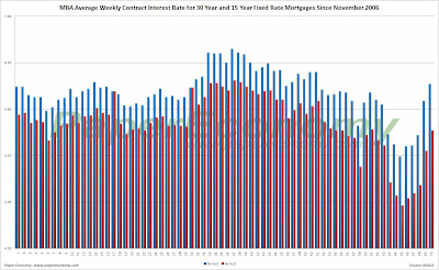
The latest data is showing that the average rate for a 30 year fixed rate mortgage jumped 18 basis points since last week to 6.27% while the purchase application volume increased slightly by 0.2% and the refinance application volume collapsed, plunging 30.4% compared to last week’s results.

The average fixed mortgage rate has again climbed significantly since last week and now is nearing the highs seen during the initial stages of the 2007 credit debacle resulting in the obvious plunge in refinance volume and flat purchase application volume.

It’s important to note that all application volume values reflect only “initial” applications NOT approved applications… i.e. originations… I will post on originations on the coming weeks.

Also note that the interest rate for an 80% LTV 1 year ARM now rests 55 basis points below the rate equal to an 80% LTV 30 year fixed rate loan.

It’s important to note that the data is reported (and charted) weekly and that the rate data represents average interest rates, and the index data represents mortgage loan application volume for home purchases, home refinances and a composite of all loans.

The following chart shows how the principle and interest cost and estimated annual income required to cover the PITI (using the 29% “rule of thumb”) on a $400,000 loan has changed since November 2006.

The following chart shows the average interest rate for 30 year and 15 year fixed rate mortgages over the last number of weeks (click for larger version).


The following charts show the Purchase Index, Refinance Index and Market Composite Index since November 2006 (click for larger versions).


Tuesday, February 26, 2008

OFHEO Home Price Index: Q4 2007

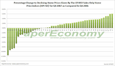
Today, the Office of Federal Housing Enterprise Oversight (OFHEO) published their Home Price Index (HPI) data for Q4 2007 showing unprecedentedly widespread weakness with 49 states and Washington DC experiencing peak home price declines with 20 declining better than 2% and 8 declining more that 6%.

Topping the list of peak decliners by state is California at -14.72%, Michigan at-13.48%, Nevada at -11.50%, Florida at -8.51%, Washington DC at -8.07, Arizona at -7.11%, Massachusetts as -6.34% and Rhode Island at -6.02%.

Topping the list of year-over-year decliners by state is California at -11.49%, Nevada at -9.35%, Michigan at -8.82%, Florida at -8.51%, and Arizona at -6.52%.

The OFHEO HPI series is formulated from home purchase and refinance information collected from Fannie Mae and Freddie Mac and as such suffers slightly from some basic limitations of the data.

First, Fannie and Freddie mortgages are subject to conforming loan limits which eliminates huge portions of data that are particularly relevant given the current bloated state of home prices.

A great percentage of home purchases made in the last decade, especially in the bubbliest areas, were made with Jumbo loans that, by their definition, exceed the Fannie-Freddie conforming loan limits and as such are not included in the OFHEO data.

Also, data from mortgages made for the purpose of refinance are also included which may have a tendency to skew the HPI series.

Fortunately, OFHEO now produces “Purchase Only” indices (i.e. HPI indices derived only from home purchase mortgage data only) for all census and states statistical areas.

In general, because the “Purchase Only” indices are based on home price changes from only home purchase transactions, they tend to show a greater degree of deceleration and/or decline than the complete data indices and may be a better indicator of the overall state of each particular housing market.

Although it’s generally recognized that the S&P/Case-Shiller (CSI) home price indices are more accurate than the OFHEO indices, OFHEO offers data for over 400 different census, state and metropolitan statistical areas compared to only 20 major metro areas for the CSI.


Be sure to check out the PaperEconomy OFHEO HPI Charting Tool allows you to visualize the HPI data as well as compare data from different areas.

Additionally, the tool now fully supports the “Purchase Only” data as well as allowing you to “normalize” the data in order to make a true comparison from one area to another.

On a side note, OFHEO will now be reporting home price data for the major Census divisions monthly so I will be adding that report to the rotation of monthly economic posts.

S&P/Case-Shiller: December 2007

Today’s release of the S&P/Case-Shiller home price indices for December continues to reflect tremendous weakness for the nation’s housing markets with 17 of the 20 metro areas tracked reporting year-over-year declines and ALL metro areas showing substantial declines from their respective peaks.

Furthermore, the decline to the 10 city composite index declined a record 9.82% as compared to December 2006 far surpassing the all prior year-over-year decline records firmly placing the current decline in uncharted territory in terms of relative intensity.

This report appears to continue to indicate that during the fall we essentially entered the serious price “free-fall” phase (look at the charts below) of the housing decline.

Topping the list of peak decliners are San Diego at -19.13%, Detroit at -18.69%, Miami at -17.50%, Phoenix at -17.48%, Las Vegas at -16.50%, Tampa at -15.94%, Los Angeles at -14.93%, San Francisco at -13.34%, Washington at -13.26%, Boston at -9.79%, and Cleveland at -9.25%,.

Additionally, both of the broad composite indices showed accelerating declines slumping -11.4% for the 10 city national index and -10.5% for the 20 city national index on a peak comparison basis.

Also, it’s important to note that Boston, having been cited as a possible example of price declines abating, has continued its decline dropping -3.36% on a year-over-year basis and a solid -9.79% from the peak set back in September 2005.

As I had noted in prior posts, Boston has a strong degree of seasonality to its price movements and with both the seasonal drop in sales and the recent stunning new decline to sales as a result of the disappearance of Jumbo and Alt-A loans, Boston may continue to decline even through the traditionally string spring selling season.

To better visualize the results use the PaperEconomy S&P/Case-Shiller/Futures Charting Tool as well as the PaperEconomy Home Value Calculator and be sure to read the Tutorial in order to best understand how best to utilize the tool.

The following chart (click for larger version) shows the percent change to single family home prices given by the Case-Shiller Indices as compared to each metros respective price peak set between 2005 and 2007.

The following chart (click for larger version) shows the percent change to single family home prices given by the Case-Shiller Indices as on a year-over-year basis.

Additionally, in order to add some historical context to the perspective, I updated my “then and now” CSI charts that compare our current circumstances to the data seen during 90s housing decline.

To create the following annual charts I simply aligned the CSI data from the last month of positive year-over-year gains for both the current decline and the 90s housing bust and plotted the data with side-by-side columns (click for larger version).

What’s most interesting about this particular comparison is that it highlights both how young the current housing decline is and clearly shows that the latest bust has surpassed the prior bust in terms of intensity.

Looking at the actual index values normalized and compared from the respective peaks, you can see that we are only seventeen months into a decline that, last cycle, lasted for roughly fifty four months during the last cycle (click the following chart for larger version).

The “peak” chart compares the percentage change, comparing monthly CSI values to the peak value seen just prior to the first declining month all the way through the downturn and the full recovery of home prices.


In this way, this chart captures ALL months of the downturn from the peak to trough to peak again.

As you can see the last downturn lasted 97 months (over 8 years) peak to peak including roughly 43 months of annual price declines during the heart of the downturn.

Notice that peak declines have been FAR more significant to date and, keeping in mind that our current run-up was many times more magnificent than the 80s-90s run-up, it is not inconceivable that current decline will run deeper and last longer.

Crashachusetts Existing Home Sales and Prices: January 2008

Today, the Massachusetts Association of Realtors (MAR) released their Existing Home Sales Report for January 2008 and simultaneously Standard & Poor’s released their Case-Shiller Home Price Index for December 2007 both showing, perfectly clearly, the truly dire circumstances that have now befallen the Bay State’s housing market.

Whether it was a slow depression brought about by over two solid years of steadily declining home sales and prices, the credit crunch, a looming recession, a palpable increase in inflation of necessities like food and fuel or just simply a change in attitudes toward the notion of a house as a vehicle for wealth, the regions housing markets have now hit a dangerous tipping point.

It appears that we have entered the “price freefall” phase of the housing decline where mounting inventory, declining sales, and negative sentiment all combine to result in plunging home prices which, quite possibly, may continue to decline substantially even through the spring and summer months which are typically strong periods in any selling season.

Of course Massachusetts’s Realtor leader Susan Renfrew, who seems to find a silver lining in every storm, projects a sense of confidence and “opportunity” in part created as a result of the federal government bailout package.

“Sales in any given month are a result of buyer activity 60 to 90 days prior, and there is no question January reflects the anxiety people were feeling about the economy that last two months of 2007 … However, this continues to be a buyer’s market and there is opportunity. That combined with low interest rates and the economic stimulus package recently signed by President Bush, should help the market.”

These are troubling times indeed…

MAR reports that in January, single family home sales plummeted 27.7% as compared to January 2007 with an 8% increase in inventory translating to a truly massive 15.4 months of supply and a median selling price decline of 5.6% while condo sales plunged 33.7% with a 1% increase in inventory translating to a startling 16.6 months of supply and a median selling price increase of 3.5%.


The S&P/Case-Shiller Home Price Index for Boston, which is the most accurate indicator of the true price movement for single family homes, showed accelerating prices declines (prices are falling faster) with Boston declining 3.3% as compared to December 2006 leaving prices now 9.8% below the peak set in September 2005.

To better illustrate the drop-off in home prices and the potential length and depth of the current housing decline, I have compared BOTH the normalized price movement and peak percentage changes to the S&P/Case-Shiller home price index for Boston (BOXR) from the 80s-90s housing bust to today’s bust (ultra-hat tip to the great Massachusetts Housing Blog for the concept).


The “normalized” chart compares the normalized Boston price index from the peak of the 80s-90s bust to the peak of today’s bust.

Notice that during the 80s-90s bust prices took roughly 46 months (3.8 years) to bottom out but that the decline was not quite a sheer as what we are seeing today.

The “peak” chart compares the percentage change, comparing monthly Boston index values to the peak value seen just prior to the first declining month all the way through the downturn and the full recovery of home prices.

In this way, this chart captures ALL months of the downturn from the peak to trough to peak again.

As you can see the last downturn lasted 105 months (almost 9 years) peak to peak including 34 months of annual price declines during the heart of the downturn.

Notice that peak declines have been more significant to date and, keeping in mind that our current run-up was many times more magnificent than the 80s-90s run-up, it is not inconceivable that current decline will run deeper and last longer.

As in months past, be on the lookout for the inflation adjusted charts produced by BostonBubble.com for an even more accurate "real" view of the current market trend.

January’s Key MAR Statistics:

  • Single family sales declined 27.7% as compared to January 2007
  • Single family median price decreased 5.6% as compared to January 2007
  • Condo sales declined 33.7% as compared to January 2007
  • Condo median price increased 3.5% as compared to January 2007
  • The number of months supply of single family homes stands at 15.4 months.
  • The number of months supply of condos stands at 16.6 months.
  • The average “days on market” for single family homes stands at 143 days.
  • The average “days on market” for condos stands at 165 days.

Monday, February 25, 2008

Collapsedachusetts Existing Home Sales (Preview): January 2008

Sources inside the Massachusetts Association of Realtors (MAR) report that tomorrows monthly existing home sales results will show that January single family home sales crashed 27.7% on a year-over-year basis while condo sales collapsed 33.7% over the same period.

Further, the single family median selling price declined 5.6% on a year-over-year basis to $321,000 while condo median prices increased 3.5% to $277,500.

It’s also important to note that January’s single family home sales count was the lowest January result on record since 1992 and at 1984 units sold was 37.9% below the record peak set in January 1999 and 33.1% below the more recent peak of January 2005.

The following charts (click for larger) show the decline in single family home sales since 2005.

Notice that January 2008 is registering a home sales count well below even the 2007 level as well as indicating that the February’s results will be well below 2000 units, a significant decline.


After two years of declining home sales, weakening home prices and now looming recession it appears that Massachusetts may have just entered the price “free-fall” phase of the housing decline where home prices continuously drop even through the spring months which are typically strong in the region.

Stay tuned as tomorrow the S&P/Case-Shiller home price index results will be available for Boston likely showing the most significant decline in the last 12 months.

Existing Home Sales Report: January 2008

Today, the National Association of Realtors (NAR) released their Existing Home Sales Report for January again confirming, perfectly clearly, the tremendous weakness in the demand of existing residential real estate with both single family homes and condos declining uniformly across the nation’s housing markets.

Although this continued and even worsening falloff in demand is mostly as a result of the momentous and ongoing structural changes that are taking place in the credit-mortgage markets, consumer sentiment surveys are now indicating that consumers are materially feeling the current recessionary trend which will likely result in even further significant sales declines to come.

Furthermore, we are now seeing solid declines to the median sales price for both single family homes and condos across virtually every region with the most notable being a decline of 7.2% to the single family home sales price in the West.

In the obvious face of home sales not “hovering in a narrow range”, NAR senior economist Lawrence Yun is now suggesting that the recent “bailout” actions by the federal government will serve to boost home sales “steadily higher” later this year.

“Subprime loans and other risky mortgage products have virtually disappeared from the marketplace, and over the past five months, this has been reflected in soft but fairly stable home sales, … As the increased limits for FHA and conventional loans are implemented, more buyers will have access to safer FHA loans and lower interest rate loans in high-cost areas, which could lead to steadily higher home sales later in the year.”

NAR president Richard Gaylord as usual, makes another wishful attempt to suggest that pent up demand will soon fuel increasing sales.

“Keep in mind the biggest slowdown in home sales last year was in high-cost markets, which were hard-hit by the credit crunch and notably higher interest rates for jumbo loans, but relief is on the way, … Once buyers have greater access to higher loan limits, it will take a few months for increased shopping activity to translate into higher sales, … We should see some movement of pent-up demand by this summer, but higher loan limits need to be implemented fully and promptly to have maximum benefit.”

In reality, the latest report provides, yet again, truly stark and total confirmation that the nation’s housing markets are declining dramatically with EVERY region showing significant double digit declines to sales of BOTH single family homes and condos as well as large increases to inventory and a continued explosion in monthly supply as a result of the collapsing pace of sales.

Keep in mind that these declines are coming “on the back” of TWO SOLID YEARS of dramatic declines further indicating that the housing markets are truly in the process of a tremendous correction.

The following (click for larger versions) are charts showing sales for single family homes, plotted monthly, for 2006, 2007 and 2008 as well as national existing home inventory and month supply.


Below is a chart consolidating all the year-over-year changes reported by NAR in their January 2008 report.