With the federal bailout now well underway and seeing that the battered massive “linchpin” mortgage enterprises of Fannie Mae (NYSE:FNM) and Freddie Mac (NYSE:FRE) will, with the help of the “temporary” increase of the conforming loan limits, the brazen lowering of their capital requirements and other even more novel actions, ride to the rescue of the nation’s housing markets!
But who will rescue them when the time comes?
I suppose you and me, our children and their children too…. It’s a real shame since these enterprises seemed to be doing so well recently, short of that stint in 2004 where Fannie Mae executives fleeced the company of over $100 million in fraudulent bonuses and the like…
Oh well, how’s another socialized bailout of private swindlers going hurt a country so deep in debt that dollar amounts on the order of billions just don’t seem to sting anymore… even trillions of dollars now seem a bit passé.
It’s important to note that all the recent changes are taking place with no required modifications to the GSEs operational practices and no additional powers granted to their Federal regulator the Office of Federal Housing Enterprise Oversight (OFHEO).
Given the sheer size of these government sponsored companies, with loan guarantee obligations recently estimated by Federal Reserve Bank of St. Louis President William Poole of totaling $4.47 Trillion (That’s TRILLION with a capital T… for perspective ALL U.S. government debt held by the public totals roughly $4.87 Trillion) and the “fuzzy” interpretation of their “implied” overall Federal government guarantee should they experience systemic crisis, these changes are reckless to say the least.
One key to understanding the potential risk that these entities face as the nation’s housing markets continue to slide lies in considering their current lending practices.
Although it’s been widely assumed by many that Fannie Mae and Freddie Mac have utilized a more conservative and risk averse standard for their loan operations, it now appears that that assumption is weak.
Whether it’s their subprime loan production, low-no down payment “prime” lending practices, or their conforming loan-piggyback loophole, the GSEs participated as aggressively in the lending boom as any of the now infamous bankrupt or near-bankrupt mortgage lenders.
Additionally, it’s important to understand that Countrywide Financial has been and continues to be Fannie Mae’s largest lender customer and servicer responsible for 28% (up from 26% in FY 2006) of Fannies credit book of business.
To that end, let’s compare the performance of Fannie Mae’s operations with that of Countrywide Financial.
NOTE: Since Countrywide Financial has discontinued reporting their monthly operational status in February the data supplied below is based on a estimates generated by a simple linear extrapolation of the actual data supplied between 2005 – February 2008. I will update the data when and if Countrywide ever provides data on its internal state.
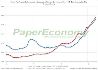
The following chart (click for larger) shows what Fannie Mae terms the count of “Seriously Delinquent” loans as a percentage of all loans on their books.
It’s important to understand that Fannie Mae does NOT segregate foreclosures from delinquent loans when reporting these numbers and that should they report the delinquent results as a percentage of the unpaid principle balance, things would likely look a lot worse.
In order to get a better sense of the relative performance of Fannie Mae as compared to Countrywide Financial, the following chart (click for larger) compares Fannie Mae’s “Seriously Delinquent” loans (which include foreclosures) to Countrywide
Financials loans in foreclosure.
Finally, the following chart (click for larger) shows the relative movements of Fannie Mae’s credit and non-credit enhanced (insured and non-insured) “Seriously Delinquent” loans versus Countrywide Financials delinquencies as a percentage of total loans.
Monday, June 30, 2008
Countrywide Foreclosures: May 2008
In February Countrywide Financial (NYSE:CFC) announced that they planed to discontinued publishing their monthly operational status report limiting insight into their internal status to what they termed a more “industry standard” quarterly frequency.
Clearly, this was a move intended to thwart transparency and prevent onlookers from completely understanding the enormity of their troubles.
In order to continue monitoring the Countrywide Financial foreclosure and delinquency status with at least some level of monthly insight I have built a simple model (simple linear extrapolation from actual data reported from 2005 – February 2008) to estimate the monthly numbers.
I will update the model with actual data when and if it ever becomes available in their quarterly reports.
Today, the estimated results for Countrywide Financial show that delinquencies and foreclosures are continuing their climb to troubling levels with delinquencies jumping over 56% on a year-over-year basis to 6.98% of total number of loans or over 78% on a year-over-year basis to 7.54% of total unpaid principle balance while foreclosures jumping over 82% on a year-over-year basis to 1.26% of total number of loans and soaring 107% to 1.77% of total unpaid principle balance.
Prior to January 2007, Countrywide reported foreclosure data as a percentage of the total number of loans serviced which obviously lacked complete clarity.
Below, are charts of both measures; delinquencies and foreclosures by total number of loans serviced and by percentage of unpaid loan principle (Click for larger versions).
Be sure to check out the Countrywide Financial Foreclosures Blog’s Inventory Tracker for some more startling evidence that foreclosures are skyrocketing over at Countrywide Financial as well as some excellent REO tracking features.
Confidence Game: Consumer, CEO and Investor Confidence June 2008 (Final)
This post combines the latest results of the Rueters/University of Michigan Survey of Consumers, the Conference Board’s Index of CEO Confidence and the State Street Global Markets Index of Investor Confidence indicators into a combined presentation that will run twice monthly as preliminary data is firmed.
These three indicators should disclose a clear picture of the overall sense of confidence (or lack thereof) on the part of consumers, businesses and investors as the current recessionary period develops.
Last week’s final release of the Reuters/University of Michigan Survey of Consumers for June confirmed another startling plunge in consumer sentiment to a reading of 56.4, a decline of 33.88% compared to June 2007.
It’s important to note that this is the lowest consumer sentiment reading seen since the recessionary period of June 1980 which, according to many metrics most notably employment, was the most severe recession seen in the U.S. since the Great Depression.
The Index of Consumer Expectations (a component of the Index of Leading Economic Indicators) fell to 49.2, the lowest reading since the 1980s recessionary environment, 34.14% below the result seen in June 2007.
As for the current circumstances, the Current Economic Conditions Index fell to 67.6, 33.66% below the result seen in June 2007.
As you can see from the chart below (click for larger), the consumer sentiment data is a pretty good indicator of recessions leaving the recent declines possibly predicting rough times ahead.
The latest quarterly results (Q1 2008) of The Conference Board’s CEO Confidence Index fell to a value of 38 the lowest readings since the recessionary period of the dot-com bust.
It’s important to note that the current value has fallen to a level that would be completely consistent with economic contraction suggesting the economy is either in recession or very near.
The June release of the State Street Global Markets Index of Investor Confidence indicated that confidence for North American institutional investors increased 1.7% since May while European confidence increased 8.2% and Asian investor confidence declined 5.8% all resulting in an increase of 0.5% to the aggregate Global Investor Confidence Index.
Given that that the confidence indices purport to “measure investor confidence on a quantitative basis by analyzing the actual buying and selling patterns of institutional investors”, it’s interesting to consider the performance surrounding the 2001 recession and reflect on the performance seen more recently.
During the dot-com unwinding it appears that institutional investor confidence was largely unaffected even as the major market indices eroded substantially (DJI -37.9%, S&P 500 -48.2%, Nasdaq -78%).
But today, in the face of the tremendous headwinds coming from the housing decline and the mortgage-credit debacle, it appears that institutional investors are less stalwart.
Since August 2007, investor confidence has declined significantly led primarily by a material drop-off in the confidence of investors in North America.
The charts below (click for larger versions) show the Global Investor Confidence aggregate index since 1999 as well as the component North America, Europe and Asia indices since 2007.
Friday, June 27, 2008
The Almost Daily 2¢ - Fun and Shameless Self Promotion
I give you… the official PaperEconomy line of apparel and other assorted chachkas!
You’ll be sure to impress all your friends with both the bluntness of you character and your deep knowledge of the complexities of central banking and monetary policy with the FIRST EVER! “Benanke Sucks!” T-shirt!
Like what you see? Use the panel below to customize and order these items… today!
You’ll be sure to impress all your friends with both the bluntness of you character and your deep knowledge of the complexities of central banking and monetary policy with the FIRST EVER! “Benanke Sucks!” T-shirt!
FRONT
BACK
Don’t go anywhere this summer without letting all your fellow drivers and pedestrians alike know your stance on central banking issues with our NEW! “Bailouts Suck!” and “Bernanke Sucks!” Bumper Stickers!Like what you see? Use the panel below to customize and order these items… today!
Thursday, June 26, 2008
The Almost Daily 2¢ - 1175 Or (and) Bust!
This post is an addendum to the regular “Twin Peaks” series as the recent retrenchment of the S&P 500 has been so dramatic that it deserves some additional attention.
It appears that the S&P 500, now poised just 48 points above the March “Bear Stearns” lows, is set to crash straight through that low level on its way to a destination somewhere in the 1100s.
Readers should take note of the charts below and fully contemplate what this selloff represents and how remarkably similar the current bear market period is to the episode that followed the dot-com collapse.
There is a host of very interesting technical similarities (which are noted below) that indicates that we have entered another bear market where on average the S&P 500 index retraces 20 – 30% from its prior peak.
It’s important to keep in mind that, at best, a bear market can be viewed as a transition into an period where there is a prolonged bias to sell into strength resulting in a successive series of lower highs (and lower lows!) yielding a clear downward trend.
At worst, there are periods (days or weeks) where particular stocks and the index as a whole will crash hard.
Study the following image (click for very large and clear version) of the S&P 500 index from 1995 to today then read below for the technical blow by blow.
Notice also, that I’ve added both the “effective” federal funds rate (light grey line) and an overlay indicating the period of the last recession.
As you can see, entering the last bear market, the Fed cut rate significantly taking it from 6.5% at the start of the bear market to 1.00% in the trough.
It’s important to note that although the Federal Reserve’s response was dramatic, the market still resulted in an over 48% decline.
THEN (1998 – 2000 Top)
NOW (Today’s Top)
It appears that the S&P 500, now poised just 48 points above the March “Bear Stearns” lows, is set to crash straight through that low level on its way to a destination somewhere in the 1100s.
Readers should take note of the charts below and fully contemplate what this selloff represents and how remarkably similar the current bear market period is to the episode that followed the dot-com collapse.
There is a host of very interesting technical similarities (which are noted below) that indicates that we have entered another bear market where on average the S&P 500 index retraces 20 – 30% from its prior peak.
It’s important to keep in mind that, at best, a bear market can be viewed as a transition into an period where there is a prolonged bias to sell into strength resulting in a successive series of lower highs (and lower lows!) yielding a clear downward trend.
At worst, there are periods (days or weeks) where particular stocks and the index as a whole will crash hard.
Study the following image (click for very large and clear version) of the S&P 500 index from 1995 to today then read below for the technical blow by blow.
Notice also, that I’ve added both the “effective” federal funds rate (light grey line) and an overlay indicating the period of the last recession.
As you can see, entering the last bear market, the Fed cut rate significantly taking it from 6.5% at the start of the bear market to 1.00% in the trough.
It’s important to note that although the Federal Reserve’s response was dramatic, the market still resulted in an over 48% decline.
THEN (1998 – 2000 Top)
- A. October 1998 – S&P 500 gives early warning sign by crossing its 400 day simple moving average (SMA). Notice also that the 50 day SMA breached the 200 day SMA.
- B. October 1999 – S&P 500 gives a second signal by crossing its 200 day SMA after a solid twelve month expansion. 50 day SMA touches the 200 day SMA.
- C. Three prominent but decelerating peaks set up the top.
- D. Between second and third (last) peak S&P 500 index breaches 200 day SMA. After the final peak S&P 500 index breaches the 400 day SMA.
- E. 50 day SMA heads down fast and crosses the 200 day SMA. (Cross of Death)
- F. 50 day SMA crosses 400 day SMA. (Cross of Far More Death)
- G. 200 day SMA crosses 400 day SMA. (Cross of Fiery Gruesome Death)
NOW (Today’s Top)
- A. June 2006 – S&P 500 gives early warning sign by crossing its 400 day SMA. Notice also that the 50 day SMA breached the 200 day SMA.
- B. March 2007 – S&P 500 gives a second signal by falling near its 200 day SMA after a solid nine month expansion. 50 day SMA similarly depressed.
- C. Three prominent but decelerating peaks set up the top.
- D. Between second and third (last) peak S&P 500 index breaches 200 day SMA. After the final peak S&P 500 index breaches the 400 day SMA.
- E. 50 day SMA heads down fast and crosses the 200 day SMA. (Cross of Death)
- F. 50 day SMA crosses 400 day SMA. (Cross of Far More Death)
- G. 200 day SMA crosses 400 day SMA. (Cross of Fiery Gruesome Death)
Existing Home Sales Report: May 2008
Today, the National Association of Realtors (NAR) released their Existing Home Sales Report for May further confirming, perfectly clearly, the tremendous weakness in the demand of existing residential real estate with both single family homes and condos declining uniformly across the nation’s housing markets while inventory and supply remained elevated.
Although this continued falloff in demand is mostly as a result of the momentous and ongoing structural changes taking place in the credit-mortgage markets, consumer sentiment surveys are continuing to indicate that consumers are materially feeling the current stagflationary trends which will likely result in even further significant sales declines to come.
Furthermore, we are continuing to see SOLID declines to the median sales price for both single family homes and condos across virtually every region with the most notable occurring in the West showing a decline of 16.8% to the median single family home sales price and a decline of 11.8% to the median condo price.
As usual, the NAR leadership continues spinning the results all the while turning to Washington DC for additional handouts.
NAR senior economist Lawrence Yun suggests that although the market is “fragile” a home buyer tax credit and permanently higher GSE loan limits will get the “housing engine humming”.
“Keep in mind that the volume of home sales is the primary driver of economic activity that is tied to housing, … It’d be premature to say the improvement marks a turnaround. The market is fragile, so a first-time home buyer tax credit and a permanent raise in loan limits would be important steps to get the housing engine humming.”
Meanwhile, NAR president Dick Gaylord continues to spin his yarn that a home is a vehicle for wealth creation:
“Home buyers are starting to get off the fence and into the market, drawn by drops in home prices in many areas and armed with greater access to affordable mortgages, … Today’s buyer plans to stay in a home for 10 years, which is a good strategy for building long-term wealth.”
Too bad for the Realtors though since lending standards will only get more restrictive as lenders further realize losses from subprime, alt-a, prime Jumbo and even prime conforming loans.
The era of FICO driven “slam-dunk” lending is coming to a close and with it will inevitably go all the absurdities leaving borrowers and the real estate industry, if they are lucky, to simply operate in an environment of the traditional “rule of thumb” requirements of substantial down-payments and sensible earnings to debt ratios.
The latest report provides, yet again, truly stark and total confirmation that the nation’s housing markets are declining dramatically with EVERY region showing significant double digit declines to sales of BOTH single family and condos as well as increases to inventory and an unusually elevated monthly supply resulting of the collapsing pace of sales.
Keep in mind that these declines are coming “on the back” of TWO SOLID YEARS of dramatic declines further indicating that the housing markets are truly in the process of a tremendous correction.
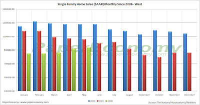
The following (click for larger versions) are charts showing sales for single family homes, plotted monthly, for 2006, 2007 and 2008 as well as national existing home inventory and month supply.
Below is a chart consolidating all the year-over-year changes reported by NAR in their most recent report.
Although this continued falloff in demand is mostly as a result of the momentous and ongoing structural changes taking place in the credit-mortgage markets, consumer sentiment surveys are continuing to indicate that consumers are materially feeling the current stagflationary trends which will likely result in even further significant sales declines to come.
Furthermore, we are continuing to see SOLID declines to the median sales price for both single family homes and condos across virtually every region with the most notable occurring in the West showing a decline of 16.8% to the median single family home sales price and a decline of 11.8% to the median condo price.
As usual, the NAR leadership continues spinning the results all the while turning to Washington DC for additional handouts.
NAR senior economist Lawrence Yun suggests that although the market is “fragile” a home buyer tax credit and permanently higher GSE loan limits will get the “housing engine humming”.
“Keep in mind that the volume of home sales is the primary driver of economic activity that is tied to housing, … It’d be premature to say the improvement marks a turnaround. The market is fragile, so a first-time home buyer tax credit and a permanent raise in loan limits would be important steps to get the housing engine humming.”
Meanwhile, NAR president Dick Gaylord continues to spin his yarn that a home is a vehicle for wealth creation:
“Home buyers are starting to get off the fence and into the market, drawn by drops in home prices in many areas and armed with greater access to affordable mortgages, … Today’s buyer plans to stay in a home for 10 years, which is a good strategy for building long-term wealth.”
Too bad for the Realtors though since lending standards will only get more restrictive as lenders further realize losses from subprime, alt-a, prime Jumbo and even prime conforming loans.
The era of FICO driven “slam-dunk” lending is coming to a close and with it will inevitably go all the absurdities leaving borrowers and the real estate industry, if they are lucky, to simply operate in an environment of the traditional “rule of thumb” requirements of substantial down-payments and sensible earnings to debt ratios.
The latest report provides, yet again, truly stark and total confirmation that the nation’s housing markets are declining dramatically with EVERY region showing significant double digit declines to sales of BOTH single family and condos as well as increases to inventory and an unusually elevated monthly supply resulting of the collapsing pace of sales.
Keep in mind that these declines are coming “on the back” of TWO SOLID YEARS of dramatic declines further indicating that the housing markets are truly in the process of a tremendous correction.
The following (click for larger versions) are charts showing sales for single family homes, plotted monthly, for 2006, 2007 and 2008 as well as national existing home inventory and month supply.
Below is a chart consolidating all the year-over-year changes reported by NAR in their most recent report.
GDP Report: Q1 2008 (Final)
Today, the Bureau of Economic Analysis (BEA) released their third and final installment of the Q1 2008 GDP report showing a anemic annual growth rate of 1.0%.
This continuation of dramatically slower growth was primarily the result of accelerating declines in fixed residential investment, only tepid growth in fixed non-residential investment, and far from outstanding growth in both the export of goods and services.
In fact, the continuation of typical growth rates for exports seems to further suggest that the exceptional growth seen during Q3 2007 was an temporary aberration, a result of there being a brief disconnect between the slowing U.S. economy (and weak dollar) and the rest of the world economies relative strength.
Now that the world economies are slowing as well, it’s unlikely that exports will provide much of a crutch against which the weakening U.S. economy can lean.
Residential fixed investment, that is, all investment made to construct or improve new and existing residential structures including multi–family units, continued its historic fall-off registering a whopping decline of 24.6% since last quarter shaving 1.12% from overall GDP, an amount roughly equivalent to the positive contributions made by all personal consumption of services in the quarter.
The following chart shows real residential and non-residential fixed investment versus overall GDP since Q1 2003 (click for larger version).
Mid-Cycle Meltdown?: Jobless Claims June 26 2008
Today, the Department of Labor released their latest read of Joblessness showing seasonally adjusted “initial” unemployment claims went unchanged remaining at 384,000 from last week’s revised 384,000 claims while “continued” claims increased a whopping 82,000 resulting in an “insured” unemployment rate of 2.4%.
It’s very important to understand that today’s report continues to reflect employment weakness that is strongly consistent with past recessionary episodes and that unequivocal clarity will more than likely come in the next few releases.
Historically, unemployment claims both “initial” and “continued” (ongoing claims) are a good leading indicator of the unemployment rate and inevitably the overall state of the economy.
The following chart (click for larger version) shows “initial” and “continued” claims, averaged monthly, overlaid with U.S. recessions since 1967 and from 2000.
As you can see, acceleration to claims generally precedes recessions.
Also, acceleration and deceleration of unemployment claims has generally preceded comparable movements to the unemployment rate by 3 – 8 months (click for larger version).
In the above charts you can see, especially for the last three post-recession periods, that there has generally been a steep decline in unemployment claims and the unemployment rate followed by a “flattening” period of employment and subsequently followed by even further declines to unemployment as growth accelerated.
This flattening period demarks the “mid-cycle slowdown” where for various reasons growth has generally slowed but then resumed with even stronger growth.
So, looking at the post-“dot com” recession period we can see the telltale signs of a potential “mid-cycle” slowdown and if we were to simply reflect on the history of employment as an indicator of the health and potential outlook for the wider economy, it would not be irrational to conclude that times may be brighter in the very near future.
But, adding a little more data I think shows that we may in fact be experiencing a period of economic growth unlike the past several post-recession periods.
Look at the following chart (click for larger version) showing “initial” and “continued” unemployment claims, the ratio of non-farm payrolls to non-institutional population and single family building permits since 1967.
One notable feature of the post-“dot com” recession era that is, unlike other recent post-recession eras, job growth has been very weak, not succeeding to reach trend growth as had minimally accomplished in the past.
Another feature is that housing was apparently buffeted by the response to the last recession, preventing it from fully correcting thus postponing the full and far more severe downturn to today.
I think there is enough evidence to suggest that our potential “mid-cycle” slowdown, having been traded for a less severe downturn in the aftermath of the “dot-com” recession, may now be turning into a mid-cycle meltdown.
Wednesday, June 25, 2008
New Home Sales: May 2008
Today, the U.S. Census Department released its monthly New Residential Home Sales Report for May showing continued deterioration in demand for new residential homes across every tracked region resulting in a startling 40.26% year-over-year decline and a truly whopping 63.14 % peak sales decline nationally.
It’s important to keep in mind that these dramatic declines are coming on the back of the significant declines seen in 2006 and 2007 further indicating the enormity of the housing bust and clearly dispelling any notion of a bottom being reached.
Additionally, although inventories of unsold homes have been dropping for fourteen straight months, the sales volume has been declining so significantly that the sales pace has now stands at an astonishing 10.9 months of supply.
The following charts show the extent of sales declines seen since 2005 as well as illustrating how the further declines in 2008 are coming on top of the 2006 and 2007 results (click for larger versions)
Look at the following summary of today’s report:
National
- The median sales price for a new home declined 5.71% as compared to May 2007.
- New home sales were down 40.3% as compared to May 2007.
- The inventory of new homes for sale declined 16.9% as compared to May 2007.
- The number of months’ supply of the new homes has increased 39.7% as compared to May 2007 and now stands at 10.9 months.
- In the Northeast, new home sales were down 57.8% as compared to May 2007.
- In the Midwest, new home sales were down 42.3% as compared to May 2007.
- In the South, new home sales were down 35.0% as compared to May 2007.
- In the West, new home sales were down 43.0% as compared to May 2007.
Reading Rates: MBA Application Survey – June 25 2008
The Mortgage Bankers Association (MBA) publishes the results of a weekly applications survey that covers roughly 50 percent of all residential mortgage originations and tracks the average interest rate for 30 year and 15 year fixed rate mortgages, 1 year ARMs as well as application volume for both purchase and refinance applications.
The purchase application index has been highlighted as a particularly important data series as it very broadly captures the demand side of residential real estate for both new and existing home purchases.
The latest data is showing that the average rate for a 30 year fixed rate mortgage declined 18 basis points since last week to 6.39% while the purchase application volume declined by 7.4% and the refinance application volume slumped 12.1% compared to last week’s results.
It’s important to note that the average interest rate on an 80% LTV 30 year fixed rate loan remains at the top of the range seen throughout 2007 while the interest rate for an 80% LTV 1 year ARM remains significantly elevated now resting 70 basis points ABOVE the rate of an average 80% LTV 30 year fixed rate loan despite all the herculean efforts by the Federal Reserve to bring rates down.
Also note that all application volume values reflect only “initial” applications NOT approved applications… i.e. originations… actual originations would likely be notably lower than the applications.
The following chart shows how the principle and interest cost and estimated annual income required to cover the PITI (using the 29% “rule of thumb”) on a $400,000 loan has changed since November 2006.
The following chart shows the average interest rate for 30 year and 15 year fixed rate mortgages over the last number of weeks (click for larger version).
The following charts show the Purchase Index, Refinance Index and Market Composite Index since November 2006 (click for larger versions).
Tuesday, June 24, 2008
S&P/Case-Shiller: April 2008
Today’s release of the S&P/Case-Shiller home price indices for April continues to reflect the extraordinary weakness seen in the nation’s housing markets with now ALL 20 of the 20 metro areas tracked reporting year-over-year declines and ALL metro areas showing substantial declines from their respective peaks.
Readers should take a moment to carefully reflect on the charts below as this level of price decline occurring simultaneously across the whole of the U.S. is not only unprecedented but is probably the purest expression of the fundamental collapse of wealth and well being for our nations typical home owning household.
The 10 city composite index declined a record 16.35% as compared to April 2007 far surpassing the all prior year-over-year decline records firmly placing the current decline in uncharted territory in terms of relative intensity.
This report indicates that we have now firmly entered the serious price “free-fall” phase (look at the charts below) of the housing bust.
Topping the list of peak decliners was Las Vegas at -29.34%, Phoenix at -29.06%, San Diego at -27.87%, Miami at -28.64%, Detroit at -26.18%, Los Angeles at -26.07%, Tampa at -25.03%, San Francisco at -24.61%, Washington DC at -19.86%, Minneapolis at -18.66%, Cleveland at -11.29%, Boston at -13.03%, Chicago at -10.77% and New York -10.15%.
Additionally, both of the broad composite indices showed accelerating declines slumping -19.06% for the 10 city national index and 17.76% for the 20 city national index on a peak comparison basis.
Also, it’s important to note that Boston, having been cited as a possible example of price declines abating, has continued its decline dropping -6.44% on a year-over-year basis and a solid -13.03% from the peak set back in September 2005.
As I had noted in prior posts, Boston has a strong degree of seasonality to its price movements and with both the seasonal drop in sales and the recent stunning new decline to sales as a result of both the looming recession working to erode confidence and the continued lack of affordable Jumbo and Alt-A loans, Boston may continue its decline even through the traditionally strong spring selling season.
To better visualize the results use the PaperEconomy S&P/Case-Shiller/Futures Charting Tool as well as the PaperEconomy Home Value Calculator and be sure to read the Tutorial in order to best understand how best to utilize the tool.
The following chart (click for larger version) shows the percent change to single family home prices given by the Case-Shiller Indices as compared to each metros respective price peak set between 2005 and 2007.
The following chart (click for larger version) shows the percent change to single family home prices given by the Case-Shiller Indices as on a year-over-year basis.
Additionally, in order to add some historical context to the perspective, I updated my “then and now” CSI charts that compare our current circumstances to the data seen during 90s housing decline.
To create the following annual charts I simply aligned the CSI data from the last month of positive year-over-year gains for both the current decline and the 90s housing bust and plotted the data with side-by-side columns (click for larger version).
What’s most interesting about this particular comparison is that it highlights both how young the current housing decline is and clearly shows that the latest bust has surpassed the prior bust in terms of intensity.
Looking at the actual index values normalized and compared from the respective peaks, you can see that we are only eighteen months into a decline that, last cycle, lasted for roughly fifty four months during the last cycle (click the following chart for larger version).
The “peak” chart compares the percentage change, comparing monthly CSI values to the peak value seen just prior to the first declining month all the way through the downturn and the full recovery of home prices.
In this way, this chart captures ALL months of the downturn from the peak to trough to peak again.
As you can see the last downturn lasted 97 months (over 8 years) peak to peak including roughly 43 months of annual price declines during the heart of the downturn.
Notice that peak declines have been FAR more significant to date and, keeping in mind that our current run-up was many times more magnificent than the 80s-90s run-up, it is not inconceivable that current decline will run deeper and last longer.
Subscribe to:
Posts (Atom)