
While today’s
Employment Situation Report showed growth to total non-farm payrolls it also disclosed continued and even peaking below trend growth overall and substantial declines in sectors directly related to residential real estate.
The following chart combines both the “residential building” and “residential specialty trade contractors” into one payroll series and then plotting the data since 2002.
Notice that, in aggregate, these payrolls, having peaked in March 2006 and declined 6.45% or 221,900 jobs since then, appear to be headed lower.
Also note that independently, “residential building” has lost 5.75% of its payrolls or 59,100 jobs since it peaked during September 2006 and that “residential specialty trade contractors” have lost 7.65% of its payrolls or 185,900 jobs since it peaked during February 2006.

Next, let’s take a look a slightly broader set of industry sectors that have been directly impacted both by the housing boom and now the bust (click for larger chart).
Note that I carefully selected sectors that showed either an obvious expansion-to-contraction trend OR a flattening-to-contraction trend and that ALL sectors have both a historical and logical relationship to residential housing as well as recent industry press releases disclosing declining profits as a result of the housing bust.

As you can see, sectors that are now being directly impacted by the current housing decline are numerous and cut across many levels of the job market from construction and materials to manufacturing and finally to retail.
Combining these series into an aggregate of payrolls “directly impacted” by the housing boom and bust cycle and plotting it, along with the S&P/Case-Shiller Composite Home Price Index (click on chart below for larger version) since 1997 provides some pretty solid evidence that a relationship exists.

To expand the analysis a bit look at the following chart that shows percent change on year-over-year basis to BOTH the “directly impacted” payrolls sectors and ALL private non-farm payroll overlaid with the S&P/Case-Shiller Composite Home Price Index.

As you can see, the “directly impacted” payrolls are declining at an increasing rate and that overall private non-farm payrolls, while continuing to increase, are doing so at a declining rate.
To get a sense of the relative intensity of the pullback to the “directly impacted” payrolls by plotting both the percentage of overall private non-farm payrolls that the “directly impacted” aggregate represents as well as the contributions it is making to the rate of change of the underlying total private non-farm payrolls.
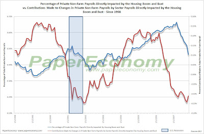
Notice that at its peak the “directly impacted” payrolls represented over 6.6% of Total Private Non-Farm Payrolls and now contracted to a degree similar to that seen during the entire course of the 2001-2003 contraction.
Plotting the ratio of overall and private non-farm payroll as well as the payroll of various business sectors to overall non-institutional population (above 16 years old and not in jail or “juvee”), the last eight years seem to pose more questions than answers.
The payroll-population ratio concept simply provides a mechanism for better isolating the changes to payroll rosters by calculating the percentage of population that is employed in a given sector at any given time.
In the following chart (click for larger version) you can see the ratio of overall non-farm payroll and private non-farm payroll to non-institutional population from 1948 overlaid with all U.S. recessions in that period.

As you can see, there is a fairly strong correlation to declining percent of population employed in non-farm and private non-farm endeavors and recession with particularly good peak-trough alignment for all recessions prior to 1990.
During the 2001 recession (and to a far lesser extent in 1990), although there where large declines to the ratio during the official recession period, the economy seemed to be able resume growth while the ratio continued to slide or stayed well below the peak of the prior expansion.
This is an interesting situation in that, although increases in population have been steady and could have replenished the literal number of jobs lost during the downdraft of 2000-2003, the latest expansion of payrolls has not been strong.
The following chart (click for larger version), on the other hand, the payroll ratio related to construction has remained above even the peak set in the 90s expansion but now seems to be coming down.

As you can see, although 3.25% of the population currently is employed in a construction occupation, there is a chance that this percentage could drop below the trend resulting in 2,327,150 lost construction jobs for every 1% drop in ratio.
Of course these lost jobs could shift to some other part of the labor force but the point is, the current ratio appears poised to drop and with it will inevitably go many construction jobs.
The following is a list of other individual sectors and I’ll leave it up to you to interpret the results but by all means, comment with opinions.
I’ll try to offer some better analysis in a layer post.


 Comparing the private nonfarm payroll estimate from ADP, a national staffing and business services firm, to the BLS results, you can see that while an unusual divergence had shaped up over 2010, ADP appears to be closing the gap as of late.


