Showing posts with label employment. Show all posts

Friday, October 08, 2010

Recovery-less Recovery: Unemployment Duration September 2010

Be sure to bookmark the "Scary Unemployment Dashboard"... it's live.

Today's employment situation report showed that conditions for the long term unemployed has improved notably over the last few months while still remaining epically distressed by historic standards.

In September, workers unemployed 27 weeks or more declined slightly dropping to 6.123 million or 41.7% of all unemployed workers while the median number of weeks unemployed increased to 20.4 weeks and the average stay on unemployment declined to 33.3 weeks.

Looking at the charts below (click for super interactive versions) you can see that today’s sorry situation far exceeds even the conditions seen during the double-dip recessionary period of the early 1980s, long considered by economists to be the worst period of unemployment since the Great Depression.


Wednesday, September 10, 2008

Economic Jolt: Job Openings and Labor Turnover July 2008

Yesterday, the Bureau of Labor Statistics released their latest monthly read of job availability and turnover (JOLT) showing that, on a year-over-year basis, private non-farm job “openings” declined 18.23%, job “hires” declined 15.53%, and “separations” declined 3.24% led by a 10.66% drop in “quits”.

These results are clearly indicating that the slowdown in the employment market has developed substantially over the last six months and now is quickly accelerating down into territory typical of recessionary contraction.

Job “openings” (click chart below for larger version), the reports most leading “demand side” indicator, has now declined on a year-over-year basis for five consecutive months strongly suggesting that the private sector is planning to curtail future hiring activity.

Sliding down that slope of the Beveridge curve, the decline in the job vacancy rate is clearly corresponding with an equal but inverse movement up in the general unemployment rate as can be plainly seen in the following chart (click chart for larger version).

Job “hiring” activity (click chart for larger version) has also been declining significantly with December’s results posting the eighth straight decline on a year-over-year basis further confirming the recent weakness seen in the job market.

Job “separations”, whereby workers and their employers go their separate ways by one means or another (layoffs, retirement, termination, quitting, etc.), are also declining primarily due to the inclusion of “quitting” activity.

It’s important to understand that job “quits” are included as a component of the “separations” data series as “quitting” is a valid means of workers “separating” from employers but their inclusion tends to create an overall procyclical trend in what would otherwise be logically thought of as a countercyclical process (i.e. downturn leads to increase in separations not decrease).

As the economy slides into recession and the employment situation worsens workers tend to reduce quitting activity presumably for fear that they could risk a long bout of unemployment and the latest results (click chart for larger version) confirm this with the sharpest decline on a year-over-year basis seen since August of 2003.

Wednesday, September 03, 2008

The Almost Daily 2¢ - Real Marginalized Unemployment

In recent years there has been a lot of talk about the quirkiness of the traditional unemployment rate which some argue under-represents the true rate by, among other things, removing “discouraged workers” from the calculation.

But “discouraged workers” (i.e. workers who have cited job market reasons or conditions for giving up their job search) are but a subset of a larger group of fringe workers that include both “marginally attached workers” (i.e. workers who are not employed and are not looking but indicate that they wish to work) and those workers who want full-time work but have to settle for part-time.

So, let’s call the larger group that includes all “marginally attached” workers, all “discouraged” workers and all “part-time” looking for “full-time” workers “marginalized workers”.

To calculate the “total” rate of unemployment we would simply use this total “marginalized worker” group rather than the smaller and more restrictive “unemployed” group used in the traditional unemployment rate calculation.

Below is a chart showing the “total” unemployment rate versus the “traditional” unemployment rate along with the year-over-year percent change to the “total” unemployment rate.

Notice that the “total” unemployment rate has increased dramatically over the last 18 months and currently stands at 10.3%.

Also note that this given last month’s data, we are currently sitting at the exact level seen during the worst portion of the dot-com recession and the rate appears poised to accelerate further.

So, is the “total” unemployment rate the “real” rate or is the “traditional” unemployment rate the better measure?

I would argue that the “total” unemployment rate is a better indicator of the breadth of hardship faced by a larger number of workers during economic contractions and particularly the current contraction where many workers will be increasingly marginalized and face the hard realities of relying on part-time work or being forced to leave the workforce altogether.

Thursday, July 03, 2008

Mid-Cycle Meltdown?: Jobless Claims July 03 2008

Today, the Department of Labor released their latest read of Joblessness showing seasonally adjusted “initial” unemployment claims increased 16,000 to 404,000 from last week’s revised 388,000 claims while “continued” claims decreased 19,000 resulting in an “insured” unemployment rate of 2.3%.

It’s very important to understand that today’s report continues to reflect employment weakness that is strongly consistent with past recessionary episodes and that this signal is now so strong and sustained that a contraction in the economy is fundamentally certain.

Historically, unemployment claims both “initial” and “continued” (ongoing claims) are a good leading indicator of the unemployment rate and inevitably the overall state of the economy.

The following chart (click for larger version) shows “initial” and “continued” claims, averaged monthly, overlaid with U.S. recessions since 1967 and from 2000.

As you can see, acceleration to claims generally precedes recessions.


Also, acceleration and deceleration of unemployment claims has generally preceded comparable movements to the unemployment rate by 3 – 8 months (click for larger version).


In the above charts you can see, especially for the last three post-recession periods, that there has generally been a steep decline in unemployment claims and the unemployment rate followed by a “flattening” period of employment and subsequently followed by even further declines to unemployment as growth accelerated.

This flattening period demarks the “mid-cycle slowdown” where for various reasons growth has generally slowed but then resumed with even stronger growth.

So, looking at the post-“dot com” recession period we can see the telltale signs of a potential “mid-cycle” slowdown and if we were to simply reflect on the history of employment as an indicator of the health and potential outlook for the wider economy, it would not be irrational to conclude that times may be brighter in the very near future.

But, adding a little more data I think shows that we may in fact be experiencing a period of economic growth unlike the past several post-recession periods.

Look at the following chart (click for larger version) showing “initial” and “continued” unemployment claims, the ratio of non-farm payrolls to non-institutional population and single family building permits since 1967.

One notable feature of the post-“dot com” recession era that is, unlike other recent post-recession eras, job growth has been very weak, not succeeding to reach trend growth as had minimally accomplished in the past.

Another feature is that housing was apparently buffeted by the response to the last recession, preventing it from fully correcting thus postponing the full and far more severe downturn to today.

I think there is enough evidence to suggest that our potential “mid-cycle” slowdown, having been traded for a less severe downturn in the aftermath of the “dot-com” recession, may now be turning into a mid-cycle meltdown.

Thursday, April 17, 2008

Mid-Cycle Meltdown?: Jobless Claims April 17 2008

Today, the Department of Labor released their latest read of Joblessness showing seasonally adjusted “initial” unemployment claims increasing 17,000 to 372,000 from last week’s revised 406,000 claims and “continued” claims increased 26,000 resulting in an “insured” unemployment rate of 2.2%.

It’s very important to understand that today’s report continues to reflect employment weakness that is wholly consistent with past recessionary episodes and that unequivocal clarity will more than likely come in the next few releases.

Historically, unemployment claims both “initial” and “continued” (ongoing claims) are a good leading indicator of the unemployment rate and inevitably the overall state of the economy.

The following chart (click for larger version) shows “initial” and “continued” claims, averaged monthly, overlaid with U.S. recessions since 1967 and from 2000.

As you can see, acceleration to claims generally precedes recessions.


Also, acceleration and deceleration of unemployment claims has generally preceded comparable movements to the unemployment rate by 3 – 8 months (click for larger version).


In the above charts you can see, especially for the last three post-recession periods, that there has generally been a steep decline in unemployment claims and the unemployment rate followed by a “flattening” period of employment and subsequently followed by even further declines to unemployment as growth accelerated.

This flattening period demarks the “mid-cycle slowdown” where for various reasons growth has generally slowed but then resumed with even stronger growth.

So, looking at the post-“doc com” recession period we can see the telltale signs of a potential “mid-cycle” slowdown and if we were to simply reflect on the history of employment as an indicator of the health and potential outlook for the wider economy, it would not be irrational to conclude that times may be brighter in the very near future.

But, adding a little more data I think shows that we may in fact be experiencing a period of economic growth unlike the past several post-recession periods.

Look at the following chart (click for larger version) showing “initial” and “continued” unemployment claims, the ratio of non-farm payrolls to non-institutional population and single family building permits since 1967.

One notable feature of the post-“dot com” recession era that is, unlike other recent post-recession eras, job growth has been very weak, not succeeding to reach trend growth as had minimally accomplished in the past.

Another feature is that housing was apparently buffeted by the response to the last recession, preventing it from fully correcting thus postponing the full and far more severe downturn to today.

I think there is enough evidence to suggest that our potential “mid-cycle” slowdown, having been traded for a less severe downturn in the aftermath of the “dot-com” recession, may now be turning into a mid-cycle meltdown.

Wednesday, March 12, 2008

Economic Jolt: Job Openings and Labor Turnover January 2008

Today the Bureau of Labor Statistics released their latest monthly read of job availability and turnover (JOLT) showing that, on a year-over-year basis, private non-farm job “openings” declined 9.67%, job “hires” declined 11.25%, and “separations” declined 6.60% led by a 8.51% drop in “quits”.

Job “openings” (click chart below for larger version), the reports most leading “demand side” indicator, has now declined on a year-over-year basis for five consecutive months strongly suggesting that the private sector is planning to curtail future hiring activity.

Sliding down that slope of the Beveridge curve, the decline in the job vacancy rate is clearly corresponding with an equal but inverse movement up in the general unemployment rate as can be plainly seen in the following chart (click chart for larger version).

Job “hiring” activity (click chart for larger version) has also been declining significantly with December’s results posting the eighth straight decline on a year-over-year basis further confirming the recent weakness seen in the job market.

Job “separations”, whereby workers and their employers go their separate ways by one means or another (layoffs, retirement, termination, quitting, etc.), are also declining primarily due to the inclusion of “quitting” activity.

It’s important to understand that job “quits” are included as a component of the “separations” data series as “quitting” is a valid means of workers “separating” from employers but their inclusion tends to create an overall procyclical trend in what would otherwise be logically thought of as a countercyclical process (i.e. downturn leads to increase in separations not decrease).

As the economy slides into recession and the employment situation worsens workers tend to reduce quitting activity presumably for fear that they could risk a long bout of unemployment and the latest results (click chart for larger version) confirm this with recent weakness showing some of the sharpest declines on a year-over-year basis seen since August of 2003.

Thursday, February 14, 2008

Economic Jolt: Job Openings and Labor Turnover December 2007

This week the Bureau of Labor Statistics released their latest monthly read of job availability and turnover (JOLT) showing that, on a year-over-year basis, private non-farm job “openings” declined 8.27%, job “hires” declined 9.80%, and “separations” declined 5.06% led by a 11.20% drop in job“quits”, the largest year-over-year decline to voluntary “quitting” activity seen since August 2003.

Job “openings” (click chart below for larger version), the reports most leading “demand side” indicator, has now declined on a year-over-year basis for five consecutive months strongly suggesting that the private sector is planning to curtail future hiring activity.

Sliding down that slope of the Beveridge curve, the decline in the job vacancy rate is clearly corresponding with an equal but inverse movement up in the general unemployment rate as can be plainly seen in the following chart (click chart for larger version).

Job “hiring” activity (click chart for larger version) has also been declining significantly with December’s results posting the eighth straight decline on a year-over-year basis further confirming the recent weakness seen in the job market.

Job “separations”, whereby workers and their employers go their separate ways by one means or another (layoffs, retirement, termination, quitting, etc.), are also declining primarily due to the inclusion of “quitting” activity.

It’s important to understand that job “quits” are included as a component of the “separations” data series as “quitting” is a valid means of workers “separating” from employers but their inclusion tends to create an overall procyclical trend in what would otherwise be logically thought of as a countercyclical process (i.e. downturn leads to increase in separations not decrease).

As the economy slides into recession and the employment situation worsens workers tend to reduce quitting activity presumably for fear that they could risk a long bout of unemployment and the latest results (click chart for larger version) confirm this with the sharpest decline on a year-over-year basis seen since August of 2003.

Friday, January 04, 2008

Envisioning Employment: Employment Situation December 2007

Today’s Employment Situation Report again showed declining growth to employment with both the Household and Establishment data indicating anemic conditions with only a 18K increase to non-farm payrolls, a 436K worker decline in civilian labor force employment, a 474K increase to unemployed workers, 179K increase to workers now not in the labor force, increasing the rate of unemployment at 5.0% rate, the highest rate seen since the fall of 2005.

The report also disclosed continued and even peaking below trend growth overall and substantial declines in sectors directly related to residential real estate.

The following chart combines both the “residential building” and “residential specialty trade contractors” into one payroll series and then plotting the data since 2002.

Notice that, in aggregate, these payrolls, having peaked in March 2006 and declined 6.83% or 293,100 jobs since then, appear to be headed lower.

Also note that independently, “residential building” has lost 6.14% of its payrolls or 84,900 jobs since it peaked during September 2006 and that “residential specialty trade contractors” have lost 7.74% of its payrolls or 224,300 jobs since it peaked during February 2006.

Next, let’s take a look a slightly broader set of industry sectors that have been directly impacted both by the housing boom and now the bust (click for larger chart).

Note that I carefully selected sectors that showed either an obvious expansion-to-contraction trend OR a flattening-to-contraction trend and that ALL sectors have both a historical and logical relationship to residential housing as well as recent industry press releases disclosing declining profits as a result of the housing bust.

As you can see, sectors that are now being directly impacted by the current housing decline are numerous and cut across many levels of the job market from construction and materials to manufacturing and finally to retail.

Combining these series into an aggregate of payrolls “directly impacted” by the housing boom and bust cycle and plotting it, along with the S&P/Case-Shiller Composite Home Price Index (click on chart below for larger version) since 1997 provides some pretty solid evidence that a relationship exists.

To expand the analysis a bit look at the following chart that shows percent change on year-over-year basis to BOTH the “directly impacted” payrolls sectors and ALL private non-farm payroll overlaid with the S&P/Case-Shiller Composite Home Price Index.

As you can see, the “directly impacted” payrolls are declining at an increasing rate and that overall private non-farm payrolls, while continuing to increase, are doing so at a declining rate.

To get a sense of the relative intensity of the pullback to the “directly impacted” payrolls by plotting both the percentage of overall private non-farm payrolls that the “directly impacted” aggregate represents as well as the contributions it is making to the rate of change of the underlying total private non-farm payrolls.

Notice that at its peak the “directly impacted” payrolls represented over 6.6% of Total Private Non-Farm Payrolls and now contracted to a degree similar to that seen during the entire course of the 2001-2003 contraction.

Plotting the ratio of overall and private non-farm payroll as well as the payroll of various business sectors to overall non-institutional population (above 16 years old and not in jail or “juvee”), the last eight years seem to pose more questions than answers.

The payroll-population ratio concept simply provides a mechanism for better isolating the changes to payroll rosters by calculating the percentage of population that is employed in a given sector at any given time.

In the following chart (click for larger version) you can see the ratio of overall non-farm payroll and private non-farm payroll to non-institutional population from 1948 overlaid with all U.S. recessions in that period.

As you can see, there is a fairly strong correlation to declining percent of population employed in non-farm and private non-farm endeavors and recession with particularly good peak-trough alignment for all recessions prior to 1990.

During the 2001 recession (and to a far lesser extent in 1990), although there where large declines to the ratio during the official recession period, the economy seemed to be able resume growth while the ratio continued to slide or stayed well below the peak of the prior expansion.

This is an interesting situation in that, although increases in population have been steady and could have replenished the literal number of jobs lost during the downdraft of 2000-2003, the latest expansion of payrolls has not been strong.

The following chart (click for larger version), on the other hand, the payroll ratio related to construction has remained above even the peak set in the 90s expansion but now seems to be coming down.

As you can see, although 3.21% of the population currently is employed in a construction occupation, there is a chance that this percentage could drop below the trend resulting in 2,327,150 lost construction jobs for every 1% drop in ratio.

Of course these lost jobs could shift to some other part of the labor force but the point is, the current ratio appears poised to drop and with it will inevitably go many construction jobs.

Friday, December 07, 2007

Envisioning Employment: Employment Situation November 2007

While today’s Employment Situation Report showed growth to total non-farm payrolls it also disclosed continued and even peaking below trend growth overall and substantial declines in sectors directly related to residential real estate.

The following chart combines both the “residential building” and “residential specialty trade contractors” into one payroll series and then plotting the data since 2002.

Notice that, in aggregate, these payrolls, having peaked in March 2006 and declined 6.45% or 221,900 jobs since then, appear to be headed lower.

Also note that independently, “residential building” has lost 5.75% of its payrolls or 59,100 jobs since it peaked during September 2006 and that “residential specialty trade contractors” have lost 7.65% of its payrolls or 185,900 jobs since it peaked during February 2006.

Next, let’s take a look a slightly broader set of industry sectors that have been directly impacted both by the housing boom and now the bust (click for larger chart).

Note that I carefully selected sectors that showed either an obvious expansion-to-contraction trend OR a flattening-to-contraction trend and that ALL sectors have both a historical and logical relationship to residential housing as well as recent industry press releases disclosing declining profits as a result of the housing bust.

As you can see, sectors that are now being directly impacted by the current housing decline are numerous and cut across many levels of the job market from construction and materials to manufacturing and finally to retail.

Combining these series into an aggregate of payrolls “directly impacted” by the housing boom and bust cycle and plotting it, along with the S&P/Case-Shiller Composite Home Price Index (click on chart below for larger version) since 1997 provides some pretty solid evidence that a relationship exists.

To expand the analysis a bit look at the following chart that shows percent change on year-over-year basis to BOTH the “directly impacted” payrolls sectors and ALL private non-farm payroll overlaid with the S&P/Case-Shiller Composite Home Price Index.

As you can see, the “directly impacted” payrolls are declining at an increasing rate and that overall private non-farm payrolls, while continuing to increase, are doing so at a declining rate.

To get a sense of the relative intensity of the pullback to the “directly impacted” payrolls by plotting both the percentage of overall private non-farm payrolls that the “directly impacted” aggregate represents as well as the contributions it is making to the rate of change of the underlying total private non-farm payrolls.
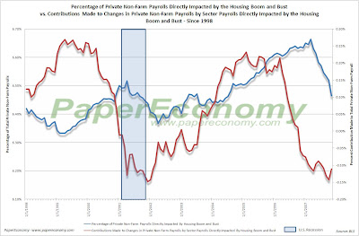
Notice that at its peak the “directly impacted” payrolls represented over 6.6% of Total Private Non-Farm Payrolls and now contracted to a degree similar to that seen during the entire course of the 2001-2003 contraction.

Plotting the ratio of overall and private non-farm payroll as well as the payroll of various business sectors to overall non-institutional population (above 16 years old and not in jail or “juvee”), the last eight years seem to pose more questions than answers.

The payroll-population ratio concept simply provides a mechanism for better isolating the changes to payroll rosters by calculating the percentage of population that is employed in a given sector at any given time.

In the following chart (click for larger version) you can see the ratio of overall non-farm payroll and private non-farm payroll to non-institutional population from 1948 overlaid with all U.S. recessions in that period.

As you can see, there is a fairly strong correlation to declining percent of population employed in non-farm and private non-farm endeavors and recession with particularly good peak-trough alignment for all recessions prior to 1990.

During the 2001 recession (and to a far lesser extent in 1990), although there where large declines to the ratio during the official recession period, the economy seemed to be able resume growth while the ratio continued to slide or stayed well below the peak of the prior expansion.

This is an interesting situation in that, although increases in population have been steady and could have replenished the literal number of jobs lost during the downdraft of 2000-2003, the latest expansion of payrolls has not been strong.

The following chart (click for larger version), on the other hand, the payroll ratio related to construction has remained above even the peak set in the 90s expansion but now seems to be coming down.

As you can see, although 3.25% of the population currently is employed in a construction occupation, there is a chance that this percentage could drop below the trend resulting in 2,327,150 lost construction jobs for every 1% drop in ratio.

Of course these lost jobs could shift to some other part of the labor force but the point is, the current ratio appears poised to drop and with it will inevitably go many construction jobs.

The following is a list of other individual sectors and I’ll leave it up to you to interpret the results but by all means, comment with opinions.

I’ll try to offer some better analysis in a layer post.