Showing posts with label housing bubbe. Show all posts

Tuesday, February 23, 2010

S&P/Case-Shiller: December 2009

Today’s release of the S&P/Case-Shiller (CSI) home price indices for December 2009 reported that the non-seasonally adjusted Composite-10 price index declined slightly since November further indicating that the government sponsored housing bounce has drawn to a close.

It’s important to remember that the CSI data is lagged by two months and that today’s results represent the trend of prices paid from home sales closed between October-December of 2009.

Now that the strongest selling months have been reported, look for all remaining CSI releases until early spring to continue to indicate notable price weakness coming from typical seasonal declines as well as extra-seasonal declines as a result of reduced demand from activity that was “stimulated” forward into the summer and early fall by the tax sham.

Also, looking at the 1990s-era comparison charts below its obvious that even after the main downward thrust has been reached, the housing markets have a long tough slog ahead with the ultimate bottom likely many years out…. Or if we are currently experiencing the Japanese model… decades out.

Further, is important to remember that the 90s housing recovery played out against the backdrop of a truly unique period of growth in the wider economy fueled primarily by novel and ubiquitous technological change (cell phones, internet, personal computers, telecommunications, etc).

Today, we may not be so lucky.

The 10-city composite index declined 2.41% as compared to December 2008 while the 20-city composite declined 3.08% over the same period.

Topping the list of regional peak decliners was Las Vegas at -55.54%, Phoenix at -50.52%, Miami at -47.07%, Detroit at -42.87% and Tampa at -41.67%.

Additionally, both of the broad composite indices show significant peak declines slumping -30.10% for the 10-city national index and -29.35% for the 20-city national index on a peak comparison basis.

To better visualize today’s results use Blytic.com and search for “case shiller”.

The following chart (click for larger version) shows the percent change to single family home prices given by the Case-Shiller Indices as compared to each metros respective price peak set between 2005 and 2007.

The following chart (click for larger version) shows the percent change to single family home prices given by the Case-Shiller Indices as on a year-over-year basis.

The following chart (click for larger version) shows the percent change to single family home prices given by the Case-Shiller Indices as on a month-to-month basis.

Additionally, in order to add some historical context to the perspective, I updated my “then and now” CSI charts that compare our current circumstances to the data seen during 90s housing decline.

To create the following annual charts I simply aligned the CSI data from the last month of positive year-over-year gains for both the current decline and the 90s housing bust and plotted the data with side-by-side columns (click for larger version).

What’s most interesting about this particular comparison is that it highlights both how young the current housing decline is and clearly shows that the latest bust has surpassed the prior bust in terms of intensity.

The “peak” chart compares the percentage change, comparing monthly CSI values to the peak value seen just prior to the first declining month all the way through the downturn and the full recovery of home prices.

In this way, this chart captures ALL months of the downturn from the peak to trough to peak again.

As you can see the last downturn lasted 97 months (over 8 years) peak to peak including roughly 43 months of annual price declines during the heart of the downturn.

Friday, September 25, 2009

New Home Sales: August 2009

Subtitle: Green Shoots Go Limp… Is That All You Got!

Today, the U.S. Census Department released its monthly New Residential Home Sales Report for August showing the fifth, albeit tepid, consecutive monthly increase in sales of newly constructed single family dwellings bringing the seasonally adjusted annual sales pace to 429,000 units or 3.4% below the level seen in August 2008 and remaining 69.11% below the peak level 2005

You would think that the government’s historic first-time "homebuyer" welfare payments could trump up a bit more activity but it’s looking as if the pool of unwitting suckers is starting to dry up.

Like the “cash for clunkers” ruse, all this scam is doing is pulling forward demand while giving handouts to a lot of buyers who would have been capable of (…and fool enough) buying this year or next anyhow.

The government will more than likely extend this program and maybe even relax its terms but as home prices continue to decline it may soon become clear to both the newly minted “homeowners” and their representatives that this policy was misguided.

For the time being though, you can certainly expect the National Association of Realtors and the home builders to push hard for the extension of this swindle… In good times they rip you off honestly with bloated commissions or junk McMansions… In bad, they underhandedly lean on your representatives for a portion of your pay… it’s a classic lose-lose.

In any event, it looks like buying activity is slowing down and I say good riddance!

The following charts show the extent of sales declines seen since 2005 as well as illustrating how the further declines in 2009 are coming on top of the 2006, 2007 and 2008 results (click for larger versions)


It’s important to note that although the new home sales data appears to have prompted the traditional media to make many “bottom calls” recently, the evidence for their conclusions were scant.

First, most “bottom callers” have focused too closely on just the new home sales series and its historic bottoms rather than other important indicators that disclose a more complete state of the new home market.

As I have argued recently, the level of inventory and supply and level of completed new homes are still too high for a real sustained bottom for the new home market.

The following chart (click for larger) plots the new home sales (SAAR) series along with the current inventory level (NA) and the level of homes completed (NA) since 1973.

As you can see, although the new home sales series has breached the lowest level in over 30 years, the level of inventory (homes for sale at end of period) still remains higher than past historic bottoms and the level of homes completed remains much higher.

In fact, the level of completed new homes remains near PEAK levels for past housing boom periods… a truly bad sign for pricing going forward.

Look at the following summary of today’s report:

National

  • The median sales price for a new home declined 11.67% as compared to August 2008.
  • New home sales were down 3.4% as compared to August 2008.
  • The inventory of new homes for sale declined 36.4% as compared to August 2008.
  • The number of months’ supply of the new homes has decreased 34.2% as compared to August 2008 and now stands at 7.3 months.
Regional

  • In the Northeast, new home sales increased 28.6% as compared to August 2008.
  • In the Midwest, new home sales declined 31.9% as compared to August 2008.
  • In the South, new home sales declined 11.1% as compared to August 2008.
  • In the West, new home sales increased 30.4% as compared to August 2008.

Friday, May 29, 2009

Bull Trip!: GDP Report Q1 2009 (Preliminary)

Today, the Bureau of Economic Analysis (BEA) released their second installment of the Q1 2009 GDP report showing a (revised) significant contraction with GDP declining at an annual rate of -5.7%.

Easily the most notable features of today’s report are the stunning declines to residential and non-residential as well as exports of both goods and services.

Fixed investment provided significant drags on growth with non-residential investment declining a whopping -36.9% and residential investment plunging -38.7% while net exports of goods and services declined -28.7%.

Making a positive contribution to GDP were equally stunning declines to imports of goods and services slumping -34.1% as well as positive personal consumption expenditures increasing 1.5%.

The following chart shows real residential and non-residential fixed investment versus overall GDP since Q1 2003 (click for larger version).

Thursday, September 25, 2008

Existing Home Sales Report: August 2008

Yesterday, the National Association of Realtors (NAR) released their Existing Home Sales Report for August further confirming a continuation of the tremendous weakness in the demand of existing residential real estate with sales of both single family homes and condos declining nearly uniformly across the nation’s housing markets.

Although this continued falloff in demand is mostly as a result of the momentous and ongoing structural changes taking place in the credit-mortgage markets, consumer sentiment surveys are continuing to indicate that consumers are materially feeling the strain of the current economic weakness which will likely result in even further significant sales declines to come.

Furthermore, we are continuing to see SOLID declines to the median sales price for both single family homes and condos across virtually every region.

As usual, the NAR leadership continues suggesting that the massive government intervention into the marketplace will translate to a boon for their industry.

“August sales reflect higher interest rates before the government takeover of Freddie Mac and Fannie Mae, and the sudden drop in mortgage interest rates over the past couple weeks is improving housing affordability, … However, home sales will be constrained without a freer flow of credit into the mortgage market. The faster that happens, the sooner we’ll see a broad stabilization in home prices that in turn will help the economy recover, … Historically, housing has led the nation out of economic doldrums – there will not be an economic recovery without a housing recovery.”

Yun forgets to mention that the government bailouts and housing initiatives will cost taxpayers literally hundreds of billions of dollars placing a historic burden on industry and workers and seriously restraining economic growth.

Keep in mind that these declines are coming “on the back” of TWO SOLID YEARS of dramatic declines further indicating that the housing markets are truly in the process of a tremendous correction.

The following (click for larger versions) are charts showing sales for single family homes, plotted monthly, for 2006, 2007 and 2008 as well as national existing home inventory and month supply.


Below is a chart consolidating all the year-over-year changes reported by NAR in their most recent report.

Thursday, September 18, 2008

Follow The Leader: Index of Leading Economic Indicators August 2008

Today’s results of the Conference Board’s Leading Economic Indicators continue to indicate troubled times ahead decreasing 0.5% from July and declining 2.70% compared to August 2007, leaving the index at 100.8.

It’s important to note that a year-over-year decline greater than 1.5% has ONLY preceded EVERY recession that has occurred in the last 59 years so the 11 consecutive and significant year-over-year declines strongly suggests that overall the components of the index are indicating that recession is upon us.

Tuesday, July 08, 2008

NARcasting The Future: July 2008

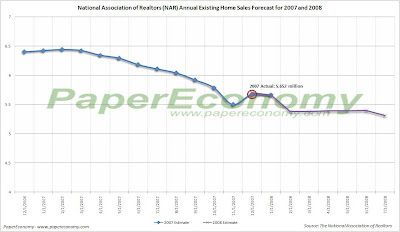
Today, the National Association of Realtors (NAR) provided their latest estimate of annual existing home sales for 2008 lowering their total year sales forecast to 5.31 million units.

As usual, the latest forecast comes with another dose of truly ridiculous spin.

In an effort to put their absurd bias into perspective I compiled all their existing home sales forecasts for 2007 and now 2008 into a chart along with a list of prominent quotes supplied with each forecast.

12/11/2006 Prediction: 6.40 million units.
Lereah "Most of the correction in home prices is behind us."

1/10/2007 Prediction: 6.42 million units.
Lereah "The good news is that the steady improvement in sales will support price appreciation moving forward."

2/7/2007 Prediction: 6.44 million units.
Lereah "After reaching what appears to be the bottom in the fourth quarter of 2006, we expect existing-home sales to gradually rise all this year and well into 2008."

3/13/2007 Prediction: 6.42 million units.
Lereah "Although existing-home sales will be marginally reduced due to subprime lending restrictions, they should be gradually rising this year and next."

4/11/2007 Prediction: 6.34 million units.
Lereah "Tighter lending standards will dampen home sales a bit, but by less than a couple of percentage points from initial projections."

4/30/2007 Lereah Leaves NAR for Move.com

5/9/2007 Prediction: 6.29 million units.
Yun "Housing activity this year will be somewhat lower than in earlier forecasts."

6/6/2007 Prediction: 6.18 million units.
Yun "Home sales will probably fluctuate in a narrow range in the short run, but gradually trend upward with improving activity by the end of the year."

7/11/2007 Prediction: 6.11 million units.
Yun "Home prices are expected to recover in 2008 with existing-home sales picking up late this year."

8/8/2007 Prediction: 6.04 million units.
Yun “With the population growing, the demand for homes isn’t going away – it’s just being delayed.”

9/11/2007 Prediction: 5.92 million units.
Yun “Patient buyers in most areas who do their homework will recognize that housing remains a good long-term investment.”

10/10/2007 Prediction: 5.78 million units.
Yun "The speculative excesses have been removed from the market and home sales are returning to fundamentally healthy levels, while prices remain near record highs, reflecting favorable mortgage rates and positive job gains."

11/13/2007 Prediction: 5.5 million units.
Yun "In some ways, the extended real estate boom from 2001 to 2005 created unrealistic expectations that housing is a short-term high-yield investment… 2007 will be the fifth best year for housing on record"

12/10/2007 Prediction: 5.67 million units in 2007, 5.7 million units in 2008.
Yun "The broad trend over the coming year will be a gradual rise in existing-home sales, but because sales are exceptionally low in the final months of 2007, total sales for 2008 will be only modestly higher than 2007."

01/08/2008 Prediction: 5.66 million units in 2007, 5.7 million units in 2008.
Yun "A meaningful recovery in existing-home sales could occur as early as this spring, or it may be further delayed toward late 2008."

ACTUAL: 5.652 million existing units sold in 2007

02/07/2008 Prediction: 5.38 million units full year.
Yun "Where builders have cut construction sharply, and in most areas with improving affordability conditions, we’ll generally see moderately higher home prices."

03/06/2008 Prediction: 5.38 million units full year.
Yun "Significant price declines in some local markets have sharply and quickly improved local affordability conditions, and are inducing buyers to return to the marketplace"

04/08/2008 Prediction: 5.39 million units full year.
Yun "Exceptionally weak home sales related to jumbo loans problems will depress home prices in the first half of the year, but steady liquidity improvements in the conforming jumbo-loan market will help prices recover in the second half of the year"

05/08/2008 Prediction: 5.39 million units full year.
Yun "Although more than half of local markets are expected to see price growth this year, the aggregate existing-home price will decline 2.4 percent in 2008, driven by a relatively few markets that are very oversupplied"

06/09/2008 Prediction 5.4 million units full year.
Yun "We’re seeing healthy price gains in moderately priced areas like Erie, Pa., and Corpus Christi, Texas, and double-digit gains in others"

07/08/2008 Prediction 5.31 million units full year.
Yun "Interestingly, there have been reports of multiple bidding after the large price cuts, so it is possible that most of the price declines have already occurred in those markets."

Thursday, July 03, 2008

Envisioning Employment: Employment Situation June 2008

Today’s Employment Situation Report showed unequivocal signs of a slumping recessionary economy with the Household survey indicating an decline of 155,000 in employment and a 12,000 increase in unemployment since May again resulting in an unemployment rate of 5.5% while the Establishment survey showed a decline of 62,0000 nonfarm jobs.

With the latest news littered with reports of job cuts and layoffs cutting across many regions and industries the recessionary job loss trend is now firmly established and only the extent is in question.

Additionally, along with the weak results seen in June comes additional downward revisions to April and May resulting in 485,000 private non-farm jobs being shed this year.

The report also confirmed declining below trend growth overall and substantial declines in sectors directly related to residential real estate and construction.

The following chart combines both the “residential building” and “residential specialty trade contractors” into one payroll series and then plotting the data since 2002.

Notice that, in aggregate, these payrolls, having peaked in March 2006 and declined 15.20% or 525,100 jobs since then, appear to be headed lower.

Also note that independently, “residential building” has lost 16.84% of its payrolls or 171,900 jobs since it peaked during September 2006 and that “residential specialty trade contractors” have lost 14.76% of its payrolls or 360,300 jobs since it
peaked during February 2006.

Next, let’s take a look a slightly broader set of industry sectors that have been directly impacted both by the housing boom and now the bust (click for larger chart).

Note that I carefully selected sectors that showed either an obvious expansion-to-contraction trend OR a flattening-to-contraction trend and that ALL sectors have both a historical and logical relationship to residential housing as well as recent industry press releases disclosing declining profits as a result of the housing bust.

As you can see, sectors that are now being directly impacted by the current housing decline are numerous and cut across many levels of the job market from construction and materials to manufacturing and finally to retail.

Combining these series into an aggregate of payrolls “directly impacted” by the housing boom and bust cycle and plotting it, along with the S&P/Case-Shiller Composite Home Price Index (click on chart below for larger version) since 1997 provides some pretty solid evidence that a relationship exists.

To expand the analysis a bit look at the following chart that shows percent change on year-over-year basis to BOTH the “directly impacted” payrolls sectors and ALL private non-farm payroll overlaid with the S&P/Case-Shiller Composite Home Price Index.

As you can see, the “directly impacted” payrolls are declining at an increasing rate and that overall private non-farm payrolls, while continuing to increase, are doing so at a declining rate.

To get a sense of the relative intensity of the pullback to the “directly impacted” payrolls by plotting both the percentage of overall private non-farm payrolls that the “directly impacted” aggregate represents as well as the contributions it is making to the rate of change of the underlying total private non-farm payrolls.

Notice that at its peak the “directly impacted” payrolls represented over 6.67% of Total Private Non-Farm Payrolls and now contracted to a degree similar to that seen during the entire course of the 2001-2003 contraction.

Plotting the ratio of overall and private non-farm payroll as well as the payroll of various business sectors to overall non-institutional population (above 16 years old and not in jail or “juvee”), the last eight years seem to pose more questions than answers.

The payroll-population ratio concept simply provides a mechanism for better isolating the changes to payroll rosters by calculating the percentage of population that is employed in a given sector at any given time.

In the following chart (click for larger version) you can see the ratio of overall non-farm payroll and private non-farm payroll to non-institutional population from 1948 overlaid with all U.S. recessions in that period.

As you can see, there is a fairly strong correlation to declining percent of population employed in non-farm and private non-farm endeavors and recession with particularly good peak-trough alignment for all recessions prior to 1990.

During the 2001 recession (and to a far lesser extent in 1990), although there where large declines to the ratio during the official recession period, the economy seemed to be able resume growth while the ratio continued to slide or stayed well below the peak of the prior expansion.

This is an interesting situation in that, although increases in population have been steady and could have replenished the literal number of jobs lost during the downdraft of 2000-2003, the latest expansion of payrolls has not been strong.

The following chart (click for larger version), on the other hand, the payroll ratio related to construction has remained above even the peak set in the 90s expansion but now seems to be coming down.

As you can see, although 3.08% of the population currently is employed in a construction occupation, there is a chance that this percentage could drop below the trend.

Of course these lost jobs could shift to some other part of the labor force but the point is, the current ratio appears poised to drop and with it will inevitably go many construction jobs.

Mid-Cycle Meltdown?: Jobless Claims July 03 2008

Today, the Department of Labor released their latest read of Joblessness showing seasonally adjusted “initial” unemployment claims increased 16,000 to 404,000 from last week’s revised 388,000 claims while “continued” claims decreased 19,000 resulting in an “insured” unemployment rate of 2.3%.

It’s very important to understand that today’s report continues to reflect employment weakness that is strongly consistent with past recessionary episodes and that this signal is now so strong and sustained that a contraction in the economy is fundamentally certain.

Historically, unemployment claims both “initial” and “continued” (ongoing claims) are a good leading indicator of the unemployment rate and inevitably the overall state of the economy.

The following chart (click for larger version) shows “initial” and “continued” claims, averaged monthly, overlaid with U.S. recessions since 1967 and from 2000.

As you can see, acceleration to claims generally precedes recessions.


Also, acceleration and deceleration of unemployment claims has generally preceded comparable movements to the unemployment rate by 3 – 8 months (click for larger version).


In the above charts you can see, especially for the last three post-recession periods, that there has generally been a steep decline in unemployment claims and the unemployment rate followed by a “flattening” period of employment and subsequently followed by even further declines to unemployment as growth accelerated.

This flattening period demarks the “mid-cycle slowdown” where for various reasons growth has generally slowed but then resumed with even stronger growth.

So, looking at the post-“dot com” recession period we can see the telltale signs of a potential “mid-cycle” slowdown and if we were to simply reflect on the history of employment as an indicator of the health and potential outlook for the wider economy, it would not be irrational to conclude that times may be brighter in the very near future.

But, adding a little more data I think shows that we may in fact be experiencing a period of economic growth unlike the past several post-recession periods.

Look at the following chart (click for larger version) showing “initial” and “continued” unemployment claims, the ratio of non-farm payrolls to non-institutional population and single family building permits since 1967.

One notable feature of the post-“dot com” recession era that is, unlike other recent post-recession eras, job growth has been very weak, not succeeding to reach trend growth as had minimally accomplished in the past.

Another feature is that housing was apparently buffeted by the response to the last recession, preventing it from fully correcting thus postponing the full and far more severe downturn to today.

I think there is enough evidence to suggest that our potential “mid-cycle” slowdown, having been traded for a less severe downturn in the aftermath of the “dot-com” recession, may now be turning into a mid-cycle meltdown.

Wednesday, July 02, 2008

Reading Rates: MBA Application Survey – July 02 2008

The Mortgage Bankers Association (MBA) publishes the results of a weekly applications survey that covers roughly 50 percent of all residential mortgage originations and tracks the average interest rate for 30 year and 15 year fixed rate mortgages, 1 year ARMs as well as application volume for both purchase and refinance applications.

The purchase application index has been highlighted as a particularly important data series as it very broadly captures the demand side of residential real estate for both new and existing home purchases.

The latest data is showing that the average rate for a 30 year fixed rate mortgage declined 6 basis points since last week to 6.33% while the purchase application volume increased by 2.8% and the refinance application volume increased 4.7% compared to last week’s results.

It’s important to note that the average interest rate on an 80% LTV 30 year fixed rate loan remains near the top of the range seen throughout 2007 while the interest rate for an 80% LTV 1 year ARM remains significantly elevated now resting 81 basis points ABOVE the rate of an average 80% LTV 30 year fixed rate loan despite all the herculean efforts by the Federal Reserve to bring rates down.

Also note that all application volume values reflect only “initial” applications NOT approved applications… i.e. originations… actual originations would likely be notably lower than the applications.

The following chart shows how the principle and interest cost and estimated annual income required to cover the PITI (using the 29% “rule of thumb”) on a $400,000 loan has changed since November 2006.

The following chart shows the average interest rate for 30 year and 15 year fixed rate mortgages over the last number of weeks (click for larger version).


The following charts show the Purchase Index, Refinance Index and Market Composite Index since November 2006 (click for larger versions).


Tuesday, July 01, 2008

The Almost Daily 2¢ - Goodbye March Lows

Intra-day, the S&P 500 has now broken well below the lows set in March during the emergency bailout of Bear Stearns.

As I have noted before, this bear market selloff has, thus far, been relatively orderly with only mild volatility especially when compared to past similar episodes.

The chart below (click for absolutely HUGE version) simply plots the percentage gained or lost (with moving averages) on consecutive up and down daily closings of the S&P 500 against the S&P 500 itself.

Percentage gains accumulate until there is a down daily closing after which percentage losses accumulate until there is an up daily closing.

This provides another view of market volatility and, I think, better allows for the visualization of the “tug of war” that goes on between Bullish and Bearish forces.

Probably the most striking detail disclosed in this chart is how little volatility has occurred during this current bear market selloff.

After nearly eight months of decline, the volatility registered during this episode appears muted compared to period surrounding the dot-com collapse of 1998 – 2004 or even the S&L meltdown of the early 90s.

Though the current selloff has been orderly to date, I fear we may be entering a period where we could see a significant market crash.

The lows from the Bear Stearns panic have been breached, the Asian markets are significantly off their October highs, most major world economies are slowing, U.S. auto sales are hideous, retail sales (especially inflation adjusted) are continuing to decline, home prices are continuing to collapse, foreclosures are soaring, oil and gas and food prices continue to climb… the list is endless.

We are clearly in the midst of a complex and sustained financial crisis and the broader stock market averages have simply not accurately reflected that fact.

Construction Spending: May 2008

Today, the U.S. Census Bureau released their May read of construction spending again demonstrating the significant extent to which private residential construction is contracting particularly for single family structures while non-residential spending continued to grow essentially in-line with its recent expansion.

An important note, with this release the Census Bureau revised both the total private residential and private single family component series to EXCLUDE “expenditures on private residential improvements to rental, vacant, and seasonal properties” an adjustment that has significantly change the slope of the recent pullback.

In order to get a sense of the significance of the revisions, I have isolated the delta (pre – post revision) in the chart below which appears to indicate that spending on improvements to rental, vacant and seasonal properties actually boomed during 2007 but has begun to erode a bit in 2008.

It’s likely that expenditures on vacant and rental properties increased in 2007 simply as a result of the stock of vacant and rental properties increasing significantly.


With the tremendous weakening trend continuing, total residential construction spending fell 27.27% as compared to May 2007 and 43.99% from the peak set in March 2006.

Worse off though was private single family residential construction spending which declined 39.21% as compared to May 2007 and a truly grotesque 57.53% from the peak set in February 2006.

Non-residential construction spending, currently accounting for just under half of all private construction spending, remains the only pillar of strength gaining 16.61% as compared to May 2007.

As was noted in prior posts, commercial real estate (CRE) appears to be coming under some pressure with increasing vacancy rates and falling prices.

Keep your eye on the last chart in the months to come for a clear indication of a pullback.

The following charts (click for larger versions) show private residential construction spending, private residential single family construction spending and private non-residential construction spending broken out and plotted since 1993 along with the year-over-year and peak percent change to each since 1994 and 2000 – 2005.