It's important to recognize that as we continue to move away from the government's tax sham, the home sales and price movement fueled by that epic monstrosity are left further and further behind.
Yet, it will be some time before the effects are completely expunged from the CSI as its methodology uses a three month rolling average of the source data and further, as BostonBubble points out, since Congress moved to extend the closing deadline for the credit until September, the CSI data may not be free of the distortion until the February 2011 release!
In any event, you can see from the latest CSI data that the price trends are starting to slump and, as I recently pointed out, the more timely and less distorted Radar Logic RPX data is already capturing notable price weakness nationwide.
The 10-city composite index increased just 0.22% as compared to October 2009 while the 20-city composite increased 0.80% over the same period.
Topping the list of regional peak decliners was Las Vegas at -56.99%, Phoenix at -53.40%, Miami at -48.72%, Detroit at -45.80% and Tampa at -43.21%.
Additionally, both of the broad composite indices show significant peak declines slumping -29.72% for the 10-city national index and -29.63% for the 20-city national index on a peak comparison basis.
To better visualize today’s results use Blytic.com to view the full release.
Also, follow the S&P/Case-Shiller dashboard.
The following chart (click for larger version) shows the percent change to single family home prices given by the Case-Shiller Indices as compared to each metros respective price peak set between 2005 and 2007.
 The following chart (click for larger version) shows the percent change to single family home prices given by the Case-Shiller Indices as on a year-over-year basis.
 The following chart (click for larger version) shows the percent change to single family home prices given by the Case-Shiller Indices as on a month-to-month basis.
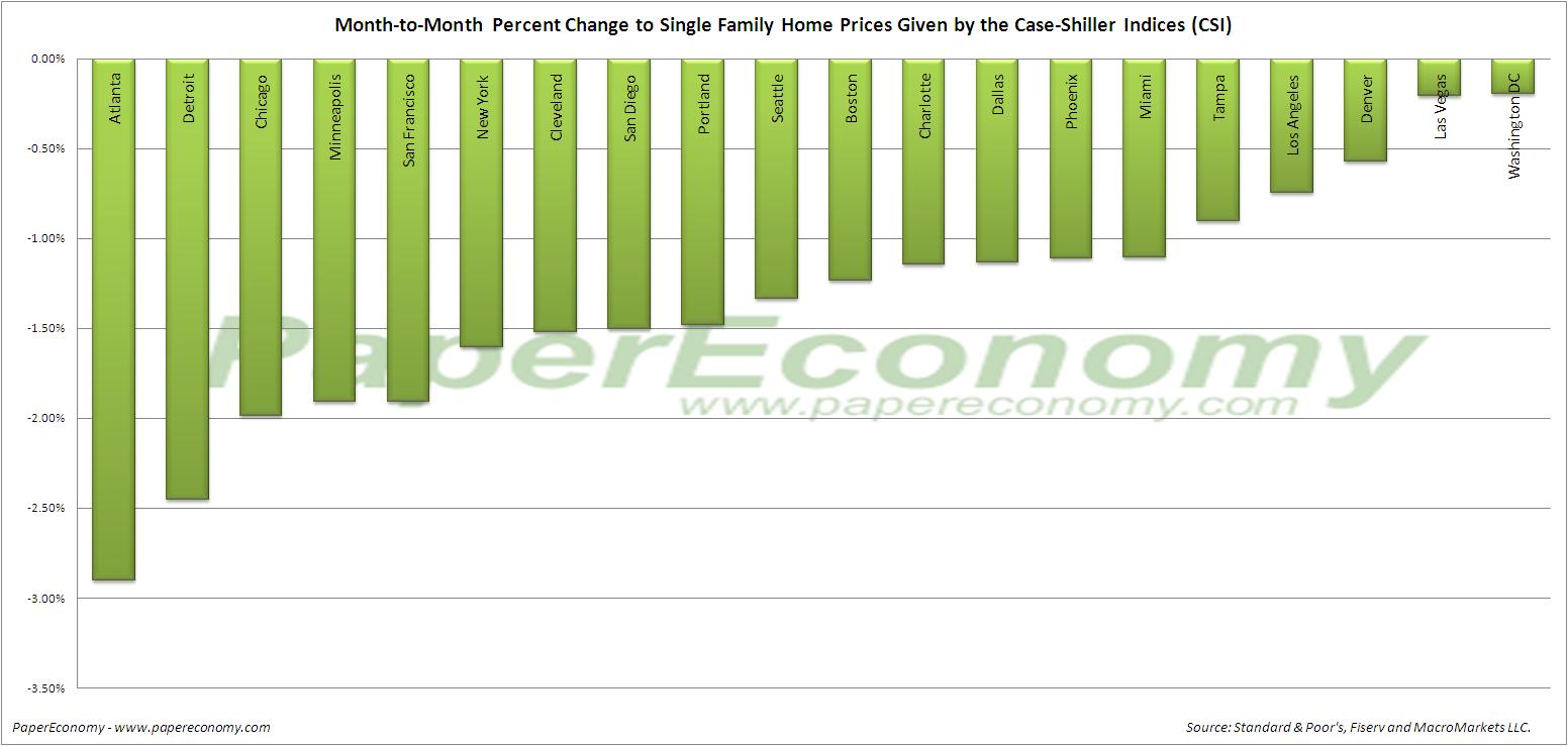 Additionally, in order to add some historical context to the perspective, I updated my “then and now” CSI charts that compare our current circumstances to the data seen during 90s housing decline.
To create the following annual charts I simply aligned the CSI data from the last month of positive year-over-year gains for both the current decline and the 90s housing bust and plotted the data with side-by-side columns (click for larger version).

 The “peak” chart compares the percentage change, comparing monthly CSI values to the peak value seen just prior to the first declining month all the way through the downturn and the full recovery of home prices.
