Today’s release of the S&P/Case-Shiller (CSI) home price indices for June reported that the non-seasonally adjusted Composite-10 price index increased 1.05% since May while the Composite-20 index increased 1.11% over the same period with both measures continuing to decline notably since last year.
The latest CSI data clearly indicates that the price trends are experiencing a bit of a lift into the typically more active spring season and, as I recently pointed out, the more timely and less distorted Radar Logic RPX data is continuing to capture rising prices driven primarily by seasonality.
It's important to note though that both composite indices are continuing to show notable year-over-year declines, a weak sign indeed.
The 10-city composite index declined 3.84% as compared to June 2010 while the 20-city composite declined 4.52% over the same period.
Topping the list of regional peak decliners was Las Vegas at -59.25%, Phoenix at -55.73%, Miami at -50.35%, Detroit at -48.51% and Tampa at -45.86%.
Additionally, both of the broad composite indices show significant peak declines slumping -31.56% for the 10-city national index and -31.58% for the 20-city national index on a peak comparison basis.
To better visualize today’s results use Blytic.com to view the full release.
The following chart (click for larger version) shows the percent change to single family home prices given by the Case-Shiller Indices as compared to each metros respective price peak set between 2005 and 2007.
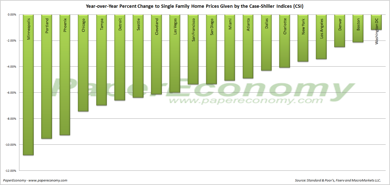
 The following chart (click for larger version) shows the percent change to single family home prices given by the Case-Shiller Indices as on a year-over-year basis.
 The following chart (click for larger version) shows the percent change to single family home prices given by the Case-Shiller Indices as on a month-to-month basis.
 Additionally, in order to add some historical context to the perspective, I updated my “then and now” CSI charts that compare our current circumstances to the data seen during 90s housing decline.
To create the following annual and normalized charts I simply aligned the CSI data from the last month of positive year-over-year gains for both the current decline and the 90s housing bust and plotted the data side-by-side (click for larger version).

 The “peak” chart compares the percentage change, comparing monthly CSI values to the peak value seen just prior to the first declining month all the way through the downturn and the full recovery of home prices.

