Showing posts with label recession economy. Show all posts

Friday, August 21, 2009

Outstanding Contraction!: Commercial Paper Outstanding August 20 2009

The Commercial Paper (CP) market is essentially a private debt market used by corporations as a cheaper means of funding typical recurring operations than drawing on a line of bank credit.

Commercial paper, as financial instrument, is by no means a recent innovation and, in fact, you can read about how the CP market was affected by the many historic financial shocks experienced by the U.S. (read Panic on Wall Street: A History of America’s Financial Disasters)

Although the Federal Reserve was able to artificially bring CP rates down significantly since the shocking 615 basis point spread blowout (A2/P2 spread) of late 2008, they have apparently not been successful in preventing an overall contraction in the CP market.

The Federal Reserve calculates and published the total amount of CP outstanding every week and as of the latest published period, commercial paper outstanding is contracting at nearly the fastest rate on record, registering a whopping 37.87% decline year-over-year.

Another important insight, at $1.110 trillion the total CP market is now 12.73% smaller than the $1.272 trillion seen at the bottom of the last contraction in late 2003.

The CP market that expanded wildly throughout 2004, 2005, 2006 and most of 2007 is now no more, replaced instead by one smaller and contracting faster than at any other time in this century.

Thursday, June 18, 2009

Philadelphia Feeling: Federal Reserve Bank of Philadelphia Business Outlook Survey June 2009

Today, the Federal Reserve Bank of Philadelphia released the results of their Business Outlook Survey for June showing significant improvement to the regions manufacturing sector with the current activity index indicating only mild continued contraction at –2.2.

This is another strong indicator currently favoring the “Green Shoots” position though as with today’s index of leading economic indicators, the intensity of the “V” should be monitored closely in coming months in order to establish the fundamental trend.

It’s important to note that with today’s release the future general activity index has pushed up near the high set during the strongest portion of the last economic “expansion” clearly indicating that respondents on the whole see a strong recovery in the works.

Is this and accurate take or just a significant bounce from a sense of relief that the events of Q4 2008 are now behind us?


Also, today’s results now show that any recent parallel to the stagflationary eras of the 70s and early 80 have given way to a stronger stag-deflationary force bringing down prices and new orders though the latest release shows predictions on future employment appear to have taken a turn up.

The following chart shows the latest results of the “current new orders” “current prices paid” and “future employment” components (click for larger versions).

The following chart (click for larger) shows these measures during the last stagflationary era seen between 1976 – 1980. Notice the clear divergence of rising prices and falling growth.

Monday, December 22, 2008

U.S. Invasion: U.K. Home Prices November 2008

The two most prominent and long running monthly U.K. housing price indices continue to register accelerating year-over-year declines resulting in the largest peak decline seen in at least 17 years.

The “Nationwide” series, which reported data through November, indicated that U.K. home prices declined 13.9% on a year-over-year basis while the “Halifax” series, which reported data through November, indicated that U.K. home prices declined 16.44% on a year-over-year basis.

Both indices are similar to our own S&P/Case-Shiller data series in that they both implement a methodology that seeks to standardize the quality homes included as source data and track the price changes occurring between sales instead of simply tracking the distorted average or median sales price.

The following charts (click for larger) show the price movement since 1991 to each index.
Notice that annual price appreciation peaked in 2003 and continued to weaken consistently until early 2008 when it actually devolved into annual depreciation.


Tuesday, October 07, 2008

Ticking Time Bomb?: Fannie Mae Monthly Summary August 2008

Decades from now August 2008 will likely be remembered to mark the turning point where legislative blundering took an otherwise serious financial crisis and molested it into an epic financial collapse.

By fully assuming the liabilities of Fannie Mae and Freddie Mac, the two colossal and corrupt (and conduit of corruptness funneling junk Countrywide Financial loans onto the implied balance sheet of the federal government) government sponsored enterprises, the federal government, led by Treasury Secretary Paulson and Federal Reserve Chairman Ben Bernanke, has thrust taxpayers into the abyss of insolvency with one mighty shove.

Given the sheer size of these government sponsored companies, with loan guarantee obligations recently estimated by Federal Reserve Bank of St. Louis President William Poole of totaling $4.47 Trillion (That’s TRILLION with a capital T… for perspective ALL U.S. government debt held by the public totals roughly $4.87 Trillion) this legislative reversal making certain the “implied” government guarantee is reckless to say the least.

The following chart (click for larger) shows what Fannie Mae terms the count of “Seriously Delinquent” loans as a percentage of all loans on their books.

It’s important to understand that Fannie Mae does NOT segregate foreclosures from delinquent loans when reporting these numbers and that should they report the delinquent results as a percentage of the unpaid principle balance, things might likely look a lot worse.

Finally, the following chart (click for larger) shows the relative movements of Fannie Mae’s credit and non-credit enhanced (insured and non-insured) “Seriously Delinquent” loans.

Thursday, January 17, 2008

Mid-Cycle Meltdown?: Jobless Claims January 17 2008

Today, the Department of Labor released their latest read Joblessness showing “initial” unemployment claims declining 21,000 and “continued” claims increasing 66,000 resulting in an “insured” unemployment rate of 2.1%.

Historically, unemployment claims both “initial” and “continued” (ongoing claims) are a good leading indicator of the unemployment rate and inevitably the overall state of the economy.

The following chart (click for larger version) shows “initial” and “continued” claims, averaged monthly, overlaid with U.S. recessions since 1967 and from 2000.

As you can see, acceleration to claims generally precedes recessions.


Also, acceleration and deceleration of unemployment claims has generally preceded comparable movements to the unemployment rate by 3 – 8 months (click for larger version).


In the above charts you can see, especially for the last three post-recession periods, that there has generally been a steep decline in unemployment claims and the unemployment rate followed by a “flattening” period of employment and subsequently followed by even further declines to unemployment as growth accelerated.

This flattening period demarks the “mid-cycle slowdown” where for various reasons growth has generally slowed but then resumed with even stronger growth.

So, looking at the post-“doc com” recession period we can see the telltale signs of a potential “mid-cycle” slowdown and if we were to simply reflect on the history of employment as an indicator of the health and potential outlook for the wider economy, it would not be irrational to conclude that times may be brighter in the very near future.

But, adding a little more data I think shows that we may in fact be experiencing a period of economic growth unlike the past several post-recession periods.

Look at the following chart (click for larger version) showing “initial” and “continued” unemployment claims, the ratio of non-farm payrolls to non-institutional population and single family building permits since 1967.

One notable features of the post-“dot com” recession era that is, unlike other recent post-recession eras, job growth has been very weak, not succeeding to reach trend growth as had minimally accomplished in the past.

Another feature is that housing was apparently buffeted by the response to the last recession, preventing it from fully correcting thus postponing the full and far more severe downturn to today.

I think there is enough evidence to suggest that our potential “mid-cycle” slowdown, having been traded for a less severe downturn in the aftermath of the “dot-com” recession, may now be turning into a mid-cycle meltdown.

Tuesday, June 05, 2007

OFHEO Home Price Index: Q1 2007


Last Friday, the Office of Federal Housing Enterprise Oversight (OFHEO) published their Home Price Index (HPI) data for Q1 2007 showing continued deceleration of home price appreciation in most regions as well as outright declines in many states and metropolitan areas.

The current installment shows declines to the East North Central and New England census regions as well as to 25 states (using “purchase only” data) including Michigan, Massachusetts, Californian, and Florida and a whole host of Metropolitan Statistical Areas (MSA).

I have updated my OFHEO HPI Charting Tool by both updating the data as well as adding some additional features that make the tool more powerful but first, I should mention some background on the OFHEO HPI.

The OFHEO HPI series is formulated from home purchase and refinance information collected from Fannie Mae and Freddie Mac and as such suffers slightly from some basic limitations of the data.

First, Fannie and Freddie mortgages are subject to conforming loan limits which eliminates huge portions of data that are particularly relevant given the current bloated state of home prices.

A great percentage of home purchases made in the last decade, especially in the bubbliest areas, were made with Jumbo loans that, by their definition, exceed the Fannie-Freddie conforming loan limits and as such are not included in the OFHEO data.

Also, data from mortgages made for the purpose of refinance are also included which may have a tendency to skew the HPI series.

Fortunately, OFHEO now produces “Purchase Only” indices (i.e. HPI indices derived only from home purchase mortgage data only) for all census and states statistical areas.

In general, because the “Purchase Only” indices are based on home price changes from only home purchase transactions, they tend to show a greater degree of deceleration and/or decline than the complete data indices and may be a better indicator of the overall state of each particular housing market.

Although it’s generally recognized that the S&P/Case-Shiller (CSI) home price indices are more accurate than the OFHEO indices, OFHEO offers data for over 400 different census, state and metropolitan statistical areas compared to only 20 major metro areas for the CSI.

The OFHEO HPI Charting Tool allows you to visualize the HPI data as well as compare data from different areas.

Additionally, the tool now fully supports the “Purchase Only” data as well as allowing you to “normalize” the data in order to make a true comparison from one area to another.

To illustrate how to use the tool, I will build up a simple chart that compares the data from the New England census division, Massachusetts, and the Boston-Quincy and Cambridge-Newton-Framingham Metropolitan Statistical Areas (MSA).

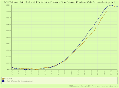
For the following chart (click to jump to the tool itself), I added the New England census division to the chart by going to the “U.S. Census Regional Division” section and “checking” New England and also “un-checking” the United States.

Then, in the section of checkboxes just under the “Update Chart” button, I checked the “Show Complete Index”, “Show Purchase-Only, Seasonally Adjusted Index (if available)” and “Normalize using base of 100” checkboxes.

Finally, I constringed the date range a bit by going to the “Date Range” section at the bottom and selecting “1991” in the first dropdown and then clicked the “Update Chart” button.


Other than the over 150% increase in New England home values seen since 1993, this chart shows that the “purchase only” index has seen a more significant increase that the “complete” index and appears to have declined more since the peak.

To get a better sense of what has gone on since the peak, let’s constrain the date range even more, by setting the starting year to “2000” in the first drop down found in the “Date Range” section at the bottom and then clicking the “Update Chart” button.


Now you can clearly see that there is a significant difference between the “purchase only” data and the “complete” data as the “complete” data series has decelerated but has not yet registered an actual decline compared to the “purchase only” data which peaked in Q1 of 2006 and has declined steadily ever since.

Since the “complete” data seems less then perfect, lets “un-check” the “Show Complete Index” checkbox found at the top and “check” the Massachusetts checkbox found in the “States and District of Columbia” section and then click the “Update Chart” button.


We can see from this chart that Massachusetts actually peaked in Q2 2005 and has been trending down ever since as well as the fact that the extent of the decline seen in Massachusetts far surpasses that seen by the New England region as a whole.

But something about this chart seem to run counter to the basic expectation that Massachusetts has the “hottest” real estate markets in New England, namely the fact that the New England data seems to peak at a higher value than the Massachusetts data.

This is because the chart is showing the two data series in “normalized” mode which, for simple comparison purposes, adjusts all the data on the chart to start with a base value of 100.

With the normalization feature you can compare two totally different data series and get a sense as to the relative changes they have made over the same time period.

In order to get the “real” view of the data, simply un-check the “Normalize using base of 100” checkbox and click the “Update Chart” button.


Now you can see that Massachusetts home prices have appreciated to a greater degree than the New England region as a whole.

But since we really do want to make a relative comparison across different data series, let’s continue with the “normalize” checkbox checked.

Now, lets add the Boston-Quincy and Cambridge-Newton-Framingham Metropolitan Statistical Areas by selecting “Boston-Quincy,MA” and “Cambridge-Newton-Framingham,MA” in the first and second drop downs found under the “Metropolitan Statistical Areas and Divisions” section then click the “Update Chart” button.


Now you can see that Boston peaked in Q1 2006, and Cambridge peaked in Q3 of 2005 while all data series declined steadily throughout 2006 and continue to decline today.

You can follow these general steps with any state and set of areas and do particularly interesting comparisons by “mixing and matching” completely unrelated areas.

Saturday, May 26, 2007

Crashachusetts Existing Home Sales: April 2007

This week, the Massachusetts Association of Realtors (MAR) released their Existing Home Sales Report for April 2007 showing further weakness to the regions residential housing market.

Along with the release, MAR President Doug Azarian continued to maintain an optimistic outlook on the trend.

“The housing market continued to trend in a positive direction for the month of April … While the number of detached single-family homes sold was down, the 1.7 percent decrease year-to-year was the lowest we’ve seen in the month of April for the past three years. … With inventory levels decreasing and interest rates still low, demand should continue to keep prices stable through the end of the spring home buying season,”

Probably the most notable data-point of the report is the continued increase of the average “days on the market” resulting in an increasing monthly supply.

Although the total residential inventory is lower now than in April of 2006, the sales pace is continuing to slow.

It’s important to remember that we are again seeing year-over-year sales declines “on the back” of last years historic sales drop-off indicating truly fundamental weakness.

This is inevitably resulting in climbing inventories that for some towns, such as Concord, are exceeding last years levels while many other towns continue to simply trend upward.

Use the PaperMoney Inventory Tracker to follow your town’s daily inventory as well as visualize the inventory changes that have occurred over the last year.

As in months past, be on the lookout for the inflation adjusted charts produced by BostonBubble.com for an even more accurate "real" view of the current market trend.

April’s Key Statistics:

  • Single family sales declined 3.5% from March and declined 1.7% as compared to April 2006
  • Single family median price increased 0.3% from March and declined 2.3% as compared to April 2006
  • Condo sales declined 0.7% from March and increased 0.7% as compared to April 2006
  • Condo Median Price declined 1.6% from February and increased 2.6% as compared to April 2006
  • The number of months supply of residential properties stands at 10.0 months.
  • The average “days on market” for single family homes stands at 150 days.
  • The average “days on market” for condos stands at 143 days.

Friday, May 25, 2007

A Closer Look at New Home Sales

Let’s take another crack at making some sense of the numbers released in yesterday’s New Home Sales Report.

The most notable figures released in the report were the 10.9% decline in median selling price and simultaneous 16.2% jump in the number of sales.

Revisions notwithstanding, these figures seemed to indicate that declining prices are now driving greater number of sales.

Although it’s likely true that lower prices are, in fact, spurring on sales, it’s important to look at the distribution of sales activity in order to gain a truly accurate sense of how the housing markets are changing.

It’s also important to understand that the “headline” new home sales number is essentially an estimated count of the number of homes sold during a given month regardless of price.

As we all know very well, home prices have increased dramatically in recent years, and new homes, especially in the bubbliest markets, are very expensive.

In order to really understand what’s happening in the market, as well as make the sentiment and results provided by luxury homebuilders like Toll Brothers (NYSE:TOL) and Hovnanian (NYSE:HOV) “jive”, we need to examine the home sales results by particular price ranges.

Luckily, the Census Department also publishes the price range breakdown and sales counts of the home sales that are used to formulate the overall “headline” total home sales number.

First, let’s examine the following chart that shows home sales counts for four separate price ranges since January 2000 (click ALL charts for larger versions).

Note, the data has been smoothed using a six month moving average so as to make the trends a bit more obvious.


Notice that in 2000, the majority of new homes sold were priced at or less than $150,000 and the minority of new homes sold were priced at or above $300,000.

Notice also, that some time in 2005, this relationship reversed.

That is, in 2005, the distribution of home sales exactly flipped, the lowest priced homes showed the lowest number of sales while the highest priced homes showed the highest number of sales.

Although, this change can obviously be explained by a number of factors including increasing prices, changes in buying patterns and builder products, it represents an important shift in the market that may, or may not be fundamental and long lived.

Now, look at the following chart which shows the same four price ranges, unadjusted and un-smoothed, since January of 2006.


Notice that during the course of the housing slowdown, the numbers of homes sold in each price range appears to be beginning to converge.

That is, the number of homes sold in the top two price ranges are trending down while the number of homes sold in the bottom two prices ranges are flat to recently trending up.

This may indicate that the distribution flip that occurred in 2005 and still exists today, is likely in the process of reverting.

Notice also, that April 2007’s data showed the largest simultaneous decline in the top two ranges and “incline” to the bottom two.

This explains why there was such a dramatic increase in sales and simultaneous decline in median price.

There was a surge in the number of new homes sold below $199,999 and a slump in homes sold at or above $200,000.

Another way to look at this data is to visualize the “market share” of homes sold per each of the four price ranges.

The following chart shows the share of each price range out of a total of 100% of all unadjusted new home sales.


Notice again how the market share has changed since 1999 when the lowest priced homes showed the largest percentage of home sales and the highest priced showed the smallest.

Also note that in April 2007 (all the way to the right), the bottom three ranges are increasing in market share while the share of homes sold at or above $300,000 is decreasing.

Aside from all this, let’s remember that, in general, new homes, particularly the “McMansions” commonly seen in the luxury developments of the nations bubbliest areas, are very expensive.

In order to really make the new home sales numbers “jive” with the outlook and results reported by home builders like Toll Brothers (NYSE:TOL), Hovnanian (NYSE:HOV), and KB Home (NYSE:KBH) we are going to need look ONLY at the top price range of homes priced at or above $300,000.


As you can see, there was a considerable expansion of homes sold in the top price range which peaked in August of 2005 and has been heading down precipitously ever since.

Thursday, May 24, 2007

New Home Sales: April 2007

Today, the U.S. Census Department released its monthly New Residential Home Sales Report for April showing an unexpected “surge” in new home sales.

Probably the most notable figure in today’s report was the 10.9% decline to the median home price, the largest decline since December 1970, further reflecting the weakness brought on by the inventory oversupply and continued reduced demand.

It’s important to note, however, that with this report the Census Department revised every month back to January 2005 as formally imputed permit data, a factor in the new home sales estimate, was replaced with actual data.

This, as well as other factors, effected both sales and price data, including a 22% downward revision to the March 2007 reported median home price providing further evidence that some caution should be used when interpreting this report.

The following charts illustrate the revisions to sales and median price published in today's report (click for larger versions).


As with prior months, on a year-over-year basis sales are still declining in the double digits at 10.6% below the sales activity seen in April 2006.

It’s important to keep in mind that these declines are coming on the back of the significant declines seen in 2006.

This should not be understated as it is clearly showing continued and even accelerating weakness to new home sales.

The following charts show the extent of sales declines seen since 2006 as well as illustrating the further declines 2007 is showing on top of the 2006 results (click for larger versions)

Note that the last chart essentially combines the year-over-year changes seen in 2005 and 2006 and shows sales trending down precipitously as compared to the peak period.


Look at the following summary of today’s report:

National

  • The median price for a new home was down 10.9% as compared to April 2006.
  • New home sales were down 10.6% as compared to April 2006.
  • The inventory of new homes for sale declined 4.8% as compared to April 2006.
  • The number of months’ supply of the new homes has increased 4.8% as compared to April 2006.
Regional

  • In the Northeast, new home sales were up 43.1% as compared to April 2006.
  • In the West, new home sales were down 25.4% as compared to April 2006.
  • In the South, new home sales were down 3.4% as compared to April 2006.
  • In the Midwest, new home sales were down 28.1% as compared to April 2006.

Tuesday, May 22, 2007

BNN - MUST SEE TV!


Today brings six great additions to the BNN lineup, most notably, a Nightly Business Report interview with Federal Reserve’s Michael Moscow in which he admits, in so many words, that the housing decline has been more significant than the Fed had anticipated last year.

“As we move through this year, I would expect to see the housing market stabilizing, but no one can say exactly when that’s going to happen. I had thought it was stabilizing toward the end of last year as well and then we had some numbers that turned out to be worse than expected.”

Watch Moscow backpedal on BNN!

Next up there is News Hour interview with Treasury Secretary Henry Paulson in which he states that the US has experienced a “major” housing correction that was inevitable after years of historic gains. “That correction has now been significant, we think it is near the bottom, it will take a while to work its way through the system.” Unfortunately, Paulson only reiterates the same guidance he offered last year prior to the housing market taking another major leg down.

Watch Paulson call the bottom again on BNN!

Then there was Bernanke’s latest take on the subprime meltdown. Although Bernanke underestimated the extent to which the mortgage market would slide, he continues to present an optimistic outlook.

“How will developments in the subprime market affect the evolution of the housing market? We know from data gathered under the Home Mortgage Disclosure Act that a significant share of new loans used to purchase homes in 2005 (the most recent year for which these data are available) were nonprime (subprime or near-prime). In addition, the share of securitized mortgages that are subprime climbed in 2005 and in the first half of 2006. The rise in subprime mortgage lending likely boosted home sales somewhat, and curbs on this lending are expected to be a source of some restraint on home purchases and residential investment in coming quarters. Moreover, we are likely to see further increases in delinquencies and foreclosures this year and next as many adjustable-rate loans face interest-rate resets. All that said, given the fundamental factors in place that should support the demand for housing, we believe the effect of the troubles in the subprime sector on the broader housing market will likely be limited, and we do not expect significant spillovers from the subprime market to the rest of the economy or to the financial system.”

Watch Bernanke talk containment on BNN!

Next, we have an excellent segment where Marc Faber, founder and managing director of Marc Faber Ltd outlines all the assets, sectors and regions in which he sees bubbles. In an era of historic liquidity, it’s not surprising that there are price bubbles in virtually every asset. Faber suggests that “everything will come down and massively so.” Additionally, Faber sees the whole global bubble scenario resulting from the inflation of the US housing bubble.

“The global liquidity was fueled largely from the American current account deficit, coming largely from the trade deficit, coming largely from US consumption, which was driven from the asset inflation in the US, most notably the housing market.”

Watch Faber talk Bubbly on BNN!

Next, Mortgage Bankers Association Chairman John Robbins discusses the subprime meltdown suggesting that the extent of the mess has been “oversold”. While pointing the finger squarely at predatory lenders for their obvious role in the current meltdown, Robbins adeptly downplays the possibility of any spillover and grater effects on the general economy.

“[the subprime meltdown] is certainly not expected to cause any great pain to the financial markets and shouldn’t bleed over to a great degree.”

Watch Robins spin on BNN!

Finally... Want to get cash out of your home without those pesky monthly payments and interest charges?

This CNBC segment features a new home equity product from Rex and Co. that allows homeowners to “borrow” against the future value of their home. That’s right! You get cash now, no payments and when you sell, you return the favor.

Watch and learn at BNN!

Wednesday, April 25, 2007

New Home Sales: March 2007

Today, the U.S. Census Department released its monthly New Residential Home Sales Report for March showing both significant downward revisions to the results for every month since November 2006 as well as continued weakness for the March results.

Hopes for a bottom to the new home market are now surely dashed as March showed that sales were down across virtually every region, most notably the West, as well as a 27.9% increase to the months supply as compared to March of 2006.

Easily the most notable aspect of the report was the enormous downward revisions to November and December of 2006 and January and February 2007 helping to push their respective year-over-year declines further into the double-digits.

It’s important to keep in mind that these declines are coming on the back of the significant declines seen in 2006.

This should not be understated as it is clearly showing continued and even accelerating weakness to new home sales.

The following charts show the extent of sales declines seen since 2006 as well as illustrating the further declines 2007 is showing on top of the 2006 results (click for larger versions)

Note that the last chart essentially combines the year-over-year changes seen in 2005 and 2006 and shows sales trending down precipitously as compared to the peak period.


Look at the following summary of today’s report:

National

  • The median price for a new home was up 6.36% as compared to March 2006.
  • New home sales were down 23.5% as compared to March 2006.
  • The inventory of new homes for sale declined 1.4% as compared to March 2006.
  • The number of months’ supply of the new homes has increased 27.9% as compared to March 2006.
Regional

  • In the Northeast, new home sales were up 18.0% as compared to March 2006.
  • In the West, new home sales were down 29.6% as compared to March 2006.
  • In the South, new home sales were down 25.7% as compared to March 2006.
  • In the Midwest, new home sales were down 19.3% as compared to March 2006.


Copyright © 2007

PaperMoney Blog - www.paperdinero.com
All Rights Reserved

Disclaimer

Monday, April 23, 2007

Crashachusetts Existing Home Sales: March 2007

Today, the Massachusetts Association of Realtors (MAR) released their 1st quarter 2007 and March 2007 results for existing home sales, median prices and inventory along with a fresh dose of spin from President Doug Azarian and MAR President-Elect, Susan Renfrew.

Before we delve into the numbers, let me point out the truly awful quality of data reported by MAR, particularly on Azarian’s watch.

For a few months now I have noticed some strange “revisions” to the single family sales numbers for past months and after considering all the possible rational reasons for these irregularities, I can only conclude that it is sloppy reporting on the part of MAR.

I should mention, that I don’t necessarily think that there is any foul play in MAR’s reporting, instead it appears that MAR has simply fumbled and, unfortunately for us, has tainted the sales and median price results.

There are several many that exhibit questionable revisions but Ill highlight February and March of 2006 as examples.

It February 2006, MAR’s Existing Home Sales Report (EHS) reported that single family sales were 2254 units with a media sale price of $339,450.

MAR than revised this number in their March 2006 EHS report to show February 2006 single family home sales of 2265 units with a median sale price of $339,000.

Then in the February 2007 EHS, MAR reports that in February 2006 single family home sales were 2380 units with a median sale price of $339,000 while ALSO citing the 2265 unit sales number at the bottom of the very same report (first and second pages versus very last page).

Which is it … 2380 or 2254? Both numbers are used in the same report.

Furthermore, in the March 2006 EHS report, MAR reported that single family home sales were 3440 units with a median sale price of $344,000.

MAR then reaffirmed both their single family sales and median price numbers in their April 2006 EHS report.

Then in the March 2007 EHS, MAR reports that in March 2006 single family sales were 3550 units with a median selling price of $343,500.

That’s a 3.2% upward revision to single family sales yet there seems to be no evidence that the number is accurate.

Keep in mind, I looked back over MAR’s past releases to see any patterns to revisions and there are some but there are many examples where months are simply randomly altered showing totally different numbers in-between months that have numbers consistent to what was past reported.

Also, these revisions have all been made WITHOUT the customary press release providing any explanation for the changes as well as for the procedure used for revisions.

Wouldn’t it be great if “crack” reporter Kimberly Blanton of the Boston Globe could focus some attention on issues like MAR’s unusual numbers revisions rather than reporting puff pieces on the strength of the bottoming housing market?

Well good numbers or bad we are stuck with what we have and with that lets take a look at March 2007’s findings.

With the today’s release of the existing home sales, MAR president Doug Azarian suggests, “The housing market in Massachusetts is gaining momentum and we can continue to feel good about where it is headed. With prices remaining stable and supplies decreasing, we can expect the spring home buying season to be active.”

As in months past, be on the lookout for the inflation adjusted charts produced by BostonBubble.com for an even more accurate "real" view of the current market trend.

March’s Key Statistics:

  • Single family sales increased 43.2% from February and declined 2.8% as compared to March 2006
  • Single family median price increased 5.8% from February and declined 0.1% as compared to March 2006
  • Condo sales increased 39.6% from February and declined 1.4% as compared to March 2006
  • Condo Median Price increased 3.3% from February and declined 3.0% as compared to March 2006
  • The number of months supply of residential properties stands at 9.0 months.
  • The “days on market” for single family homes stands at 158 days.

Friday, March 30, 2007

Bull Trap?

Yikes! I don’t know how this one made its way under the radar but I certainly didn’t see the story when it first crossed.

Last December, in the wake of the Greenspan’s “Worst of this may well be over” outlook for housing, a second significant and widely publicized Bullish note was struck when it was announced that the Bill and Melinda Gates Foundation had made a substantial investment in the homebuilders.

At the time, I looked at the SEC filing (13F-HR) for these transactions and found that they were, in fact, taking a substantial position across the board buying whopping numbers of shares of Beazer, Centex, KB Home, Lennar, Pulte and Ryland totaling over $225,400,000.

Business media accounts at the time attributed this to sound, long term investing on the part of the massive trust, further suggesting that home builders had bottomed out in August 2006 permitting investors who take a long term approach an opportunity to scoop these stocks up at relative bargain prices.

Now, of course, we know that homebuilders are likely facing a substantially more problematic environment than any had anticipated last fall.

Experiencing historic declines to profits, massive impairment charges, momentous inventory backlog, the effects of the sub-prime credit crunch, and now even charges of fraud and accounting irregularities, the sector seems almost certainly poised for a new and substantially harsher leg down.

Without a doubt, many “investors” followed the Gates Foundation’s lead pumping plenty of cash into homebuilder stocks and those that continued to follow their lead probably made out pretty well.

Why?

Because the Gates Foundation apparently sold ALL their homebuilder holdings sometime in December 2006!

That was according to their latest 13F-HR filing dated February 14 outlining their holdings as of December 31 2006.

So was this a “Bull Trap”?

Not for the Gates Foundation as my estimates have them gaining roughly 12.5% or $28,200,000 on the transactions.

Not bad, but what of the numerous “investors” who likely had been influenced by the disclosure and subsequent Bullish media coverage of the trusts initial investment?

Well, we’ll never know for sure, but it’s safe to say that there was substantially less fanfare for the sale than there was for the purchase, most likely leaving many Bullish “investors” now rethinking the soundness of this long term strategy.


Wednesday, March 28, 2007

The Second Shoe

Something seems afoot…

While vetting clips for BNN last night it seemed that there was no end to the bad news for the housing market circulating the business media.

More importantly, the news was varied with respect to particular topic but perfectly unified in outlook.

First, there was the news of Lennar, the national home builder, reporting a 73% drop in profits in Q1 forcing them to cancel all earnings guidance for the foreseeable future.

"While we are primarily focused on fortifying our balance sheet, we are concurrently focused on rebuilding our profit margins. Given current market conditions, we are continuing to pursue cost reductions, SG&A savings, product redesign and proper land pricing in order to see margin improvement starting in the second half of 2007. Until we see prices stabilize, however, we will not be able to project the timing or the scope of margin recovery, or set earnings goals for the company." said CEO Stuart Miller.

Late day breaking news yielded more trouble for the nation’s home builders as it was reported that Beazer Homes USA was under a fraud investigation by the FBI, IRS, DOJ and HUD related to their internal subprime mortgage workings.

An FBI spokesman offered the following:

"there are potentially all sorts of fraud issues associated with Beazer to included corporate, mortgage, or investments in varying degrees."

Then, there was unquestionably the oddest occurrence I have yet to witness for the new home market when David Seiders, Chief Economist of the National Association of Home Builders was effectively positioned as the “Bear” in a classic Bear-Bull segment on CNBC.

Seiders again reaffirms his “ever revising lower” outlook for the remainder of 2007 currently calling for an 8% decline to new home sales for the year.

It’s important to note that Seiders, expressing true surprise about the effect that the subprime meltdown has had on his industry, has now revised his outlook four times since February.

“Late last year, early this year it really looked like housing demand had stabilized. Sales volume looked pretty stable, other indicators looked pretty good, the Fed concluded that the housing market was stabilizing… and then the entire subprime mess and everything that goes with it in terms of the mortgage market hit, and I’ve been not only following the homes sales numbers which clearly were rather disappointing to say the very least for both January and February, but also surveying the builders on an ongoing basis, both large and small, and I actually have been very surprised by the degree to which the builders say that the tightening of mortgage lending standards has already effected sales volume. We are really sort of in uncharted waters here, I think, in terms of the new leg of the weakening process and how far it will go.” said Seiders.

Next up was the January release of the S&P/Case-Shiller index again showing a precipitous and accelerating drop-off in home prices in most of the tracked metro markets.

Professor Robert Shiller had this to say about the results:

“[the index data] are a good indicator of the dire state of the U.S. residential real-estate market. The dismal growth in the 10-city composite is now at rates not seen since January 1994,"

Don’t forget to check out the S&P/Case-Shiller index tool for a dynamic visualization of the latest results for January.

Finally, there seems to be a dangerous head of steam building with respect to what the federal government’s response should be in cleaning up the home lending mess that has befallen the nation.

Multiple reports of proposed bailouts, new lending standards legislation as well as an FHA “modernization” initiative seem to indicate that we are now beyond the point at which the federal government can remain inactive.

More importantly, with many of the early presidential candidates, most notably Hillary Clinton, remarking on the subprime meltdown, it now seems likely we will soon see Congress attempt to put some teeth behind the latest rhetoric.

One can only hope that in a hectic attempt to help mitigate the massive wave of foreclosures now washing over the country, Congress doesn’t place the burden on the taxpayer to, in effect, bailout “shoddy” lenders and grotesquely wealthy Wall Street financial institutions in the name of unfortunate homebuyers.

Given all the above, I sense a bit of a “second shoe dropping” for housing.

It’s reminiscent of some of the days toward the end of last July and early August of last year when the general understanding that the spring market had come and gone with very poor results seemed to bring a general malaise over the market that was only lifted with Greenspan’s “Market Bottom” sentiment in early October.


Tuesday, March 27, 2007

BNN - MUST SEE TV!


Today brings four great additions to the BNN lineup, most notably, a Bloomberg interview with David Seiders, Chief Economist of the National Association of Home Builders.

It seems Seiders is now presenting a significantly more Bearish outlook for the new home market suggesting that 30% of home builders surveyed are now suggesting that they are feeling a weakening of sales related to the tightening of lending standards.

“I was surprised… I got about a third of the respondents saying yes [that they were being effected by tightening lending] and of them… among them, a median hit on sales of about 10 percent.”

Watch Seiders turn Bearish on BNN!

Next up there is a great “point – sort of – counterpoint” between Economist Dean Baker and David Michonski, CEO of Coldwell Banker Hunt Kennedy.

Michonski, apparently suffering from all the bad news lately, has a hard time living in the here and now as he suggests that housing supply currently “balanced” and that he expects national median home prices to be up 4% by the end of 2007 and beyond putting an end to all the hubbub over the housing decline.

Watch Michonski delude himself some more on BNN!

Next, although the Fed’s Moskow doesn’t see the subprime slime spilling over to the general economy, CNBC’s Steve Leisman presents findings from a recent “risk conference” that seemingly draws an analogous “easy lending” relationship between the mortgage market and corporate derivatives.

Two other experts, who are both calling for significant spillover and looming recession, discuss the latest developments concerning Morgan Stanley’s recent decision to sell roughly $2.5 billion of New Century Financial mortgages.

Watch the sub-prime slime continue on BNN!

Finally, a nearly perfect example of CNBC “blathering clueless” as they try desperately attempt to understand the month by month changes in the housing market.

Diana Olick was so “Shocked” by the February’s New Home Sales report that her eyebrows were seen raised in surprise after the announcement.

Add to that UBS analyst Margret Whelan’s suggestion that for new homes, the spring selling season is already over (as Bob Toll previously discussed at length) and it’s just about all the two anchor-girls could take… “Come on! It’s not even April yet!” What’s a bull to do?

Watch CNBC Bulls Look Confused on BNN!


Copyright © 2007

PaperMoney Blog - www.paperdinero.com
All Rights Reserved

Disclaimer

Monday, March 26, 2007

New Home Sales: February 2007

Today, the U.S. Census Department released its monthly “New Residential Home Sales” report for February showing both dramatic downward revisions to November, December of 2006 and January 2007 as well as continued weakness with February’s results.

As was noted before, Bob Toll, who was formally calling a bottom in the new home market, recently clarified both his outlook as well as the general misunderstanding that the spring market will bring the highest numbers of new home sales.

“Most of the markets are having a difficult time. The primary reason is the oversupply left by speculators and investors who got caught up in the mania of the price increases that were brought to the market by the extra demand created by the speculators and investors.”

“… the Spring selling season is over, it’s a misunderstanding that we have been unable to correct over the past 40 years. In the new home business, you start selling immediately after the holidays… then you continue to run-up from after the Super Bowl to Presidents Day weekend… That’s the peak of the market… When you stepped back and looked at it [it was] no where near where it should have been if you were looking at an average of the last 10 years.”

So, if we are to take Toll at his word, February’s results should represent either the peak or near the peak of monthly sales for 2007.

This is clearly not a good sign for the new home market as February’s report showed that sales were down across every region, most notably the Northeast, as well as a 26.6% increase to the months supply.

But probably the most notable aspect of the report was the enormous downward revisions to November, December and January helping to push their respective year-over-year declines into the double-digits.

So, we are now continuing to see significant declines on a year-over-year basis as compared to 2006.

It’s important to keep in mind that these declines are coming on the back of the declines seen in 2006.

This should not be understated as it is clearly showing continued and even accelerating weakness to new home sales.

The following charts shows the extent of sales declines seen since 2006 as well as illustrating the further declines 2007 is showing on top of the 2006 results (click for larger versions)


Look at the following summary of today’s report:

National

  • The median price for a new home was down 0.03% as compared to February 2006.
  • New home sales were down 18.3% as compared to February 2006.
  • The inventory of new homes for sale increased 1.5% as compared to February 2006.
  • The number of months’ supply of the new homes has increased 26.6% as compared to February 2006.
Regional

  • In the Northeast, new home sales were down 36.9% as compared to February 2006.
  • In the West, new home sales were down 5.7% as compared to February 2006.
  • In the South, new home sales were down 17.1% as compared to February 2006.
  • In the Midwest, new home sales were down 32.2% as compared to February 2006.


Copyright © 2007

PaperMoney Blog - www.paperdinero.com
All Rights Reserved

Disclaimer

Wednesday, March 21, 2007

Crashachusetts Existing Home Sales: February 2007

So, it appears that last month’s optimistic market “rebound” sentiment was short lived.

As I had noted last month, the Northeast had experienced exceptionally warm weather in January most likely resulting in an increase in the number of days suitable for home sales when compared to an average January.

This inevitably resulted in a bump up in residential real estate activity, noticeably affecting indicators from home sales to residential construction permits.

The weather in February, on the other hand, was far more typical for winter in the Northeast with a few snow storms and lots of bitter cold days pushing single family homes sales 12.2% below January’s results and holding reasonably flat compared to the February 2006 results.

These results become even more interesting when you consider that the February’s slower sales came even as the median home price declined 4.4% from January and 4.1% as compared to February 2006.

Additionally, although February registered a 17% decrease to inventory of residential properties (single family and condos combined… unfortunately MAR seems to no longer report the inventory and supply statistics separately) as compared to February 2006, there has been a 15% increase to the number of months supply since January indicating again that the sales pace is slowing.

In fact, the average number of “days on the market” now stands at 148 days compared to 115 days for February 2006.

It now appears that the Spring market may present a pretty ugly spectacle as I believe that inventory levels may significantly exceed last years results.

It appeared to me, at least anecdotally, that an unusually large number of listings were pulled from the market during the October-November timeframe, far more that I had witnessed in the fall of 2005.

In a matter of days, the number of listings had been more than halved in virtually every town inside 128.

Those listings have yet to resurface and, although this is the typical pattern seen during this time of year, I believe that, in the face of an uncertain housing market, sellers that got stuck with stale listings last year are attempting to time their listings to a greater extent than has been seen in past seasons.

Don’t forget to use the Inventory Tracking Tool If you would like to get a “bead” on inventory.

It’s still fairly basic, but now that I have nearly a years worth of data captured, Ill soon add some more advanced analytical functionality.

Finally, the Federal Reserve Bank of Boston recently released a paper titled “Understanding Foreclosures in Massachusetts” within which the authors discuss at length the sudden increase in foreclose rates seen recently.

Massachusetts has now exceeded New England’s average for foreclosure rates and is quickly closing in on the national average as well.

The paper attributes this increase to both an increase in the use of risky loan products as well as the decline of the housing market.

“Since the 1990s, products featuring changing monthly payments have grown increasingly popular. These can include adjustable-rate mortgages (ARMs), where monthly interest rates and payments size are linked to some index, such as the prime rate; or products with features like “teaser rates” where initial interest rates are low, but are set to increase after fixed time periods. While some ARMs are structured to have only moderate shifts in monthly payments, some have dramatic increases, often occurring a fairly short time after origination.”

“The weakening housing market has likely played a strong role in the recent foreclosure increase. Since 2004, rates of housing price appreciation in Massachusetts and New England have slowed dramatically, and by some estimates, property values have declined.”

The following is one interesting chart (click for larger version) from the paper that shows how in 2003, when affordability really hit the wall, the percentage of market share of traditional fixed rate loans dropped nearly 15% from their 5 year average while prime ARMs and subprime products simultaneously picked up that 15% slack. This resulted in roughly 30% of all loans being either a prime ARM or subprime product.


As in months past, be on the lookout for the inflation adjusted charts produced by BostonBubble.com for an even more accurate "real" view of the current market trend.

February’s Key Statistics:

  • Single family sales declined 12.2% from January and increased 1.2% as compared to February 2006
  • Single family median price declined 4.4% from January and declined 4.1% as compared to February 2006
  • Condo sales declined 0.6% from January and increased 4.5% as compared to February 2006
  • Condo Median Price increased 0.7% from January and declined 1.8% as compared to February 2006
  • The number of months supply of residential properties stands at 12.3 months.
  • The “days on market” for residential properties stands at 148 days.