Tuesday, January 22, 2008

The Arlington Artifice: December and Annual 2007

This recurring monthly post tracks the latest results of the housing market seen in Arlington Massachusetts.

I choose Arlington as a result of the Boston Globe’s recently published and absurdly anecdotal and ludicrous farce about the town’s “hot” housing market.

The ridiculous tone and outright mishandling of the housing data by the Boston Globe “reporter” would almost be comical if it weren’t for the fact that the Globe’s editor, Martin Baron, ALSO blundered seriously when he responded to my email about the discrepancies.

Baron attempted to justify the articles contents and in so doing, he disclosed his disgracefully poor and obviously unsophisticated abilities with even the most basic economic data.

The December and annual results again confirm that Arlington is by no means a “stand out” amongst its neighboring towns as Baron suggested in his email and, in fact, is following along on a path wholly consistent with the trend seen in the county, state, region and nation.

Why would an editor of a nationally recognized newspaper think that a single town would continue to function as an isolated bubble amongst a backdrop of the most significant nationwide housing recession since the Great Depression?

Could it be the real estate ad revenues?

Decembers’s raw results (as reported by The Warren Group) show us the following for Arlington:

  • Monthly median home sales price of $450,750.
  • Year-to-Date median home sales price of $460,750, the lowest value since 2003.
  • Monthly home sales count of 22.
  • Year-to-Date home sales count of 332.
As I had shown in my prior post, this data when charted and compared to other towns in the region proves there are absolutely no grounds to call Arlington’s market exceptional.

The following chart (click for much larger version) shows how Arlington’s median sales price has changed since 1988, the first year the data was tracked by the Warren Group. Notice that while the current monthly result is clearly the most jagged and volatile measure, all three (monthly, year-to-date, and annual) measures are essentially saying the same thing, namely median prices are going down.

The next chart (click for much larger version) shows that home sales in Arlington have been essentially flat during the last 15 years, a result that is generally to be expected when looking only at the sales of one town in isolation.

The final chart shows how the year-to-date median sales price for Arlington, Bedford, Belmont, Cambridge and Lexington has changed since 1988. Notice that each town is essentially staying on the same track having made great strides during the boom and now firmly headed lower.

In review, the data shows that there is nothing exceptional about Arlington’s housing market proving clearly that the claims made in the Boston Globe article and later endorsed by its editor Martin Baron were entirely erroneous.

Please let editor Baron know what you think of this misstep.

Monday, January 21, 2008

The Almost Daily 2¢ - Twin Peaks?

Following up on a prior post, take a look at the trend and most recent state of the S&P 500 index and compare it to the last major bear market conditions that followed the dot-com bust.

There is a host of very interesting technical similarities (which are noted below) that may indicate that we have entered or are just about to enter another bear market where on average the S&P 500 index retraces 20 – 30% from its prior peak.

It’s important to keep in mind that, at best, a bear market can be viewed as a transition into an period where there is a prolonged bias to sell into strength resulting in a successive series of lower highs yielding a clear downward trend.

At worst, there are periods (days or weeks) where particular stocks and the index as a whole will crash hard.

Study the following image (click for very large and clear version) of the S&P 500 index from 1995 to today then read below for the technical blow by blow.

Notice that I’ve added both the “effective” federal funds rate (light gray line) and an overlay indicating the period of the last recession.

As you can see, entering the last bear market, the Fed cut rate significantly taking it from 6.5% at the start of the bear market to 1.25% in the trough.

It’s important to note that although the Federal Reserve’s response was dramatic, the market still resulted in an over 48% decline.


THEN (1998 – 2000 Top)

  • A. October 1998 – S&P 500 gives early warning sign by crossing its 400 day simple moving average (SMA). Notice also that the 50 day SMA breached the 200 day SMA.
  • B. October 1999 – S&P 500 gives a second signal by crossing its 200 day SMA after a solid twelve month expansion. 50 day SMA touches the 200 day SMA.
  • C. Three prominent but decelerating peaks set up the top.
  • D. Between second and third (last) peak S&P 500 index breaches 200 day SMA. After the final peak S&P 500 index breaches the 400 day SMA.
  • E. 50 day SMA heads down fast and crosses the 200 day SMA.
  • F. 50 day SMA crosses 400 day SMA.
  • G. 200 day SMA crosses 400 day SMA.

NOW (Today’s Top?)

  • A. June 2006 – S&P 500 gives early warning sign by crossing its 400 day SMA. Notice also that the 50 day SMA breached the 200 day SMA.
  • B. March 2007 – S&P 500 gives a second signal by falling near its 200 day SMA after a solid nine month expansion. 50 day SMA similarly depressed.
  • C. Three prominent but decelerating peaks set up the top.
  • D. Between second and third (last) peak S&P 500 index breaches 200 day SMA. After the final peak S&P 500 index breaches the 400 day SMA.
  • E. 50 day SMA heads down fast and crosses the 200 day SMA.
  • F. TBD
  • G. TBD
Needless to say then next few weeks will be white-knuckle time…

Friday, January 18, 2008

Goin’ Down Slow: Confidence and Economy January 2007

I’ve decided to roll the Reuters/University of Michigan Survey of Consumers, The Conference Board’s Index of CEO Confidence and The Conference Board’s Index of Leading Economic indicators into a combined post that will run twice monthly as preliminary data is firmed.

These three indicators should disclose a clear picture of both the overall sense of confidence (or lack thereof) on the part of consumers and businesses as well the overall trend of economic circumstances.

Today’s preliminary release of the Reuters/University of Michigan Survey of Consumers for January showed a surprise uptick to 80.5 from 75.5 in December but remaining near the lowest levels seen since the early 1990’s.

The Index of Consumer Sentiment fell 16.92% as compared to January 2007 mostly as a result of consumers’ expectations of future economic prospects.

The Index of Consumer Expectations (a component of the Index of Leading Economic Indicators) fell a whopping 21.12% below the result seen in January 2007.

As for the current circumstances, the Current Economic Conditions Index fell 11.86% as compared to the result seen in January 2007.

As you can see from the chart below (click for larger), the consumer sentiment data is a pretty good indicator of recessions leaving the recent declines possibly foretelling rough times ahead.

The latest quarterly results (Q4 2007) of The Conference Board’s CEO Confidence Index fell to a value of 39 with the “current economic conditions” component registering 33.54, the lowest readings since the recessionary period following the dot-com bust.

It’s important to note that on every instance that the CEO “current economic conditions” index dropped below a level of 40, the economy was either in recession or very near.

Finally, the latest results (December 2007) of the Conference Boards’ Index of Leading Economic Indicators continues to foretell troubled times ahead declining 0.2% from November’s level and 1.37% on a year-over-year basis compared to December 2006, a third straight monthly decline leaving the index at 136.5.

It’s important to note that a year-over-year decline greater than .5% has preceded every recession that has occurred in the last 59 years.

Thursday, January 17, 2008

Mid-Cycle Meltdown?: Jobless Claims January 17 2008

Today, the Department of Labor released their latest read Joblessness showing “initial” unemployment claims declining 21,000 and “continued” claims increasing 66,000 resulting in an “insured” unemployment rate of 2.1%.

Historically, unemployment claims both “initial” and “continued” (ongoing claims) are a good leading indicator of the unemployment rate and inevitably the overall state of the economy.

The following chart (click for larger version) shows “initial” and “continued” claims, averaged monthly, overlaid with U.S. recessions since 1967 and from 2000.

As you can see, acceleration to claims generally precedes recessions.


Also, acceleration and deceleration of unemployment claims has generally preceded comparable movements to the unemployment rate by 3 – 8 months (click for larger version).


In the above charts you can see, especially for the last three post-recession periods, that there has generally been a steep decline in unemployment claims and the unemployment rate followed by a “flattening” period of employment and subsequently followed by even further declines to unemployment as growth accelerated.

This flattening period demarks the “mid-cycle slowdown” where for various reasons growth has generally slowed but then resumed with even stronger growth.

So, looking at the post-“doc com” recession period we can see the telltale signs of a potential “mid-cycle” slowdown and if we were to simply reflect on the history of employment as an indicator of the health and potential outlook for the wider economy, it would not be irrational to conclude that times may be brighter in the very near future.

But, adding a little more data I think shows that we may in fact be experiencing a period of economic growth unlike the past several post-recession periods.

Look at the following chart (click for larger version) showing “initial” and “continued” unemployment claims, the ratio of non-farm payrolls to non-institutional population and single family building permits since 1967.

One notable features of the post-“dot com” recession era that is, unlike other recent post-recession eras, job growth has been very weak, not succeeding to reach trend growth as had minimally accomplished in the past.

Another feature is that housing was apparently buffeted by the response to the last recession, preventing it from fully correcting thus postponing the full and far more severe downturn to today.

I think there is enough evidence to suggest that our potential “mid-cycle” slowdown, having been traded for a less severe downturn in the aftermath of the “dot-com” recession, may now be turning into a mid-cycle meltdown.

New Residential Construction Report: December 2007

Today’s New Residential Construction Report continues to firmly demonstrate the intensity of the total washout conditions that now exist in the nation’s housing markets and for new residential construction showing tremendous declines on a year-over-year basis to single family permits both nationally and across every region.

Single family housing permits, the most leading of indicators, again suggests extensive weakness in future construction activity dropping 41.4% nationally as compared to December 2006.

Moreover, every region showed significant double digit declines to permits with the West declining 47.3%, the South declining 43.9%, the Midwest declining 30.4% and the Northeast declining 27.4%.

Keep in mind that these declines are coming on the back of last year’s record declines.

To illustrate the extent to which permits and starts have declined, I have created the following charts (click for larger versions) that show the percentage changes of the current values compared to the peak years of 2004 and 2005.

Notice that on each chart the line is essentially combining the year-over-year changes seen in 2005, 2006 and 2007 showing virtually every measure trending down precipitously.

Declines to single family permits have NOW ACCELERATED measurably in terms of monthly YOY declines, and the fact that we are now seeing declines of roughly 30%-40% on the back of 2006 declines should provide a an unequivocal indication that the housing markets are by no means stabilizing.


Here are the statistics outlined in today’s report:

Housing Permits

Nationally

  • Single family housing permits down 41.4% as compared to December 2006
Regionally

  • For the Northeast, single family housing down 27.4% as compared to December 2006.
  • For the Midwest, single family housing permits down 30.4% as compared to December 2006.
  • For the South, single family housing permits down 43.9% compared to December 2006.
  • For the West, single family housing permits down 47.3% as compared to December 2006.
Housing Starts

Nationally

  • Single family housing starts down 36.0% as compared to December 2006.
Regionally

  • For the Northeast, single family housing starts down 29.9% as compared to December 2006.
  • For the Midwest, single family housing starts down 29.4% as compared to December 2006.
  • For the South, single family housing starts down 30.0% as compared to December 2006.
  • For the West, single family housing starts down 54.1% as compared to December 2006.
Housing Completions

Nationally

  • Single family housing completions down 32.8% as compared to December 2006.
Regionally

  • For the Northeast, single family housing completions down 16.8% as compared to December 2006.
  • For the Midwest, single family housing completions down 29.8% as compared to December 2006.
  • For the South, single family housing completions down 38.7% as compared to December 2006.
  • For the West, single family housing completions down 26.5% as compared to December 2006.
Keep in mind that this particular report does NOT factor in the cancellations that have been widely reported to be occurring in new construction.

The Almost Daily 2¢ - Grim Toppings

Although I don’t usually comment directly on the stock market or stock indexes and generally limit observations of individual stocks to those that are related to housing and real estate, I thought I might share some basic analysis that I have worked up concerning a pretty grim looking topping pattern now present in the S&P 500 index.

Study the following image (click for very large and clear version) of the S&P 500 index from 1995 to today then read below for the technical blow by blow.


THEN (1998 – 2000 Topping)

  • A. October 1998 – S&P 500 gives early warning sign by crossing its 400 day simple moving average (SMA). Notice also that the 50 day SMA breached the 200 day SMA.
  • B. October 1999 – S&P 500 gives a second signal by crossing its 200 day SMA after a solid twelve month expansion. 50 day SMA touches the 200 day SMA.
  • C. Three prominent but decelerating peaks set up the top.
  • D. Between second and third (last) peak S&P 500 index breaches 200 day SMA. After the final peak S&P 500 index breaches the 400 day SMA.
  • E. 50 day SMA heads down fast and crosses the 200 day SMA.
  • F. 50 day SMA crosses 400 day SMA.
  • G. 200 day SMA crosses 400 day SMA.

NOW (Today’s Topping?)

  • A. June 2006 – S&P 500 gives early warning sign by crossing its 400 day SMA. Notice also that the 50 day SMA breached the 200 day SMA.
  • B. March 2007 – S&P 500 gives a second signal by falling near its 200 day SMA after a solid nine month expansion. 50 day SMA similarly depressed.
  • C. Three prominent but decelerating peaks set up the top.
  • D. Between second and third (last) peak S&P 500 index breaches 200 day SMA. After the final peak S&P 500 index breaches the 400 day SMA.
  • E. 50 day SMA heads down fast and crosses the 200 day SMA.
  • F. TBD
  • G. TBD
Needless to say then next few weeks will be white-knuckle time… Be sure to check back as I will update the data in the coming days and weeks.

Wednesday, January 16, 2008

Homebuilder Blues: NAHB/Wells Fargo Home Builder Ratings January 2008

Today, the National Association of Home Builders (NAHB) released their Housing Market Index (HMI) showing continued evidence that the new home market is experiencing a prolonged recession.

The release came along with some guarded, yet optimistic, outlook from Chief Economist David Seiders who has continues to look for an “upswing” in building activity in the second half of 2008.

“The HMI has held within a narrow two-point range for the past five months, indicating that builder views of housing market conditions essentially haven’t changed over that time, … Builders are anticipating a time when market conditions will support an upswing in building activity – most likely in the second half of 2008.”

With this month’s release the NAHB has apparently discontinued (I’m looking into it… I’ll post what I find out) publishing the individual builder respondent rating (“good”, “fair” and “poor”) data series that are the components of the overall composite HMI series, so I have reworked my charts to simply show the four main composites; the HMI index, the “present conditions” index, the “future conditions” index and the “buyer traffic” index.

It’s important to understand that each component of the NAHB housing market index is now sitting at or near the worst levels ever seen in the over 20 years the data has been being compiled.

This suggests that the current severe contraction has surpassed all other events seen in the last 22 years and is now firmly in uncharted territory.


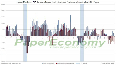
Production Pullback: Industrial Production December 2007

Today, the Federal Reserve released their monthly read of industrial production showing continued weakness to various consumer and construction related durables as well as a significant pullback to general and business vehicle production.

“Final product” consumer durable goods continue to show weakness, with particularly significant declines coming specifically from home appliances, furniture and carpeting.

Construction supply production has been showing the most severe contraction to wood products seen in at least the last 20 years.

Although automotive production has been showing weakness since the middle of 2004, business vehicle production is now showing a stark contraction.

The following charts (click for larger) show the overall consumer durable component along with the Home Appliances, Furniture and Carpeting sub-component on both a time series and year-over-year basis, construction supply production with the wood products sub-component, and general and business related vehicle production all overlaid with the last two recessions for comparisons purposes.


As you can see, each measure appears to indicate that recession is either currently upon us or drawing ever nearer as the unwinding of the housing-led business cycle exacts its toll on the general economy.

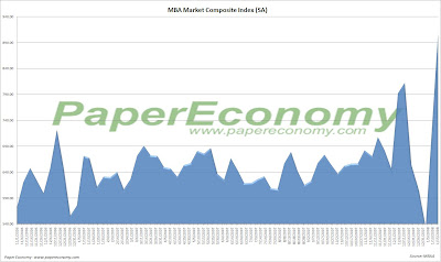
Reading Rates: MBA Application Survey – January 16 2008

The Mortgage Bankers Association (MBA) publishes the results of a weekly applications survey that covers roughly 50 percent of all residential mortgage originations and tracks the average interest rate for 30 year and 15 year fixed rate mortgages, 1 year ARMs as well as application volume for both purchase and refinance applications.

The purchase application index has been highlighted as a particularly important data series as it very broadly captures the demand side of residential real estate for both new and existing home purchases.

The latest data is showing that the average rate for a 30 year fixed rate mortgage decreased since last week to 5.62% while the purchase volume increased 11.4% and the refinance volume increased a whopping 43.4% compared to last week’s results.

Again, as I had noted in prior MBA posts, seasonally adjusting a weekly data series becomes problematic surrounding the holiday weeks so today’s results should be viewed with some caution as the erratic movements since December should even out a bit over the next few weeks.

There is no doubt that the average fixed mortgage rate is now materially below the trend of 2007 and increases to loan volume will reflect that but it will take a few weeks for the underlying trend to become clear.

Also note that the average interest rates for 80% LTV fixed rate mortgages has now dropped firmly below the mean for the prior year and that the interest rate for an 80% LTV 1 year ARM continues to be elevated with a 15 basis point spread above the 30 year fixed rate.

It’s important to note that the data is reported (and charted) weekly and that the rate data represents average interest rates, and the index data represents mortgage loan application volume for home purchases, home refinances and a composite of all loans.

The following chart shows how the principle and interest cost and estimated annual income required to cover the PITI (using the 29% “rule of thumb”) on a $400,000 loan has changed since January 2007.

The following chart shows the average interest rate for 30 year and 15 year fixed rate mortgages over the last number of weeks (click for larger version).


The following charts show the Purchase Index, Refinance Index and Market Composite Index since January 2007 (click for larger versions).


Tuesday, January 15, 2008

Conspicuous Correlation: December 2007

In light of recent increases to consumer prices and declining retail sales, I’ve reworked my analysis of the possible correlation between falling home values and declining consumption of the most “discretionary” retail items.

On a “nominal” basis, there appeared to be “rough correlation” between strong home value appreciation and strong retail spending preceding the housing bust and an even stronger correlation when home values started to decline.

The following charts show the initial analysis plotting the year-over-year change to an aggregate series consisting of the primary discretionary retail sales categories that I termed the “discretionary” retail sales series and the year-over-year change to the S&P/Case-Shiller Composite home price index since 1993 and since 2000.


As you can see there was, at the very least, a coincidental change to home values and consumer spending during the boom and then the bust, but as home values have continued to decline, retail spending has remained low but has not continued to consistently contract.

One problem with this initial analysis is that both retail sales and the S&P/Case-Shiller Composite index are reported in “nominal” (i.e. non-inflation adjusted) terms and thus result in a somewhat skewed view especially for the retail sales data.

In fact, the year-over-year change to “nominal” discretionary retail sales has been positive for seven of the last eight months while the year-over-year change to “real” discretionary retail sales has been negative for twelve straight months (see the following chart).

The key point here is that although inflation (as reported by the CPI) has been relatively stable in recent years it is always a factor and in light of the latest surprise increases to the CPI results as well as many anecdotal reports of producers now passing through increasing energy prices to the consumer, it’s important to adjust retail sales (and home values) in order to fully understand its direction.


As you can see from the above charts (click for larger version), adjusted for inflation (CPI for retail sales, CPI less shelter for S&P/Case-Shiller Composite) the “rough correlation” between the year-over-year change to the “discretionary” retail sales series and the year-over-year S&P/Case-Shiller Composite series seems now even more significant.

Given the anecdotal accounts of homeowners drawing equity out of their homes with refi’s and HELOCs and using the proceeds to buy consumer goods, it could be interesting to attempt to “shift” the retail spending in time as the decline to home values would surely precede a pullback in consumer spending but for now I’ll leave it aligned and work on the shifting in a later post.

In past posts I attempted to build a 12 month moving Pearson’s correlation series in order to demonstrate the true correlation between the rate of change of both discretionary retail sales and home values but although the movements may be coincidental, they really share no actual binding correlation.

I may dust off the correlation chart in future posts but for now let’s just assume that both home values and discretionary retail sales are not doing very well, especially in “real” terms and the correlation is at least coincidental with the overall unhealthy state of the economy.

Monday, January 14, 2008

The Almost Daily 2¢ - Nouvelle Riche

It would be an understatement to say that since I learned of the existence of the “Nouvelle at Natick”, a luxury condo project “fused” to the revamped Natick Mall in Natick Massachusetts, I have been a bit perplexed.

In truth though, I have also been also captivated by the many details and news surrounding the project and I have followed along closely.

As you may already know from past posts concerning the project, to me the Nouvelle represents a sort of crescendo of optimism and exuberance of both the notion of American “consumer” and of the modern concepts of “homeowner” and "luxury".

How better could the euphoric sensibilities of the pre-collapse heyday be represented than through a luxury condo project, with units ranging from $439,900 to $1,599,900, that is actually attached to a newly refurbished mall some 20 miles from the nearest city center.

Add to that the fact that the town of Natick has never seen a median condo price higher than $242,000 or that over the last year only 18% of all condo sales for the town sold at or above the LOWEST priced Nouvelle unit with NO sales ever reaching the HIGHEST priced unit, or the many quietly reported details suggesting that the builder, General Growth Properties (NYSE:GGP) has been experiencing very poor, almost nonexistent, sales from the project and the picture becomes even clearer.

But before I get too downbeat and bearish let’s all remember that thankfully not everyone interprets information the same way and that there is certainly room differing opinions on both the fundamental value and personal value we place on the things we purchase.

Remember, these are “luxury” units implying that the buyers are, in a sense, both in the position to expect and desire a bit extra from their living space.

They can afford the extra expense, the space fits their need of location and lifestyle, and risk of re-pricing may simply not be a concern.

To that end, I recently contacted Michael DuGally, one of the current Nouvelle buyers quoted in the many articles (Boston Globe, NY Times, etc.) on the project and here is an excerpt from our exchange.

Keep in mind, Michael was generous enough to answer my questions even in light of the fact that this blog and blogger present some of the most pessimistic and bearish outlook on residential real estate to be found on the web and, as you can see from his responses, he is perfectly aware of the downturn in housing, its causes and its effects on the wider economy.

SoldAtTheTop: Can you describe what you perceive the total experience will be living at the Nouvelle at Natick?

Michael: Convenience. First class building, great amenities, underground parking, our primary view is the small wetlands so feels like being remote even on top of a mall. Access to both work and airport for travel is even time for us. We have our favorite Yoga studio 5 minutes away that we used to have to drive to from Everett.

SoldAtTheTop: Has the builder communicated any information to you regarding any difficulties with the project or the possibility of them leasing rather than selling units?

Michael: No, not yet.

SoldAtTheTop: If leasing the units rather than selling was to occur in the future, would that change things for you?

Michael: We would have to deal with that when the time comes. I don't think it really matters because we we're not snobs about who our neighbors are, and a college party crowd would not lease there anyway.

SoldAtTheTop: Has the builder reduced prices (or increased incentives) on any of the units and if so, are you entitled to any compensation?

Michael: Not yet from what I understand. Not sure if we would be entitled to anything.

SoldAtTheTop: Are you close with any of the other unit buyers and if so, have any others expressed any reservations about their purchases especially in light of the recent downturn to residential real estate?

Michael: Real Estate has been in a downturn for 18 months. All that is happening now is the reality of bigger impact is starting to set in. As you well know, the bubble bursting is GOOD for the economy.

Americans have become ridiculously obsessed with easy debt and deserve a reality check. You can't blame McDonald's for obesity. People make choices. It is a shame that state and federal governments are bailing out people who live beyond their means.

I don't blame the lenders. There are a miniscule handful of real victims. We have been getting easy credit card promotions in the mail for over 20 years now. Do we blame the banks because people use them and end up in bankruptcy? No.

The best thing that could happen to the larger economy is for home prices to adjust to somewhat resemble wages and for the condo "flippers" to be driven out of the market.

Nouvelle had an insane amount of people (hundreds) a couple years ago on a list who paid $1000 for the right to buy them when they went on the market.

Those were fast money flippers. Not people like us making a lifestyle living decision. I don't think you will see a single condo flipper buying at Natick. It is not an easy money investment.

SoldAtTheTop: You mentioned that this will be your primary residence... will you be selling your current property prior to moving to Nouvelle and if so, are you having or do you think that you will have any difficulty?

Michael: We have the nicest unit in our current property, and did so many unique things to it that we have actually a list of interested buyers and a couple offers already to consider.

We bought pre-construction and very early on that project, and won't lose money. We won't make the killing we thought, but that is the way real estate is.

SoldAtTheTop: What's your take on the current state and future outlook for housing and the economy?

Michael: I think we are heading for a deeper recession, but it should be a softer more gradual blow over the next 8-10 months and will be overall very good for the broader economy in 09 and 10.

The fed will continue to cut rates, but lenders will not be dropping rates as a result. Global economic growth and weakness of the dollar will help in many ways from things going totally south.

New construction and new permits will come to a standstill by this spring, which will help move the record inventory in the market.

Once that is gone, builders I think will be more prudent. This is very akin to the dot.com bubble.

We could argue we are in another bubble with Google at a multiple that would take 1000 years to justify, but largely there is rationale in valuations of tech companies versus blind faith during the bubble days. Same thing will happen with housing.

SoldAtTheTop: Is there any misinformation that has been reported about the project that you would like to correct?

Michael: The Globe (Boston Globe) did a great cover story on Natick, but it focused too much on "Living at the Mall." JC Penney, Cheesecake Factory are not what Nouvelle represents.

It’s simply a blend of city “high rise” style convenience with an urban hook. Sure, for the price we paid we could find a nice place in Boston.

We could not find a 2200 sq. ft penthouse with all the other amenities.

In comparable quality buildings with similar interior standards we would have paid 50-100% more. Not just in price, but in taxes, condo fees, etc. Nouvelle is practical for us both, cutting our reverse commute in half. That is 1 less hour a day of the mass pike. And, we will still be just 20-25 minutes from the city.

Friday, January 11, 2008

Mid-Cycle Meltdown?: Jobless Claims January 2007

Yesterday, the Department of Labor released their latest read Joblessness showing “initial” unemployment claims declining 15,000 and “continued” claims declining 52,000 resulting in an “insured” unemployment rate of 2.0%.

I’m going to add the weekly claims to the rotation of recurring economic data and will more fully develop the post over the coming months but for now, take a look at the following charts as they are very telling.

First, keep in mind that the consensus notion of “mid-cycle slowdown” is still alive and well (in fact Bernanke was speaking on the subject just last night) and for good reason as you can see by the first several charts.

Historically, unemployment claims both initial and continued (ongoing claims) are a good leading indicator of the unemployment rate and inevitably the overall state of the economy.

The following chart (click for larger version) shows “initial” and “continued” claims, averaged monthly, overlaid with U.S. recessions since 1967 and from 2000.

As you can see, acceleration to claims generally precedes recessions.


Also, acceleration and deceleration of unemployment claims has generally preceded comparable movements to the unemployment rate by 3 – 8 months (click for larger version).


In the above charts you can see, especially for the last three post-recession periods, that there has generally been a steep decline in unemployment claims and the unemployment rate followed by a “flattening” period of employment and subsequently followed by even further declines to unemployment as growth accelerated.

This flattening period demarks the “mid-cycle slowdown” where for various reasons growth has generally slowed but then resumed with even stronger growth.

So, looking at the post-“dot com” recession period we can see the telltale signs of a potential “mid-cycle” slowdown and if we were to simply reflect on the history of employment as an indicator of the health and potential outlook for the wider economy, it would not be irrational to conclude that times may be brighter in the very near future.

But, adding a little more data I think shows that we may in fact be experiencing a period of economic growth unlike the past several post-recession periods.

Look at the following chart (click for larger version) showing “initial” and “continued” unemployment claims, the ratio of non-farm payrolls to non-institutional population and single family building permits since 1967.

One notable features of the post-“dot com” recession era is that, unlike other recent post-recession eras, job growth has been very weak, not succeeding to reach trend growth as had minimally accomplished in the past.

Another feature is that housing was apparently buffeted by the response to the last recession, preventing it from fully correcting thus postponing the full and far more severe downturn to today.

I think there is enough evidence to suggest that our potential “mid-cycle” slowdown, having been traded for a less severe downturn in the aftermath of the “dot-com” recession, may now be turning into a mid-cycle meltdown.