 The following charts were taken from a recent presentation and discussion given at the Federal Deposit Insurance Corporation (FDIC) 2006 Economic Outlook Roundtable entitled “Scenarios for the Next U.S. Recession”. A section of the presentation focused on how a “segmented” consumer recession could occur shortly. In this segmented recession, 10% of the
 - Banks are now at record levels of real estate related loans (home loans and home equity loans).
- Although non-current loans (loans with payments at least 90 days late) are at historically low levels, the increase in sub-prime (loans generally given to applicants with poor credit who prior to a relaxing of lending standards in1994, would not have been qualified) loans are at historically high levels.
- Cash out refinancing is at historically high levels with a decline to a cease shortly on the horizon as interest rates hike up.
- As home equity trails off during the projected housing cooling, revolving credit card debt will overtake home equity increases.
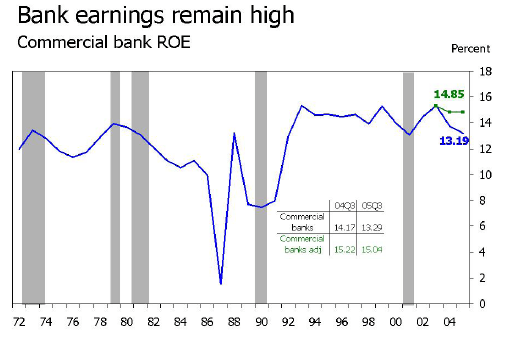
This chart shows return on investment for commercial banks from the 70s to today. Apparently the green line in the upper right is present to reflect an overall change to ROI as a result of two big bank mergers that occurred in 2004. So as you can see, bank earnings are very strong, roughly 12% - 15% annually since the early 90s.
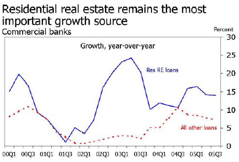
This chart shows bank growth from real estate loans vs. all other loan types from 2000 to the third quarter of 2005. Real estate growth played an important role in bank growth during this period.
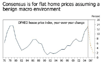
This chart shows year over year national home price appreciation since 1976, and a projected decline to home price appreciation for 2006 consistent with a “flattening” outlook over the next few years. Notice, that the red dashes represent a projected decline in appreciation, not actual price declines.
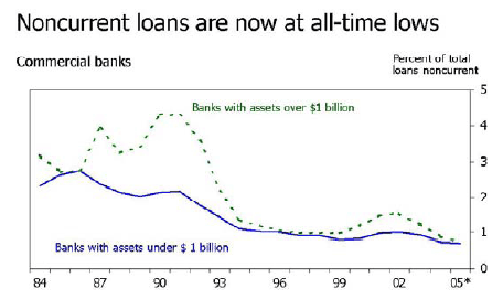
This chart shows that banks are currently at an over 20 year low for percentage of non-current loans. A non-current loan is one that has a current payment more that 90 days late for payment. This chart would suggest that current credit quality of bank loans is very high with less than 1% of loans currently more than 90 days overdue.
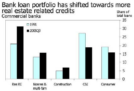
Shows that as a percentage of total loans, real estate loans have increased to 30% of the average commercial banks loan portfolio.

This one is hard to read as the original content seems to have been formatted for an overhead projector but it shows the increase in owned homes and related home ownership since 1994 when apparently the underwriting standards for real estate loans were relaxed. Since 1994, an increase of 15 million new home owners which represents an 8% increase in the size of the home buying market. Note, the blue bars on this chart represent the number of “owned homes” and the dark blue line represents the number of home owners.
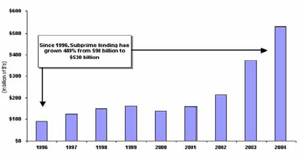
This chart shows the increase, in billions of dollars, of “subprime” loans. Subprime loans are loans that are given to applicants who have generally poor credit. Typically, subprime loans have significantly higher interest rates and are generally considered more volatile than conventional loans, Notice, that from 1996 to 2004, subprime lending has increased from $90 billion to $530 billion dollars.

This chart shows the growth in home equity loans from 1995 to October of 2005. The blue bars indicate the total amount of loans in billions of dollars, and the blue line indicates the percentage increase. Again, this chart demonstrates that bank exposure to real estate has dramatically increased and is now at peak levels.
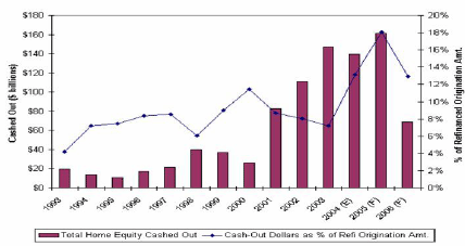
This chart shows the growth and predicted decline of “cash out” refinancing from 1993 to 2006. The purple bars indicate the total in billions of dollars of cash out refinancing per year and the blue line indicates the percentage of refinancing origination amount. This chart would suggest that a major source (if not THE major source) of consumer liquidity (i.e. the ability of the consumer to get their hands on substantial cash) is going to dry up as interest rates rise and make these loans unaffordable.
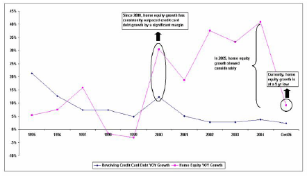
Again, this chart is hard to read as it seems to have been formatted for a projector but it shows a comparison of year over year revolving credit card debt (blue line) vs. year over year home equity growth (magenta line). This chart would suggest that since 2000, home equity growth has far outpaced credit card dept but now seems to be headed to the reverse as home equity growth declines.