Today, the Bureau of Economic Analysis (BEA) released their first preliminary installment of the Q1 2008 GDP report showing a truly anemic annual growth rate of 0.6%.
This continuation of dramatically slower growth was primarily the result of accelerating declines in fixed residential investment, a substantial decline in fixed non-residential investment (particularly a 6.2% decline to non-residential structures), and far from outstanding growth in both the export of goods and services.
In fact, the continuation of typical growth rates for exports seems to further suggest that the exceptional growth seen during Q3 2007 was an temporary aberration, a result of there being a brief disconnect between the slowing U.S. economy (and weak dollar) and the rest of the world economies relative strength.
Now that the world economies are slowing as well, it’s unlikely that exports will provide much of a crutch against which the weakening U.S. economy can lean.
Residential fixed investment, that is, all investment made to construct or improve new and existing residential structures including multi–family units, continued its historic fall-off registering a whopping upwardly revised decline of 26.7% since last quarter shaving 1.23% from overall GDP.
Furthermore, combined with the sharp drop-off in Non-residential fixed investment, total fixed investment subtracted a whopping 1.5% from overall GDP easily exceeding the positive contributions made by all personal consumption of services in the quarter.
The following chart shows real residential and non-residential fixed investment versus overall GDP since Q1 2003 (click for larger version).
Wednesday, April 30, 2008
Reading Rates: MBA Application Survey – April 30 2008
The Mortgage Bankers Association (MBA) publishes the results of a weekly applications survey that covers roughly 50 percent of all residential mortgage originations and tracks the average interest rate for 30 year and 15 year fixed rate mortgages, 1 year ARMs as well as application volume for both purchase and refinance applications.
The purchase application index has been highlighted as a particularly important data series as it very broadly captures the demand side of residential real estate for both new and existing home purchases.
The latest data is showing that the average rate for a 30 year fixed rate mortgage decreased 3 basis point since last week to 6.01% while the purchase application volume decreased by 4.8% and the refinance application volume plunged 16.7% compared to last week’s results.
It’s important to note that the average interest rate on an 80% LTV 30 year fixed rate loan is now well within the range seen throughout 2007 while the interest rate for an 80% LTV 1 year ARM remains elevated now resting 85 basis points ABOVE the rate of an average 80% LTV 30 year fixed rate loan despite all the herculean efforts by the Federal Reserve to bring rates down.
Also note that all application volume values reflect only “initial” applications NOT approved applications… i.e. originations… actual originations would likely be notably lower than the applications.
The following chart shows how the principle and interest cost and estimated annual income required to cover the PITI (using the 29% “rule of thumb”) on a $400,000 loan has changed since November 2006.
The following chart shows the average interest rate for 30 year and 15 year fixed rate mortgages over the last number of weeks (click for larger version).
The following charts show the Purchase Index, Refinance Index and Market Composite Index since November 2006 (click for larger versions).
Tuesday, April 29, 2008
S&P/Case-Shiller: February 2008
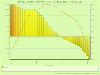
Today’s release of the S&P/Case-Shiller home price indices for February continues to reflect the extraordinary weakness seen in the nation’s housing markets with now 19 of the 20 metro areas tracked reporting year-over-year declines and ALL metro areas showing substantial declines from their respective peaks.
Furthermore, the decline to the 10 city composite index declined a record 13.55% as compared to February 2007 far surpassing the all prior year-over-year decline records firmly placing the current decline in uncharted territory in terms of relative intensity.
This report indicates that we have now firmly entered the serious price “free-fall” phase (look at the charts below) of the housing bust.
Topping the list of peak decliners was Las Vegas at -24.53%, Phoenix at -24.05%, San Diego at -23.97%, Detroit at -23.17%, Miami at -22.12%, Los Angeles at -21.58%, Tampa at -20.79%, San Francisco at -20.07%, Washington DC at -17.53%, Minneapolis at -14.72%, Cleveland at -13.50% and Boston at -12.13%
Additionally, both of the broad composite indices showed accelerating declines slumping -15.78% for the 10 city national index and 14.81% for the 20 city national index on a peak comparison basis.
Also, it’s important to note that Boston, having been cited as a possible example of price declines abating, has continued its decline dropping -4.60% on a year-over-year basis and a solid -12.13% from the peak set back in September 2005.
As I had noted in prior posts, Boston has a strong degree of seasonality to its price movements and with both the seasonal drop in sales and the recent stunning new decline to sales as a result of both the looming recession working to erode confidence and the continued lack of affordable Jumbo and Alt-A loans, Boston may continue to decline even through the traditionally string spring selling season.
To better visualize the results use the PaperEconomy S&P/Case-Shiller/Futures Charting Tool as well as the PaperEconomy Home Value Calculator and be sure to read the Tutorial in order to best understand how best to utilize the tool.
The following chart (click for larger version) shows the percent change to single family home prices given by the Case-Shiller Indices as compared to each metros respective price peak set between 2005 and 2007.
The following chart (click for larger version) shows the percent change to single family home prices given by the Case-Shiller Indices as on a year-over-year basis.
Additionally, in order to add some historical context to the perspective, I updated my “then and now” CSI charts that compare our current circumstances to the data seen during 90s housing decline.
To create the following annual charts I simply aligned the CSI data from the last month of positive year-over-year gains for both the current decline and the 90s housing bust and plotted the data with side-by-side columns (click for larger version).
What’s most interesting about this particular comparison is that it highlights both how young the current housing decline is and clearly shows that the latest bust has surpassed the prior bust in terms of intensity.
Looking at the actual index values normalized and compared from the respective peaks, you can see that we are only eighteen months into a decline that, last cycle, lasted for roughly fifty four months during the last cycle (click the following chart for larger version).
The “peak” chart compares the percentage change, comparing monthly CSI values to the peak value seen just prior to the first declining month all the way through the downturn and the full recovery of home prices.
In this way, this chart captures ALL months of the downturn from the peak to trough to peak again.
As you can see the last downturn lasted 97 months (over 8 years) peak to peak including roughly 43 months of annual price declines during the heart of the downturn.
Notice that peak declines have been FAR more significant to date and, keeping in mind that our current run-up was many times more magnificent than the 80s-90s run-up, it is not inconceivable that current decline will run deeper and last longer.
Furthermore, the decline to the 10 city composite index declined a record 13.55% as compared to February 2007 far surpassing the all prior year-over-year decline records firmly placing the current decline in uncharted territory in terms of relative intensity.
This report indicates that we have now firmly entered the serious price “free-fall” phase (look at the charts below) of the housing bust.
Topping the list of peak decliners was Las Vegas at -24.53%, Phoenix at -24.05%, San Diego at -23.97%, Detroit at -23.17%, Miami at -22.12%, Los Angeles at -21.58%, Tampa at -20.79%, San Francisco at -20.07%, Washington DC at -17.53%, Minneapolis at -14.72%, Cleveland at -13.50% and Boston at -12.13%
Additionally, both of the broad composite indices showed accelerating declines slumping -15.78% for the 10 city national index and 14.81% for the 20 city national index on a peak comparison basis.
Also, it’s important to note that Boston, having been cited as a possible example of price declines abating, has continued its decline dropping -4.60% on a year-over-year basis and a solid -12.13% from the peak set back in September 2005.
As I had noted in prior posts, Boston has a strong degree of seasonality to its price movements and with both the seasonal drop in sales and the recent stunning new decline to sales as a result of both the looming recession working to erode confidence and the continued lack of affordable Jumbo and Alt-A loans, Boston may continue to decline even through the traditionally string spring selling season.
To better visualize the results use the PaperEconomy S&P/Case-Shiller/Futures Charting Tool as well as the PaperEconomy Home Value Calculator and be sure to read the Tutorial in order to best understand how best to utilize the tool.
The following chart (click for larger version) shows the percent change to single family home prices given by the Case-Shiller Indices as compared to each metros respective price peak set between 2005 and 2007.
The following chart (click for larger version) shows the percent change to single family home prices given by the Case-Shiller Indices as on a year-over-year basis.
Additionally, in order to add some historical context to the perspective, I updated my “then and now” CSI charts that compare our current circumstances to the data seen during 90s housing decline.
To create the following annual charts I simply aligned the CSI data from the last month of positive year-over-year gains for both the current decline and the 90s housing bust and plotted the data with side-by-side columns (click for larger version).
What’s most interesting about this particular comparison is that it highlights both how young the current housing decline is and clearly shows that the latest bust has surpassed the prior bust in terms of intensity.
Looking at the actual index values normalized and compared from the respective peaks, you can see that we are only eighteen months into a decline that, last cycle, lasted for roughly fifty four months during the last cycle (click the following chart for larger version).
The “peak” chart compares the percentage change, comparing monthly CSI values to the peak value seen just prior to the first declining month all the way through the downturn and the full recovery of home prices.
In this way, this chart captures ALL months of the downturn from the peak to trough to peak again.
As you can see the last downturn lasted 97 months (over 8 years) peak to peak including roughly 43 months of annual price declines during the heart of the downturn.
Notice that peak declines have been FAR more significant to date and, keeping in mind that our current run-up was many times more magnificent than the 80s-90s run-up, it is not inconceivable that current decline will run deeper and last longer.
Monday, April 28, 2008
Crashachusetts Existing Home Sales and Prices: March 2008
Today, the Massachusetts Association of Realtors (MAR) released their Existing Home Sales Report for March showing, perfectly clearly, the truly grim circumstances that have befallen the Bay State’s housing market.
Whether it was a slow depression brought on by a local economy that has been eroding for over eight years, well over two years of steadily declining home sales and prices, the credit crunch, a looming recession, a palpable increase in inflation of necessities like food and fuel or just simply a change in attitudes toward the notion of a house as a vehicle for untold wealth, the regions housing markets have now hit a dangerous tipping point.
It appears that we have entered the “price freefall” phase of the housing decline where mounting inventory, declining sales, and negative sentiment all combine to result in plunging home prices which, quite possibly, may continue to decline substantially even through the spring and summer months which are typically strong periods in any selling season.
The Massachusetts Realtor leader Susan Renfrew, apparently a bit punch drunk from the shocking results, seems to struggle nonsensically to find the right words to describe the current state of affairs.
“These numbers reflect transactions which began earlier in the year. So, with questions about the economy beginning to accelerate at the end of 2007 and the beginning of 2008 and increased difficulty in accessing credit in the marketplace, we are not surprised by these results in March,”
Timothy Warren Jr., chief executive of the Warren Group, a Boston real estate research and publishing firm, presented a more accurate and sobering view.
"The Bay State's housing market is looking a lot like it did at the end of 1990, … It might be awhile before we pull out of the current housing slump,".
MAR reports that in March, single family home sales plummeted 32.3% as compared to March 2007 with a 4.8% increase in inventory translating to a truly massive 14.1 months of supply and a median selling price decline of 8.4% while condo sales plunged 38.0% with a 1.8% increase in inventory translating to a startling 14.5 months of supply and a median selling price decrease of 5.3%.
Ahead of tomorrow’s release of the S&P/Case-Shiller (CSI) home price index for Boston, a far more accurate and analytical measure of home price movement than the Realtor’s favored median selling price method, take a look at a the most recent Radar Logic data (a comparable dataset updated daily) as it appear that it may be giving an indication of a substantial price decline.
Check back tomorrow as I will post the complete CSI results for Boston specifically charting the decline and weighing its outcome versus the latest readings from Radar Logic.
As in months past, be on the lookout for the inflation adjusted charts produced by BostonBubble.com for an even more accurate "real" view of the current home price movement.
March’s Key MAR Statistics:
- Single family sales declined 32.3% as compared to March 2007
- Single family median price decreased 8.4% as compared to March 2007
- Condo sales declined 38.0% as compared to March 2007
- Condo median price declined 5.3% as compared to March 2007
- The number of months supply of single family homes stands at 14.1 months.
- The number of months supply of condos stands at 14.5 months.
- The average “days on market” for single family homes stands at 162 days.
- The average “days on market” for condos stands at 168 days.
Friday, April 25, 2008
Ticking Time Bomb?: Fannie Mae Monthly Summary March 2008
With the federal bailout now well underway and seeing that the battered massive “linchpin” mortgage enterprises of Fannie Mae and Freddie Mac will, with the help of the “temporary” increase of the conforming loan limits, the brazen lowering of their capital requirements and other even more novel actions, ride to the rescue of the nation’s housing markets!
But who will rescue them when the time comes?
I suppose you and me, our children and their children too…. It’s a real shame since these enterprises seemed to be doing so well recently, short of that stint in 2004 where Fannie Mae executives fleeced the company of over $100 million in fraudulent bonuses and the like…
Oh well, how’s another socialized bailout of private swindlers going hurt a country so deep in debt that dollar amounts on the order of billions just don’t seem to sting anymore… even trillions of dollars now seem a bit passé.
It’s important to note that all the recent changes are taking place with no required modifications to the GSEs operational practices and no additional powers granted to their Federal regulator the Office of Federal Housing Enterprise Oversight (OFHEO).
Given the sheer size of these government sponsored companies, with loan guarantee obligations recently estimated by Federal Reserve Bank of St. Louis President William Poole of totaling $4.47 Trillion (That’s TRILLION with a capital T… for perspective ALL U.S. government debt held by the public totals roughly $4.87 Trillion) and the “fuzzy” interpretation of their “implied” overall Federal government guarantee should they experience systemic crisis, these changes are reckless to say the least.
One key to understanding the potential risk that these entities face as the nation’s housing markets continue to slide lies in considering their current lending practices.
Although it’s been widely assumed by many that Fannie Mae and Freddie Mac have utilized a more conservative and risk averse standard for their loan operations, it now appears that that assumption is weak.
Whether it’s their subprime loan production, low-no down payment “prime” lending practices, or their conforming loan-piggyback loophole, the GSEs participated as aggressively in the lending boom as any of the now infamous bankrupt or near-bankrupt mortgage lenders.
Additionally, it’s important to understand that Countrywide Financial has been and continues to be Fannie Mae’s largest lender customer and servicer responsible for 28% (up from 26% in FY 2006) of Fannies credit book of business.
To that end, let’s compare the performance of Fannie Mae’s operations with that of Countrywide Financial.
The following chart (click for larger) shows what Fannie Mae terms the count of “Seriously Delinquent” loans as a percentage of all loans on their books.
It’s important to understand that Fannie Mae does NOT segregate foreclosures from delinquent loans when reporting these numbers and that should they report the delinquent results as a percentage of the unpaid principle balance, things would likely look a lot worse.
In order to get a better sense of the relative performance of Fannie Mae as compared to Countrywide Financial, the following chart (click for larger) compares Fannie Mae’s “Seriously Delinquent” loans (which include foreclosures) to Countrywide Financials loans in foreclosure.
Finally, the following chart (click for larger) shows the relative movements of Fannie Mae’s credit and non-credit enhanced (insured and non-insured) “Seriously Delinquent” loans versus Countrywide Financials delinquencies as a percentage of total loans.
Collapsedachusetts Existing Home Sales Preview: March 2008
Sources inside the Massachusetts Association of Realtors (MAR) report that next week’s monthly existing home sales results will show that March single family home sales crashed 32.3% on a year-over-year basis while condo sales collapsed a stunning 38.0% over the same period.
Further, the single family median selling price declined a whopping 8.4% on a year-over-year basis to $315,000 while the condo median selling price slumped 5.3% to $263,750.
It’s also important to note that the March single family home sales count was the lowest March count on record since 1992 and at 2339 units sold was 34.11% below the record March peak set in March 2006.
As for the Multi-Family market (a good indicator of the plight of the investor-speculator), MAR reports that statewide sales declined 20% in the first quarter of 2008 with a 30.5% decline seen in the Greater Boston area resulting in a TRULY STUNNING 28.4% decline to the median selling price on a year-over-year basis.
The following charts (click for larger) show the decline in single family home sales since 2005.
Notice that March 2008 is registering a home sales count well below even the 2007 level as well as indicating that the April’s results will likely be well below 3000 units, a significant decline.
After over two years of declining home sales, weakening home prices and now looming recession it appears that Massachusetts has just entered the price “free-fall” phase of the housing decline where home prices continuously drop even through the spring months which are typically strong in the region.
Stay tuned as next week the S&P/Case-Shiller home price index results will be available for Boston likely showing the most significant decline in the last 12 months.
Confidence Game: Consumer, CEO and Investor Confidence April 2008 (Final)
This post combines the latest results of the Rueters/University of Michigan Survey of Consumers, the Conference Board’s Index of CEO Confidence and the State Street Global Markets Index of Investor Confidence indicators into a combined presentation that will run twice monthly as preliminary data is firmed.
These three indicators should disclose a clear picture of the overall sense of confidence (or lack thereof) on the part of consumers, businesses and investors as the current recessionary period develops.
Today’s final release of the Reuters/University of Michigan Survey of Consumers for April confirmed another startling plunge in consumer sentiment to a reading of 62.6, a decline of 28.13% compared to April 2007.
Further, the survey disclosed that 70% of consumers plan to use their “rebate” checks to either pay down debt or save in an attempt to cope with the current economic uncertainty.
It’s important to note that this is the lowest consumer sentiment reading seen since the recessionary period of March 1982 which, according to many metrics most notably employment, was the most severe recession seen in the U.S. since the Great Depression.
The Index of Consumer Expectations (a component of the Index of Leading Economic Indicators) fell to 53.3, the lowest reading since November 1990’s recessionary environment, 29.78% below the result seen in April 2007 and 39.16% below the most recent peak set in January 2007.
As for the current circumstances, the Current Economic Conditions Index fell to 77, the lowest reading since January 1983, 26.39% below the result seen in April 2007.
As you can see from the chart below (click for larger), the consumer sentiment data is a pretty good indicator of recessions leaving the recent declines possibly predicting rough times ahead.
The latest quarterly results (Q1 2008) of The Conference Board’s CEO Confidence Index fell to a value of 38 the lowest readings since the recessionary period of the dot-com bust.
It’s important to note that the current value has fallen to a level that would be completely consistent with economic contraction suggesting the economy is either in recession or very near.
The April release of the State Street Global Markets Index of Investor Confidence indicated that confidence for North American institutional investors decreased 4.9% since March while European and Asian investor confidence both declined all resulting in a drop of 4.4% to the aggregate Global Investor Confidence Index.
Given that that the confidence indices purport to “measure investor confidence on a quantitative basis by analyzing the actual buying and selling patterns of institutional investors”, it’s interesting to consider the performance surrounding the 2001 recession and reflect on the performance seen more recently.
During the dot-com unwinding it appears that institutional investor confidence was largely unaffected even as the major market indices eroded substantially (DJI -37.9%, S&P 500 -48.2%, Nasdaq -78%).
But today, in the face of the tremendous headwinds coming from the housing decline and the mortgage-credit debacle, it appears that institutional investors are less stalwart.
Since August 2007, investor confidence has declined significantly led primarily by a material drop-off in the confidence of investors in North America.
The charts below (click for larger versions) show the Global Investor Confidence aggregate index since 1999 as well as the component North America, Europe and Asia indices since 2007.
Thursday, April 24, 2008
New Home Sales: March 2008
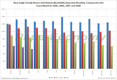
Today, the U.S. Census Department released its monthly New Residential Home Sales Report for March showing an acceleration of the deterioration in demand for new residential homes across every tracked region resulting in a 36.63% year-over-year decline and a truly whopping 62.13% peak sales decline nationally.
Additionally, sales declined significantly on a month-to-month and year-over-year basis both nationally and across every region resulting in a median selling price decline of a whopping 13.33%.
It’s important to keep in mind that these dramatic declines are coming on the back of the significant declines seen in 2006 and 2007 further indicating the enormity of the housing bust and clearly dispelling any notion of a bottom being reached.
Additionally, although inventories of unsold homes have been dropping for twelve straight months, the sales volume has been declining so significantly that the sales pace has now stands at an astonishing 11.0 months of supply.
The following charts show the extent of sales declines seen since 2005 as well as illustrating how the further declines in 2008 are coming on top of the 2006 and 2007 results (click for larger versions)
Look at the following summary of today’s report:
National
- The median price for a new home was down 13.33% as compared to March 2007.
- New home sales were down 36.6% as compared to March 2007.
- The inventory of new homes for sale declined 14.6% as compared to March 2007.
- The number of months’ supply of the new homes has increased 32.5% as compared to March 2007 and now stands at 11.0 months.
- In the Northeast, new home sales were down 64.6% as compared to March 2007.
- In the Midwest, new home sales were down 50.0% as compared to March 2007.
- In the South, new home sales were down 25.9% as compared to March 2007.
- In the West, new home sales were down 39.3% as compared to March 2007.
Mid-Cycle Meltdown?: Jobless Claims April 24 2008
Today, the Department of Labor released their latest read of Joblessness showing seasonally adjusted “initial” unemployment claims decreased 33,000 to 342,000 from last week’s revised 375,000 claims and “continued” claims declined 65,000 resulting in an “insured” unemployment rate of 2.2%.
It’s very important to understand that today’s report continues to reflect employment weakness that is wholly consistent with past recessionary episodes and that unequivocal clarity will more than likely come in the next few releases.
Historically, unemployment claims both “initial” and “continued” (ongoing claims) are a good leading indicator of the unemployment rate and inevitably the overall state of the economy.
The following chart (click for larger version) shows “initial” and “continued” claims, averaged monthly, overlaid with U.S. recessions since 1967 and from 2000.
As you can see, acceleration to claims generally precedes recessions.
Also, acceleration and deceleration of unemployment claims has generally preceded comparable movements to the unemployment rate by 3 – 8 months (click for larger version).
In the above charts you can see, especially for the last three post-recession periods, that there has generally been a steep decline in unemployment claims and the unemployment rate followed by a “flattening” period of employment and subsequently followed by even further declines to unemployment as growth accelerated.
This flattening period demarks the “mid-cycle slowdown” where for various reasons growth has generally slowed but then resumed with even stronger growth.
So, looking at the post-“doc com” recession period we can see the telltale signs of a potential “mid-cycle” slowdown and if we were to simply reflect on the history of employment as an indicator of the health and potential outlook for the wider economy, it would not be irrational to conclude that times may be brighter in the very near future.
But, adding a little more data I think shows that we may in fact be experiencing a period of economic growth unlike the past several post-recession periods.
Look at the following chart (click for larger version) showing “initial” and “continued” unemployment claims, the ratio of non-farm payrolls to non-institutional population and single family building permits since 1967.
INSERT MIDCYCLE CHART
One notable feature of the post-“dot com” recession era that is, unlike other recent post-recession eras, job growth has been very weak, not succeeding to reach trend growth as had minimally accomplished in the past.
Another feature is that housing was apparently buffeted by the response to the last recession, preventing it from fully correcting thus postponing the full and far more severe downturn to today.
I think there is enough evidence to suggest that our potential “mid-cycle” slowdown, having been traded for a less severe downturn in the aftermath of the “dot-com” recession, may now be turning into a mid-cycle meltdown.
Wednesday, April 23, 2008
Socializing The Loss: Carrying To and Fro
Here’s another beauty…
Not to be left out of the fun of robbing "Main Street" (middleclass taxpayers and everyone else) blind to bailout Wall Street, the IRS today announced that it will change (and/or not enforce) regulations to allow Wall Street finance and mortgage lending firms to count losses on delinquent mortgages (or foreclosed and all other mortgage losses) against their ordinary income.
Better still, this change fits perfectly with recent legislation proposed in the Senate that would expand “carry back” and “carry forward” rules to allow these losses to be “carried back” as much as four years, meaning the losses could be applied against regular income for any of the last four tax years and also “carried forward” to future tax years.
So effective immediately Wall Street lending and other financial firms, including Fannie Mae and Freddie Mac, can seek refunds for these losses going back two years and, if the Senate bill is approved and passed as law, an additional two years.
Here’s my favorite quote from the Bloomberg piece that noted that to date, 70 of the world's biggest banks, securities firms and mortgage companies have taken about $290 billion in asset write-downs and credit losses since the beginning of 2007:
``This is a serious windfall,'' said Christopher Whalen, managing director of Hawthorne, California-based Institutional Risk Analytics. ``Essentially, the Street gets a $290 billion tax shelter they did not have available'' under the earlier IRS position.
The Almost Daily 2¢ - Hitting The Wall
It should come as no surprise to regular readers to learn that I spend an unusual amount of time paging through county deed transactions, reading mortgage contracts and particularly ARM riders in an attempt to better understand the motivation of home sellers.
I generally wait for new listings to come on the market in the series of towns I monitor and then look up the records to see if some sign of stress or other factor may be apparent.
Maybe it’s a bit snoopy or even a little underhanded but it is very compelling and quite possibly serves as the only method available to get a sense of what’s truly driving the supply side of the existing home market.
From what I have seen to date, particularly in the last six to twelve months, I think it’s safe to say that at least half of existing single family home listings in the Boston metro area are motivated by some sort of financial stress specifically related to the homes themselves. (as opposed to the typical stressful motivating factors such as deaths and divorces which can be also be clearly discerned from the records)
First, there are MANY instances of homes that show lots of re-finance activity (2 – 3 refinances since the purchase in just the last couple of years) being finally secured with an ARM loan and, in many cases, really unscrupulous ARM loans with bad provisions. (i.e. high rates with some that never adjust downward from the unusually high initial rate).
Another pattern occurring in unexpected numbers are homes in which the prior deed transaction indicated that it was a transfer of property between family (nominal $1 transactions) with no mortgages THEN showing a slew of mortgage activity… it seems the draw of easy equity money was just too much for many who’s parents, sadly, worked a substantial portion of their lifetimes paying down the original debt.
Yet another example are many homes, just newly listed, with asking prices very close and even lower than the price the seller paid just one to three years ago.
Finally, there are properties with multiple missed tax payments and of course there are always the properties that are in some stage of the foreclosures processes.
I believe that this in part explains at least some of what’s behind the current lack of inventory of single family homes in the Boston area and may additionally serve to represent a somewhat similar process playing out across the country.
I think that many, especially more affluent, “homeowners” are only selling when they hit the wall.
They are holding out as best they can but eventually they have to face reality and make some changes.
This also dovetails nicely with the recent Zogby/AOL Real Estate Survey which showed that fully 22% of participants indicated that they would lose their home with only a short unexpected job loss and that 30% work paycheck to paycheck to simply pay their housing costs.
To sum this all up… I think that the majority of foreclosure and distressed selling we have seen to date only reflects the bleeding edge of “homeowners” and housing speculators with the worst most toxic loans and most problematic circumstances.
But I believe a large percentage of typical American households have been holding on for dear life.
This explains the unusually low results seen in the various consumer sentiment surveys as well as the dramatic pullback in discretionary and now even non-discretionary spending.
Given that there is a pretty solid possibility that this time next year national unemployment will be nearing, if not have surpassed 7%, I think it’s safe to say that the real challenges truly lay ahead.
Reading Rates: MBA Application Survey – April 23 2008
The Mortgage Bankers Association (MBA) publishes the results of a weekly applications survey that covers roughly 50 percent of all residential mortgage originations and tracks the average interest rate for 30 year and 15 year fixed rate mortgages, 1 year ARMs as well as application volume for both purchase and refinance applications.
The purchase application index has been highlighted as a particularly important data series as it very broadly captures the demand side of residential real estate for both new and existing home purchases.
The latest data is showing that the average rate for a 30 year fixed rate mortgage increased 30 basis point since last week to 6.04% while the purchase application volume decreased by 6.4% and the refinance application volume plunged 20.2% compared to last week’s results.
It’s important to note that the average interest rate on an 80% LTV 30 year fixed rate loan is now within the range seen throughout 2007 while the interest rate for an 80% LTV 1 year ARM remains elevated now resting 98 basis points ABOVE the rate of an average 80% LTV 30 year fixed rate loan despite all the herculean efforts by the Federal Reserve to bring rates down.
Also note that all application volume values reflect only “initial” applications NOT approved applications… i.e. originations… actual originations would likely be notably lower than the applications.
The following chart shows how the principle and interest cost and estimated annual income required to cover the PITI (using the 29% “rule of thumb”) on a $400,000 loan has changed since November 2006.
The following chart shows the average interest rate for 30 year and 15 year fixed rate mortgages over the last number of weeks (click for larger version).
The following charts show the Purchase Index, Refinance Index and Market Composite Index since November 2006 (click for larger versions).
Subscribe to:
Posts (Atom)