Friday, May 16, 2008

Confidence Game: Consumer, CEO and Investor Confidence May 2008 (Early)

This post combines the latest results of the Rueters/University of Michigan Survey of Consumers, the Conference Board’s Index of CEO Confidence and the State Street Global Markets Index of Investor Confidence indicators into a combined presentation that will run twice monthly as preliminary data is firmed.

These three indicators should disclose a clear picture of the overall sense of confidence (or lack thereof) on the part of consumers, businesses and investors as the current recessionary period develops.

Today’s early release of the Reuters/University of Michigan Survey of Consumers for April confirmed another startling plunge in consumer sentiment to a reading of 59.5, a decline of 32.62% compared to May 2007.

It’s important to note that this is the lowest consumer sentiment reading seen since the recessionary period of June 1980 which, according to many metrics most notably employment, was the most severe recession seen in the U.S. since the Great Depression.

The Index of Consumer Expectations (a component of the Index of Leading Economic Indicators) fell to 51.7, the lowest reading since October 1990’s recessionary environment, 33.38% below the result seen in May 2007.

As for the current circumstances, the Current Economic Conditions Index fell to 71.7, 31.78% below the result seen in April 2007.

As you can see from the chart below (click for larger), the consumer sentiment data is a pretty good indicator of recessions leaving the recent declines possibly predicting rough times ahead.

The latest quarterly results (Q1 2008) of The Conference Board’s CEO Confidence Index fell to a value of 38 the lowest readings since the recessionary period of the dot-com bust.

It’s important to note that the current value has fallen to a level that would be completely consistent with economic contraction suggesting the economy is either in recession or very near.

The April release of the State Street Global Markets Index of Investor Confidence indicated that confidence for North American institutional investors decreased 4.9% since February while European and Asian investor confidence both declined all resulting in a drop of 4.4% to the aggregate Global Investor Confidence Index.

Given that that the confidence indices purport to “measure investor confidence on a quantitative basis by analyzing the actual buying and selling patterns of institutional investors”, it’s interesting to consider the performance surrounding the 2001 recession and reflect on the performance seen more recently.

During the dot-com unwinding it appears that institutional investor confidence was largely unaffected even as the major market indices eroded substantially (DJI -37.9%, S&P 500 -48.2%, Nasdaq -78%).

But today, in the face of the tremendous headwinds coming from the housing decline and the mortgage-credit debacle, it appears that institutional investors are less stalwart.

Since August 2007, investor confidence has declined significantly led primarily by a material drop-off in the confidence of investors in North America.

The charts below (click for larger versions) show the Global Investor Confidence aggregate index since 1999 as well as the component North America, Europe and Asia indices since 2007.


New Residential Construction Report: April 2008

Today’s New Residential Construction Report continues to firmly demonstrate the intensity of the total washout conditions that now exist in the nation’s housing markets and particularly for new residential construction showing tremendous declines on both a peak and year-over-year basis to single family permits both nationally and across every region.

Single family housing permits, the most leading of indicators, again suggests extensive weakness in future construction activity dropping 40.07% nationally as compared to April 2007.

Moreover, every region showed significant double digit declines to permits with the West declining 50.19%, the Midwest declining 34.13%, the South declining 38.24%, and the Northeast declining 32.58%.

Keep in mind that these declines are coming on the back of last year’s record declines.

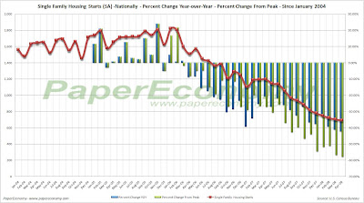
To illustrate the extent to which permits and starts have declined, I have created the following charts (click for larger versions) that show the percentage changes of the current values on a year-over-year basis as well as compared to the peak year of 2004.

Declines to single family permits have contracted measurably in terms of monthly YOY declines, and the fact that we are now seeing declines of roughly 40%-50% on the back of 2006 and 2007 declines should provide a an unequivocal indication that the housing markets are by no means stabilizing.


Here are the statistics outlined in today’s report:

Housing Permits

Nationally
  • Single family housing permits down 40.07% as compared to April 2007.
Regionally
  • For the Northeast, single family housing down 32.58% as compared to April 2007.
  • For the Midwest, single family housing permits down 34.13% as compared to April 2007.
  • For the South, single family housing permits down 38.24% compared to April 2007.
  • For the West, single family housing permits down 50.18% as compared to April 2007.
Housing Starts

Nationally
  • Single family housing starts down 42.23% as compared to April 2007.
Regionally
  • For the Northeast, single family housing starts down 38.46% as compared to April 2007.
  • For the Midwest, single family housing starts down 40.11% as compared to April 2007.
  • For the South, single family housing starts down 42.94% as compared to April 2007.
  • For the West, single family housing starts down 43.33% as compared to April 2007.
Housing Completions

Nationally
  • Single family housing completions down 37.63% as compared to April 2007.
Regionally
  • For the Northeast, single family housing completions increased 1.26% as compared to April 2007.
  • For the Midwest, single family housing completions down 37.5% as compared to April 2007.
  • For the South, single family housing completions down 39.26% as compared to April 2007.
  • For the West, single family housing completions down 44.22% as compared to April 2007.
Keep in mind that this particular report does NOT factor in the cancellations that have been widely reported to be occurring in new construction.

Philadelphia Feeling: Federal Reserve Bank of Philadelphia Business Outlook Survey May 2008

Yesterday, the Federal Reserve Bank of Philadelphia released the results of their Business Outlook Survey for May showing continued weakness to the regions manufacturing sector with the current activity index indicating contraction at –15.6, the sixth consecutive negative monthly result.

The survey of the Philadelphia regions manufacturing sector has been a pretty solid leading indicator of the overall strength or weakness and recession experienced by general economy.

As you can see by the following chart (click for larger version), during the past three post-recession expansion periods, the “current” diffusion index (more on diffusion indices later) generally vacillated between 0 and 35 while the “future” index left the period of contraction at an elevated level and eventually joining the “current” index.

Finally, as the economy pushes closer to contraction, both indices decline dramatically with a breach of -20 by the “current” index generally indicating that recession is upon us.


As you can see from last month’s results, -20 has been breached by the “current” index which now stands at -15.60 while the “future” index stands at 28.2.

Clearly, there is trouble afoot but components of the latest results also display a potential dangerous parallel to the stagflationary eras of the 70s and early 80s.

The following chart shows the latest results of the “current new orders” “current prices paid” and “future employment” components (click for larger versions).

Notice that while current orders and future employment declined, current prices paid have increased indicating a potential return to a stagflationary environment that hasn’t been seen since the early 80s.

It’s important to note that these three indicators have moved, more or less, together since the expansion of 1983 and have especially moved together during the recessionary periods of 1990 and 2001.

Now though, it appears that we may be seeing a divergence with an increase in prices paid and simultaneous decrease in growth.

The following chart (click for larger) shows these measures during the last stagflationary era seen between 1976 – 1980. Notice the clear divergence of rising prices and falling growth.

Production Pullback: Industrial Production April 2008

Yesterday, the Federal Reserve released their monthly read of industrial production showing continued declines across many industries, particularly for those related to consumer spending, construction and business vehicles, resulting in a decline of 0.7% to total aggregate production.

“Final product” consumer durable goods continue to show accelerating weakness falling 9.53% as an aggregate on a year-over-year basis, with particularly significant declines coming specifically from home appliances, furniture and carpeting which declined for the twenty first consecutive month by 11.05% on a year-over-year basis.

Construction supply production has been showing the most severe contraction to wood products seen in at least the last 20 years.

Although automotive production has been showing weakness since the middle of 2004, business vehicle production is now showing a stark contraction.

The following charts (click for larger) show the overall consumer durable component along with the Home Appliances, Furniture and Carpeting sub-component on both a time series and year-over-year basis, construction supply production with the wood products sub-component, and general and business related vehicle production all overlaid with the last two recessions for comparisons purposes.


Thursday, May 15, 2008

Mid-Cycle Meltdown?: Jobless Claims May 15 2008

Today, the Department of Labor released their latest read of Joblessness showing seasonally adjusted “initial” unemployment claims increased 6,000 to 371,000 from last week’s unrevised 365,000 claims and “continued” claims increased 28,000 resulting in an “insured” unemployment rate of 2.3%.

It’s very important to understand that today’s report continues to reflect employment weakness that is wholly consistent with past recessionary episodes and that unequivocal clarity will more than likely come in the next few releases.

Historically, unemployment claims both “initial” and “continued” (ongoing claims) are a good leading indicator of the unemployment rate and inevitably the overall state of the economy.

The following chart (click for larger version) shows “initial” and “continued” claims, averaged monthly, overlaid with U.S. recessions since 1967 and from 2000.

As you can see, acceleration to claims generally precedes recessions.


Also, acceleration and deceleration of unemployment claims has generally preceded comparable movements to the unemployment rate by 3 – 8 months (click for larger version).


In the above charts you can see, especially for the last three post-recession periods, that there has generally been a steep decline in unemployment claims and the unemployment rate followed by a “flattening” period of employment and subsequently followed by even further declines to unemployment as growth accelerated.

This flattening period demarks the “mid-cycle slowdown” where for various reasons growth has generally slowed but then resumed with even stronger growth.

So, looking at the post-“doc com” recession period we can see the telltale signs of a potential “mid-cycle” slowdown and if we were to simply reflect on the history of employment as an indicator of the health and potential outlook for the wider economy, it would not be irrational to conclude that times may be brighter in the very near future.

But, adding a little more data I think shows that we may in fact be experiencing a period of economic growth unlike the past several post-recession periods.

Look at the following chart (click for larger version) showing “initial” and “continued” unemployment claims, the ratio of non-farm payrolls to non-institutional population and single family building permits since 1967.

One notable feature of the post-“dot com” recession era that is, unlike other recent post-recession eras, job growth has been very weak, not succeeding to reach trend growth as had minimally accomplished in the past.

Another feature is that housing was apparently buffeted by the response to the last recession, preventing it from fully correcting thus postponing the full and far more severe downturn to today.

I think there is enough evidence to suggest that our potential “mid-cycle” slowdown, having been traded for a less severe downturn in the aftermath of the “dot-com” recession, may now be turning into a mid-cycle meltdown.

The Almost Daily 2¢ - Boom (And Bust) From The Past

Again, some things never seem to change.

Here’s excerpt from the article that appeared in the July 1933 edition of Harper’s entitled “Gentlemen, The Corn Belt!” as reprinted in the book “The Great Depression” by David A. Shannon:

"The boom period (for Midwest farmland during the period between the end of WWI and the crash of 1929) of the last years of the World War and the extreme inflationary period of 1919 and 1920 were like the Mississippi Bubble and the Tulip Craze in Holland in their effect on the general public. Farm prices shot sky high almost overnight. The town barber and the small-town merchant bought and sold options until every town square was a real estate exchange. Bankers and lawyers, doctors and ministers left their offices and clients and drove pell mell over the country to procure options and contracts upon this farm and that, paying a few hundred dollars down and expecting to sell the rights before the following March brought settlement day.

Not to be in the game marked one as an old fogy, while paper profits were pyramided and Cadillac cars and pleasure trips to the cities took the place of Fords and Sunday afternoon picnics. Everyone then maintained that there was only a little land as fertile as the fields of Iowa, Illinois and Minnesota, and everyone sought to get his part before it was all gone. Like gold, it was limited in extent and of great potential value.

Prices skyrocketed from $100 to $250 and $400 per acre without regard of the producing power of the land.

During this period, insurance companies were bidding against one another for the privilege of making loans on Iowa farms at $90 or $100 of $150 per acre. Prices of products were soaring. Everyone was on the high road, not only to comfort, but to wealth and luxury.

Second, third and fourth mortgages were considered just as good as government bonds.

Money was easy, and every bank was ready and anxious to loan money to any Tom, Dick or Harry on the possibility that he would make enough in these trades to repay the loans almost before the day was over.

Every country bank and every county-seat town was a replica in miniature of a brisk day on the board of trade.

… but, alas, from then on a painful awakening from this financial carousal brought long continuing headaches to the investors, the holders of the second mortgages, and the bankers that had financed these endeavors.

… during the year of the great debacle of 1929 the flood of foreclosure actions did not reach any great peak, but in the years 1931 and 1932 the tidal wave was upon us. Insurance companies and large investors had not yet realized (and in some instances do not yet realize) that, with the low price of farm commodities and the gradual exhaustion of savings and reserves, the formally safe and sane investments in farm mortgages could not be worked out, taxes and interest could not be paid, and liquidation could not be made.

With an utter disregard of the possibilities of payment or refinancing, the large loan companies plunged ahead to make the Iowa farmer pay his loans in full or turn over the real estate to the mortgage holder. Deficiency judgments were the clubs they used to make the honest but indignant farm owners yield immediate possession of the farms.

… The conservative investments in real estate which we Middle Westerners have for years considered the best possible have become not only not an asset, but a liability, with the possibility of deficiency judgments, the bane of mortgage debtors, staring us in the face.
Not only have the luxuries and comforts of life been taken away from us, but the necessaries are not secure."

Wednesday, May 14, 2008

Realtor’s New Reality: Existing Home Sales Q1 2008

Yesterday, the National Association of Realtors (NAR) released their existing home sales report for the first quarter of 2008 showing, in truly stark terms, the tremendously broad nature of the housing downturn.

Single family home sales, on a year-over-year basis, are now falling in every state except for Indiana, Alaska and New Jersey (see chart below and click for larger version and note that NH doesn’t report sales data).

Worse yet, Q1 2008 home sales on an annualized basis compared to peak home sales set between 2005 and 2007 showed significant declining home sales in virtually every state (see chart below and click for larger version) except for Alaska and Indiana.

As for median selling prices, the NAR’s data (see chart below) also shows truly tremendous and widespread weakness among the statistical regions they track with virtually EVERY (147 of the 157 NAR tracks … some of the remaining 10 declined but didn’t report enough data for prior years to be included in a peak comparison) metro region showing significant declines from their respective peaks set between 2005 and 2007 and MOST (99 of the 147) metro regions showing declines as compared to Q1 2007.


Given that the majority of price declines have just begun to show in 2007, look for this price chart to continue to deteriorate in coming quarters.

Also, keep in mind that the NAR data only includes sales for MLS listed properties and given this limitation, the S&P/Case-Shiller index for each respective major metro should be considered a far more accurate price reference.

Amazingly, even given the obvious completeness of the housing downturn shown by their own data, the NAR officials are terming the results “Unusual” with their president, Richard Gaylord, blatantly continues the Realtor tradition of shameless self interested spin.

“It’s more important than ever to examine what’s happening with home prices at the city and neighborhood level, … The old real estate mantra of ‘location, location, location’ is perhaps more relevant today than ever before. Consumers should check with REALTORS® for local expertise on what’s going on in their own area because conditions can vary considerably from one neighborhood to the next.”

Reading Rates: MBA Application Survey – May 14 2008

The Mortgage Bankers Association (MBA) publishes the results of a weekly applications survey that covers roughly 50 percent of all residential mortgage originations and tracks the average interest rate for 30 year and 15 year fixed rate mortgages, 1 year ARMs as well as application volume for both purchase and refinance applications.

The purchase application index has been highlighted as a particularly important data series as it very broadly captures the demand side of residential real estate for both new and existing home purchases.

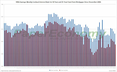
The latest data is showing that the average rate for a 30 year fixed rate mortgage decreased 9 basis points since last week to 5.82% while the purchase application volume decreased by 0.7% and the refinance application volume increased 6.5% compared to last week’s results.

It’s important to note that the average interest rate on an 80% LTV 30 year fixed rate loan has dipped just below the range seen throughout 2007 while the interest rate for an 80% LTV 1 year ARM remains elevated now resting 78 basis points ABOVE the rate of an average 80% LTV 30 year fixed rate loan despite all the herculean efforts by the Federal Reserve to bring rates down.

Also note that all application volume values reflect only “initial” applications NOT approved applications… i.e. originations… actual originations would likely be notably lower than the applications.

The following chart shows how the principle and interest cost and estimated annual income required to cover the PITI (using the 29% “rule of thumb”) on a $400,000 loan has changed since November 2006.

The following chart shows the average interest rate for 30 year and 15 year fixed rate mortgages over the last number of weeks (click for larger version).


The following charts show the Purchase Index, Refinance Index and Market Composite Index since November 2006 (click for larger versions).


Tuesday, May 13, 2008

Conspicuous Correlation: Retail Sales April 2008

Today, the U.S. Census Bureau released its latest nominal read on retail sales showing a decline of 0.2% from March 2008 but was 2.0% above April 2007 on an aggregate of all items including food, fuel and healthcare services.

Discretionary retail sales including home furnishings, home garden and building materials, consumer electronics and department store sales, on the other hand, experienced another significant decline falling 1.26% compared to April 2007.

Further, adjusted for inflation, discretionary retail sales declined 4.76% since April 2007.

On a “nominal” basis, there appeared to be “rough correlation” between strong home value appreciation and strong retail spending preceding the housing bust and an even stronger correlation when home values started to decline.

The following charts show the initial analysis plotting the year-over-year change to an aggregate series consisting of the primary discretionary retail sales categories that I termed the “discretionary” retail sales series and the year-over-year change to the S&P/Case-Shiller Composite home price index since 1993 and since 2000.


As you can see there was, at the very least, a coincidental change to home values and consumer spending during the boom and then the bust, but as home values have continued to decline, retail spending has remained low but has not continued to consistently contract.

One problem with this initial analysis is that both retail sales and the S&P/Case-Shiller Composite index are reported in “nominal” (i.e. non-inflation adjusted) terms and thus result in a somewhat skewed view especially for the retail sales data.

In fact, the year-over-year change to “nominal” discretionary retail sales has been positive for seven of the last eight months while the year-over-year change to “real” discretionary retail sales has been negative for twelve straight months (see the following chart).

The key point here is that although inflation (as reported by the CPI) has been relatively stable in recent years it is always a factor and in light of the latest surprise increases to the CPI results as well as many anecdotal reports of producers now passing through increasing energy prices to the consumer, it’s important to adjust retail sales (and home values) in order to fully understand its direction.


As you can see from the above charts (click for larger version), adjusted for inflation (CPI for retail sales, CPI less shelter for S&P/Case-Shiller Composite) the “rough correlation” between the year-over-year change to the “discretionary” retail sales series and the year-over-year S&P/Case-Shiller Composite series seems now even more significant.

Monday, May 12, 2008

Stopping The Bailout!

Bernanke might be one bad mother F’er but you can still make a difference.

To that end, I’d just like to remind everyone that now would be a good time to urge the White House to veto the various congressional plans for a taxpayer funded bailout of failed housing speculators and the mortgage and financial industries.

Extensive information and discussion regarding a Facebook group, online letters, emails and phone numbers can be found at Stop The Housing Bailout but the best method that has been presented is to simply call the White House at (202)-456-1414 or (202)-456-1111 and state "I am calling to ask you to veto any housing bailout that comes out of Congress."

Also, visit the Angry Renter online petition which has grown substantially in just a few short weeks.

A Socialized bailout of private individuals and, more grotesquely, wealthy investment firms that made outlandish private profits during the boom years is NOT an American or democratic ideal.

The Almost Daily 2¢ - Still Busting After All These Years

It’s been roughly three years since the Boston metro area started showing the first obvious signs that the housing market was in trouble and even after 29 months of steadily declining home prices and dramatically lower home sales, the bust seems poised to bring further losses.

It’s important to note that Boston was the first U.S. metro home market tracked by the S&P/Case-Shiller home price index to register a decline during this current housing bust and although some are looking to it as a leading indicator, the regional economic circumstances, as noted by the most recent Federal Reserve Beige Book, are only now beginning to show signs of notable stress in retail, construction, manufacturing, tourism, financial services and commercial real estate.

This is particularly bad news when considering that the Boston housing market has been, in a sense, declining steadily since early 2001 when annual home price appreciation peaked and the intensity of the housing expansion began to wane (click on following chart for larger version).

It appears that that the main thrust of the housing expansion occurred “in-line” with the wider economic expansion that was fueled primarily by the dot-com bubble and that since the dot-com bust, the housing market has never been quite the same.

Considering the era of easy lending following the “dot-com” bust served to prop-up and inflate the regions housing market, seeing that the intensity of the pre-2001 expansion never again materialized should serve as a troubling sign.

To better illustrate the actual drop-off in home prices and the potential length and depth of the current housing decline, I have compared BOTH the normalized price movement and peak percentage changes to the S&P/Case-Shiller home price index for Boston (BOXR) from the 80s-90s housing bust to today’s bust (ultra-hat tip to the great Massachusetts Housing Blog for the concept).


The “normalized” chart compares the normalized Boston price index from the peak of the 80s-90s bust to the peak of today’s bust.

Notice that during the 80s-90s bust prices took roughly 46 months (3.8 years) to bottom out.

The “peak” chart compares the percentage change, comparing monthly Boston index values to the peak value seen just prior to the first declining month all the way through the downturn and the full recovery of home prices.

In this way, this chart captures ALL months of the downturn from the peak to trough to peak again.

As you can see the last downturn lasted 105 months (almost 9 years) peak to peak.

Friday, May 09, 2008

The Almost Daily 2¢ - Depression Era Redux

In many ways the events surrounding the period just before and early on in the Great Depression seem to bear a striking similarity to what we have seen recently.

Maybe the events of this last year are simply an example of the typical ebb and flow of interactions between private institutions, the government and market participants during times of economic stress and uncertainty and that it’s only the reaction to turmoil that is similar.

Or, more pessimistically, Maybe through a somewhat different path and to a different degree the economy has found itself in essentially the same precarious position as it had been in during the initial stages of the Great Depression and a similar unwinding is now underway.

Or, more optimistically, maybe things just seem similar but they are in fact very different and we are now seeing nothing more than a typical recession, albeit with the potential to be a bit more severe than we have known in recent times.

Obviously looking back at history in order to gain some visibility on the future has its limitations and couldn’t possibly provide a perfect parallel to today’s circumstances but in some respects it appears that some things just never change.

I recently began reading “The Great Depression” by David A. Shannon and found that this collection of newspaper articles and firsthand accounts brings the feeling of that tumultuous era alive and further reveals startlingly similar circumstances and events to what has been seen recently.

I’ll provide a full review of the book when I’ve completed it but for now here are some points of interest:

As reported in the New York Times, October 25 1929:

“In the very midst of the collapse (note: before and after an apparently unscheduled meeting of the New York Federal Reserve) five of the country’s most influential bankers hurried to the office of J.P. Morgan & Co., and after a brief conference gave out word that they believe the foundations of the market to be sound, that the market smash has been caused by technical rather than fundamental considerations, and that many sound stocks are selling too low.”

The Stock Exchange firm of Merrill, Lynch & Co., in a message advising customers to keep accounts well margined without waiting for a direct request, said that investors “with available funds should take advantage of this break to buy good securities”

From an account written by economic historian Broadus Mitchell:

Public statements at the new year on the business outlook for 1930 damaged more reputations of forecasters than they bolstered. In the midst of the stock market debacle two months earlier, prominent persons whose word was apt to be taken – bankers, industrialists, economists, government officials – had declared their confidence in stocks, not to mention underlying business soundness.

Secretary of the Treasury Andrew W. Mellon committed himself blithely: “I see nothing… in the present situation that is either menacing or warrants pessimism… I have every confidence that there will be a revival of activity in the spring and that during the coming year the country will make steady progress.”

The White House reported the President as considering “that business could look forward to the coming year with greater assurance.” Willis H. Booth, president of the Merchants’ Association of New York, saw “no fundamental reason why business should not find itself again on the upgrade early in 1930.”

Secretary of Commerce Robert P. Lamont contented himself with listing the gains that the year 1929 as a whole had registered over 1928, and with predicting prosperity and progress “for the long run.”