 Today, the Massachusetts Association of Realtors (MAR) released their Existing Home Sales Report for October 2007 showing again the utter foolishness of MAR president Doug Azarian’s purported two month long winning streak of increasing home sales earlier this fall.
In fact, MAR now reports that in October, single family home sales plummeted 11.4% as compared to October 2006 with a median price decline of 3.2%.
Not to be deterred from attempting to bamboozle the hapless homebuyer, Azarian continues the spin:
“While sales were down last month, it is important to note that year-to-date residential sales activity is off only 2% from this time last year, … In addition, residential inventory continues to decline from year-ago levels, and mortgage rates have come down in recent months.”
Of course, Azarian forgets to mention that home sales have been falling faster than inventory continuing to leave the current months supply substantially imbalanced toward buyers.
Also, since the Jumbo mortgage market had only vanished from existence in August, the annual sales count is deceptive as it includes roughly 7 months of sales where buyers could still secure non-conforming loans.
As usual, The Warren Group’s latest figures were significantly different than that of MARs showing single family home sales down 17.1% and a median price decline of 6.5% as compared to October of 2006.
 With October’s results we have firmly crossed over to the new reality of virtually non-existent (or ridiculously costly and inaccessible… take your pick) Jumbo and No-Doc loans.
We are now clearly seeing the result of the mortgage-credit meltdown with home sales resuming double digit year-over-year declines in both September and October and even more notably, coming on the back of last year’s historic falloff.
As I predicted in past posts, the recent monthly results of the S&P/Case-Shiller index for Boston have shown renewed price declines indicating that as the mortgage-credit crisis unwinds, out area is not immune.
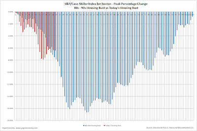
To better illustrate the drop-off in home prices and the potential length and depth of the current housing decline, I have compared BOTH the year-over-year and peak percentage changes to the S&P/Case-Shiller home price index for Boston (BOXR) from the 80s-90s housing bust to today’s bust (ultra-hat tip to the great Massachusetts Housing Blog for the concept).

 The “year-over-year” chart compares the percentage change, on a year-over-year basis, to the BOXR from the last positive value through the decline to the first positive value at the end of the decline.
In this way, this chart captures only the months that showed monthly “annual declines” and as we can see, if history is to be a guide, we could be about one third of the way through the annual price declines with the majority of falling prices yet to come.
The “peak” chart compares the percentage change, comparing monthly BOXR values to the peak value seen just prior to the first declining month all the way through the downturn and the full recovery of home prices.
In this way, this chart captures ALL months of the downturn from the peak to trough to peak again.
As you can see the last downturn lasted 105 months (almost 9 years) peak to peak including 34 months of annual price declines during the heart of the downturn.
Notice that peak declines have been more significant to date and, keeping in mind that our current run-up was many times more magnificent than the 80s-90s run-up, it is not inconceivable that current decline will run deeper and last longer.
As in months past, be on the lookout for the inflation adjusted charts produced by BostonBubble.com for an even more accurate "real" view of the current market trend.
October’s Key Statistics:
- Single family sales declined 11.4% as compared to October 2006
- Single family median price decreased 3.2% as compared to October 2006
- Condo sales declined 13.2% as compared to October 2006
- Condo median price increased 7.3% as compared to October 2006
- The number of months supply of single family homes stands at 11.8 months.
- The number of months supply of condos stands at 12.3 months.
- The average “days on market” for single family homes stands at 135 days.
- The average “days on market” for condos stands at 133 days.