Today, the Department of Labor released their latest read of Joblessness showing seasonally adjusted “initial” unemployment claims increasing 69,000 and “continued” claims increasing 47,000 resulting in an “insured” unemployment rate of 2.0%.
Historically, unemployment claims both “initial” and “continued” (ongoing claims) are a good leading indicator of the unemployment rate and inevitably the overall state of the economy.
The following chart (click for larger version) shows “initial” and “continued” claims, averaged monthly, overlaid with U.S. recessions since 1967 and from 2000.
As you can see, acceleration to claims generally precedes recessions.
Also, acceleration and deceleration of unemployment claims has generally preceded comparable movements to the unemployment rate by 3 – 8 months (click for larger version).
In the above charts you can see, especially for the last three post-recession periods, that there has generally been a steep decline in unemployment claims and the unemployment rate followed by a “flattening” period of employment and subsequently followed by even further declines to unemployment as growth accelerated.
This flattening period demarks the “mid-cycle slowdown” where for various reasons growth has generally slowed but then resumed with even stronger growth.
So, looking at the post-“doc com” recession period we can see the telltale signs of a potential “mid-cycle” slowdown and if we were to simply reflect on the history of employment as an indicator of the health and potential outlook for the wider economy, it would not be irrational to conclude that times may be brighter in the very near future.
But, adding a little more data I think shows that we may in fact be experiencing a period of economic growth unlike the past several post-recession periods.
Look at the following chart (click for larger version) showing “initial” and “continued” unemployment claims, the ratio of non-farm payrolls to non-institutional population and single family building permits since 1967.
One notable feature of the post-“dot com” recession era that is, unlike other recent post-recession eras, job growth has been very weak, not succeeding to reach trend growth as had minimally accomplished in the past.
Another feature is that housing was apparently buffeted by the response to the last recession, preventing it from fully correcting thus postponing the full and far more severe downturn to today.
I think there is enough evidence to suggest that our potential “mid-cycle” slowdown, having been traded for a less severe downturn in the aftermath of the “dot-com” recession, may now be turning into a mid-cycle meltdown.
Thursday, January 31, 2008
Crashachusetts Existing Home Sales: December 2007
This week, the Massachusetts Association of Realtors (MAR) released their Existing Home Sales Report for December 2007 showing again the utter foolishness of former MAR president Doug Azarian’s yearlong optimistic sentiment.
But, seeing as this is January, the month reserved for the annual “changing of the guards” in the Realtor power structure, let’s offer the incoming MAR president Susan M. Renfrew our warmest congratulations and even go so far as observing a short moment of silence in recognition of another orderly and peaceful transfer truly brazen and unabashed debauchery.
… now that that’s over…
MAR reports that in December, single family home sales plummeted 20% as compared to December 2006 translating to a whopping 11.9 months of supply and a median price decline of 3.6%.
Hitting the ground running, Renfrew downplays the decline while suggesting that “stable” prices and great inventory may offer some hope for a better 2008.
“December is typically not a month in which sales accelerate… Hopefully, the folks who are on the fence about owning a home will take advantage of this buyer’s market – great inventory, stable prices, last week’s Fed rate cut, and the potential increase of conforming loan limits – to get sales moving in the first quarter.”
Unfortunately for the Fed-glee filled MAR though, many buyers are now nearly “permanently” sidelined as a combination of tougher lending standards (even for FHA and GSE loans), the continued absence of Jumbo loans and outright fear of buying a quickly depreciating asset during an obvious recession all work to provide a powerful deterrent to home sales.
Nice touch on the “stable” prices though but I think that at this point it’s fairly obvious which direction prices are going from here.
Furthermore, 2007 showed the least sales of single family homes since 1996 leaving 2008 poised to set the pace back to that seen during the last major housing collapse.
As usual, The Warren Group’s latest figures were significantly different than that of MARs showing sales of single family homes down 23.3% and a median price decline of 10.5% as compared to December of 2006.
With December’s results we have completed our crossing over to the new reality of virtually non-existent (or ridiculously costly and inaccessible… take your pick) Jumbo loans and are now just entering a new phase of recessionary period sales declines.
The housing debacle is now common knowledge (we’ve sure come a long way) as is the looming (or actually existing) recession and related “bear” market conditions on Wall Street.
All of these circumstances will work together to create a sense of urgency not to overspend, get overleveraged or take unnecessary risks in the face of unprecedented uncertainty about the future prospects for the economy.
To better illustrate the drop-off in home prices and the potential length and depth of the current housing decline, I have compared BOTH the year-over-year and peak percentage changes to the S&P/Case-Shiller home price index for Boston (BOXR) from the 80s-90s housing bust to today’s bust (ultra-hat tip to the great Massachusetts Housing Blog for the concept).
The “year-over-year” chart compares the percentage change, on a year-over-year basis, to the BOXR from the last positive value through the decline to the first positive value at the end of the decline.
In this way, this chart captures only the months that showed monthly “annual declines” and as we can see, if history is to be a guide, we could be about one third of the way through the annual price declines with the majority of falling prices yet to come.
The “peak” chart compares the percentage change, comparing monthly BOXR values to the peak value seen just prior to the first declining month all the way through the downturn and the full recovery of home prices.
In this way, this chart captures ALL months of the downturn from the peak to trough to peak again.
As you can see the last downturn lasted 105 months (almost 9 years) peak to peak including 34 months of annual price declines during the heart of the downturn.
Notice that peak declines have been more significant to date and, keeping in mind that our current run-up was many times more magnificent than the 80s-90s run-up, it is not inconceivable that current decline will run deeper and last longer.
As in months past, be on the lookout for the inflation adjusted charts produced by BostonBubble.com for an even more accurate "real" view of the current market trend.
December’s Key Statistics:
- Single family sales declined 20% as compared to December 2006
- Single family median price decreased 3.6% as compared to December 2006
- Condo sales declined 28.3% as compared to December 2006
- Condo median price went unchanged as compared to December 2006
- The number of months supply of single family homes stands at 11.9 months.
- The number of months supply of condos stands at 12.7 months.
- The average “days on market” for single family homes stands at 138 days.
- The average “days on market” for condos stands at 144 days.
Wednesday, January 30, 2008
GDP Report: Q4 2007 (Advance)
Today, the Bureau of Economic Analysis (BEA) released their first installment of the Q4 2007 GDP report showing a truly anemic annual growth rate of 0.6%.
This stunning reversal from the exceptionally “hot” rate of growth seen in Q3 2007 was fueled primarily by accelerating declines in fixed residential investment, slowing growth to fixed non-residential investment, and a sudden deceleration in the export of goods to a much weaker 2.4% growth rate.
In fact, the deceleration to growth of the export of goods was so severe that it seems altogether possible that the Q3 26.6% growth rate was an temporary aberration, a result of there being a brief disconnect between the slowing U.S. economy (and weak dollar exporter) and the rest of the world economies (importers) relative strength.
Now that the world economies are slowing as well, it’s unlikely that exports will provide much of a "crutch" against which the weakening U.S. economy can lean.
Residential fixed investment, that is, all investment made to construct or improve new and existing residential structures including multi–family units, continued its historic fall-off registering a whopping decline of 23.9% since last quarter shaving 1.18% from overall GDP.
The decline to residential housing continues to be, by far, the most substantial single drag on GDP subtracting an amount roughly equivalent to contributions made by all personal consumption of durable (cars, furniture, etc.) and non-durable goods (food, clothing, gasoline, fuel oil) and most personal consumption services during the quarter.
The following chart shows real residential and non-residential fixed investment versus overall GDP since Q1 2003 (click for larger version).
Reading Rates: MBA Application Survey – January 30 2008
The Mortgage Bankers Association (MBA) publishes the results of a weekly applications survey that covers roughly 50 percent of all residential mortgage originations and tracks the average interest rate for 30 year and 15 year fixed rate mortgages, 1 year ARMs as well as application volume for both purchase and refinance applications.
The purchase application index has been highlighted as a particularly important data series as it very broadly captures the demand side of residential real estate for both new and existing home purchases.
The latest data is showing that the average rate for a 30 year fixed rate mortgage increased since last week to 5.60% while the purchase application volume decreased 17.7% and the refinance application volume increased a whopping 22.1% compared to last week’s results.
The average fixed mortgage rate continues to remain materially below the trend of 2007 and increases to refinance application volume have clearly reflected that but it will take a few more weeks for the underlying trend to become clear particularly as the purchase application volume remains essentially unchanged (or possibly trending lower) compared to last year’s levels.
It’s important to note that all application volume values reflect only “initial” applications NOT approved applications… i.e. originations… I will post on originations on the coming weeks.
Also note that the average interest rates for 80% LTV fixed rate mortgages has now dropped firmly below the mean for the prior year and that the interest rate for an 80% LTV 1 year ARM continues to be elevated with a 1 basis point spread above the 30 year fixed rate.
It’s important to note that the data is reported (and charted) weekly and that the rate data represents average interest rates, and the index data represents mortgage loan application volume for home purchases, home refinances and a composite of all loans.
The following chart shows how the principle and interest cost and estimated annual income required to cover the PITI (using the 29% “rule of thumb”) on a $400,000 loan has changed since January 2007.
The following chart shows the average interest rate for 30 year and 15 year fixed rate mortgages over the last number of weeks (click for larger version).
The following charts show the Purchase Index, Refinance Index and Market Composite Index since January 2007 (click for larger versions).
Tuesday, January 29, 2008
S&P/Case-Shiller: November 2007
Today’s release of the S&P/Case-Shiller home price indices for November continues to reflect the tremendous weakness seen in the nation’s housing markets with 17 of the 20 metro areas tracked reporting year-over-year declines and ALL metro areas showing declines from their respective peaks.
Furthermore, the 10 city composite index declined a record 8.42% as compared to November 2006 far surpassing all prior annual decline records and firmly placing the current contraction in uncharted territory in terms of relative intensity.
This report continues to indicate that during the late summer and fall of 2007 we essentially entered the vigorous price “free-fall” phase (look at the charts below) of the housing decline.
Topping the list of peak decliners are Detroit at -17.17%, San Diego at -16.27%, Miami at -15.27%, Tampa at -14.55%, Phoenix at -14.50%, Las Vegas at -13.98%, Los Angeles at -12.23%, Washington at -11.00%, San Francisco at -10.48%, Cleveland at -8.26%, Boston at -8.25%.
Additionally, both of the broad composite indices showed accelerating declines slumping -9.37% for the 10 city national index and -8.57% for the 20 city national index on a peak comparison basis.
Also, it’s important to note that Boston, having been cited as a possible example of price declines abating, has continued its decline dropping -3.01% on a year-over-year basis and a solid -8.25% from the peak set back in September 2005.
As I had noted in prior posts, Boston has a strong degree of seasonality to its price movements and with both the seasonal drop in sales and the recent stunning new decline to sales as a result of the disappearance of Jumbo and Alt-A loans, Boston will likely continue on yet another significant leg down in prices.
To better visualize the results use the PaperEconomy S&P/Case-Shiller/Futures Charting Tool as well as the PaperEconomy Home Value Calculator and be sure to read the Tutorial in order to best understand how best to utilize the tool.
The following chart (click for larger version) shows the percent change to single family home prices given by the Case-Shiller Indices as compared to each metros respective price peak set between 2005 and 2007.
The following chart (click for larger version) shows the percent change to single family home prices given by the Case-Shiller Indices as on a year-over-year basis.
Additionally, in order to add some historical context to the perspective, I updated my “then and now” CSI charts that compare our current circumstances to the data seen during 90s housing decline.
To create the following annual charts I simply aligned the CSI data from the last month of positive year-over-year gains for both the current decline and the 90s housing bust and plotted the data with side-by-side columns (click for larger version).
What’s most interesting about this particular comparison is that it highlights both how young the current housing decline is and clearly shows that the latest bust has surpassed the prior bust in terms of intensity.
Looking at the actual index values normalized and compared from the respective peaks, you can see that we are only seventeen months into a decline that, last cycle, lasted for roughly fifty four months during the last cycle (click the following chart for larger version).
The “peak” chart compares the percentage change, comparing monthly CSI values to the peak value seen just prior to the first declining month all the way through the downturn and the full recovery of home prices.
In this way, this chart captures ALL months of the downturn from the peak to trough to peak again.
As you can see the last downturn lasted 97 months (over 8 years) peak to peak including roughly 43 months of annual price declines during the heart of the downturn.
Notice that peak declines have been FAR more significant to date and, keeping in mind that our current run-up was many times more magnificent than the 80s-90s run-up, it is not inconceivable that current decline will run deeper and last longer.
Monday, January 28, 2008
New Home Sales: December 2007
Today, the U.S. Census Department released its monthly New Residential Home Sales Report for December showing accelerating deterioration of the already hideous falloff in demand for new residential homes both nationally and in every region resulting in an astounding median sales price drop of 10.42%.
Additionally, 2007 marked the single worst declines in new home sales ever recorded in the 45 years the data has been tracked.
On a year-over-year basis new home sales are continuing to weaken, dropping a truly ugly 40.73% below the sales activity seen in December 2006 representing the largest year-over-year decline registered during this current housing bust.
It’s important to keep in mind that these declines are coming on the back of the significant declines seen in 2006 further indicating the significance of the housing bust.
It’s important to note that although inventories of unsold homes have been dropping for eight straight months, the sales volume has been declining so significantly that the sales pace has now reached a new peak value of 9.6 months of supply.
The following charts show the extent of sales declines seen since 2006 as well as illustrating how the further declines in 2007 are coming on top of the 2006 results (click for larger versions)
Note that the last chart essentially combines the year-over-year changes seen in 2005, 2006 and 2007 and shows sales trending down precipitously as compared to the peak period.
Look at the following summary of today’s report:
National
- The median price for a new home was down 10.42% as compared to December 2006.
- New home sales were down 40.73% as compared to December 2006.
- The inventory of new homes for sale declined 7.5% as compared to December 2006.
- The number of months’ supply of the new homes has increased 54.8% as compared to December 2006.
- In the Northeast, new home sales were down 27.4% as compared to December 2006.
- In the Midwest, new home sales were down 55.8% as compared to December 2006.
- In the South, new home sales were down 36.3% as compared to December 2006.
- In the West, new home sales were down 42.9% as compared to December 2006.
Friday, January 25, 2008
Thursday, January 24, 2008
The Almost Daily 2¢ - Jumbo Lives (A.K.A Realtor’s Win)
So… it looks like that’s it.
Washington pulled the trigger on what they term a bipartisan “middle class” initiative to “respond to the economic pressures affecting the American people” by “putting money in the hands of working families”.
Undoubtedly, the most significant element of the proposal is NOT the cash handouts or adjustments to depreciating business investment but is instead the increasing of the GSE conforming loan limit to $730K.
After the passage of this initiative the various federal “affordable housing” programs will NO LONGER BE WORKING TO ASSIST LOWER AND MIDDLE CLASS FAMILIES afford housing as first time home buyers (as they were all intended to do) but instead will be working to enable and subsidize truly affluent homeowners and housing speculators.
This has to be easily the most warped and grotesque and truly unfair socialization of private financial losses on record.
Realtors, Homebuilders, Mortgage brokers, Flippers and other Speculators, DINK Yuppies, regular Yuppies, HGTV, the most affluent 1%, hedge funds, Countrywide Financial, Bear Sterns… greed itself has just been bailed out on the backs of the middle class.
Hey Red states!... You are now subsidizing the Blue states and enabling their most affluent and highly educated residents to continue a lifestyle of unspeakable (and unsustainable) excess.
So it looks like all the Realtor RPAC (the largest and most affluent and influential PAC our country has ever known) money paid off!!!!
If you are as outraged as I am over this….
LET THE FOLLOWING RESPONSIBLE PARTIES KNOW! THIS IS YOUR LAST CHANCE...
- The White House
- Massachusetts Representative Barney Frank at (202) 225-5931
- New York Senator Charles Schumer
- California Representative Nancy Pelosi
Existing Home Sales Report: December 2007
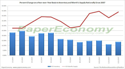
Today, the National Association of Realtors (NAR) released their Existing Home Sales Report for December again confirming, perfectly clearly, that demand for residential real estate, both single family and condos, has taken a new and substantial leg down uniformly across the nation’s housing markets likely as a direct result of the momentous and ongoing structural changes that are taking place in the credit-mortgage markets.
Furthermore, we are now seeing solid declines to the median sales price for both single family homes and condos across virtually every region (save for a paltry increase for condos in the Midwest) with the most notable being declines of 11.2% and 9.7% on a year-over-year basis to the single family home sales price in the West and Northeast respectively.
In the obvious face of home sales not “hovering in a narrow range”, NAR senior economist Lawrence Yun is now calling on Washington to provide a “quick boost” to the nation’s housing market by increasing the non-conforming loan limit (the limit that defines the boundary between Fannie Freddie insured loans and non-agency Jumbo loans).
“Home sales remain weak despite improved affordability conditions in many parts of the country, but we could get a quick boost to the market if loan limits are raised in combination with the bold cut in the Fed funds rate, … Home prices are lower, mortgage interest rates continue to decline and incomes are higher, but many potential buyers are delaying a purchase.”
NAR president Richard Gaylord also chimed in with a shrill and truly offensive take suggesting that it’s “unfair” that some Americans cannot get an $625,000 loan through the federal governments “affordable housing” program.
“The most effective way to stimulate housing and minimize the potential for a recession is for lawmakers to raise the limit on conforming mortgages to $625,000, which would open safe and affordable financing to buyers in high-cost areas, … It is grossly unfair that some Americans do not have access to low-interest rate loans. This would help people as they move away from risky subprime mortgages and high-interest rate jumbo loans.”
The latest report provides, yet again, truly stark and total confirmation that the nation’s housing markets have now taken a new leg down with EVERY region showing significant double digit declines to sales of BOTH single family and condos as well as large increases to inventory and a continued explosion in monthly supply as a result of the collapsing pace of sales.
Keep in mind that these declines are coming “on the back” of last year’s dramatic declines further indicating that the housing markets are truly in the process of a tremendous correction.
The following (click for larger versions) are charts showing sales for single family homes, plotted monthly, for 2006 and 2007 as well as national existing home inventory and month supply.
Below is a chart consolidating all the year-over-year changes reported by NAR in their December 2007 report.
Mid-Cycle Meltdown?: Jobless Claims January 24 2008
Today, the Department of Labor released their latest read Joblessness showing “initial” unemployment claims declining 1,000 and “continued” claims declining 75,000 resulting in an “insured” unemployment rate of 2.0%.
Historically, unemployment claims both “initial” and “continued” (ongoing claims) are a good leading indicator of the unemployment rate and inevitably the overall state of the economy.
The following chart (click for larger version) shows “initial” and “continued” claims, averaged monthly, overlaid with U.S. recessions since 1967 and from 2000.
As you can see, acceleration to claims generally precedes recessions.
Also, acceleration and deceleration of unemployment claims has generally preceded comparable movements to the unemployment rate by 3 – 8 months (click for larger version).
In the above charts you can see, especially for the last three post-recession periods, that there has generally been a steep decline in unemployment claims and the unemployment rate followed by a “flattening” period of employment and subsequently followed by even further declines to unemployment as growth accelerated.
This flattening period demarks the “mid-cycle slowdown” where for various reasons growth has generally slowed but then resumed with even stronger growth.
So, looking at the post-“doc com” recession period we can see the telltale signs of a potential “mid-cycle” slowdown and if we were to simply reflect on the history of employment as an indicator of the health and potential outlook for the wider economy, it would not be irrational to conclude that times may be brighter in the very near future.
But, adding a little more data I think shows that we may in fact be experiencing a period of economic growth unlike the past several post-recession periods.
Look at the following chart (click for larger version) showing “initial” and “continued” unemployment claims, the ratio of non-farm payrolls to non-institutional population and single family building permits since 1967.
One notable features of the post-“dot com” recession era that is, unlike other recent post-recession eras, job growth has been very weak, not succeeding to reach trend growth as had minimally accomplished in the past.
Another feature is that housing was apparently buffeted by the response to the last recession, preventing it from fully correcting thus postponing the full and far more severe downturn to today.
I think there is enough evidence to suggest that our potential “mid-cycle” slowdown, having been traded for a less severe downturn in the aftermath of the “dot-com” recession, may now be turning into a mid-cycle meltdown.
Wednesday, January 23, 2008
Reading Rates: MBA Application Survey – January 23 2008
The Mortgage Bankers Association (MBA) publishes the results of a weekly applications survey that covers roughly 50 percent of all residential mortgage originations and tracks the average interest rate for 30 year and 15 year fixed rate mortgages, 1 year ARMs as well as application volume for both purchase and refinance applications.
The purchase application index has been highlighted as a particularly important data series as it very broadly captures the demand side of residential real estate for both new and existing home purchases.
The latest data is showing that the average rate for a 30 year fixed rate mortgage decreased since last week to 5.49% while the purchase application volume decreased 4.6% and the refinance application volume increased 16.9% compared to last week’s results.
There is no doubt that the average fixed mortgage rate is now materially below the trend of 2007 and increases to refinance application volume has reflected that but it will take a few more weeks for the underlying trend to become clear particularly for the purchase application volume that remains essentially unchanged compared to last year’s levels.
It’s important to note that all application volume values reflect only “initial” applications NOT approved applications… i.e. originations… I will post on originations on the coming weeks.
Also note that the average interest rates for 80% LTV fixed rate mortgages has now dropped firmly below the mean for the prior year and that the interest rate for an 80% LTV 1 year ARM continues to be elevated with a 2 basis point spread above the 30 year fixed rate.
It’s important to note that the data is reported (and charted) weekly and that the rate data represents average interest rates, and the index data represents mortgage loan application volume for home purchases, home refinances and a composite of all loans.
The following chart shows how the principle and interest cost and estimated annual income required to cover the PITI (using the 29% “rule of thumb”) on a $400,000 loan has changed since January 2007.
The following chart shows the average interest rate for 30 year and 15 year fixed rate mortgages over the last number of weeks (click for larger version).
The following charts show the Purchase Index, Refinance Index and Market Composite Index since January 2007 (click for larger versions).
Subscribe to:
Posts (Atom)