First, to all U.K. readers I want to properly and whole heartedly welcome you the housing malaise!
How’s that for an U.S. export! Take that you Redcoats!
Recently, the two most prominent and long running monthly U.K. housing price indices registered the largest year-over-year declines in at least 15 years.
The “Nationwide” series, which reported data through May indicated that U.K. home prices declined 4.4% on a year-over-year basis while the “Halifax” series, which reported data through April indicated that U.K. home prices declined 3.68% on a year-over-year basis.
Both indices are similar to our own S&P/Case-Shiller data series in that they both implement a methodology that seeks to standardize the quality homes included as source data and track the price changes occurring between sales instead of simply tracking the distorted average or median sales price.
The following charts (click for larger) show the price movement since 1991 to each index.
Notice that annual price appreciation peaked in 2003 and continued to weaken consistently until early 2008 when it actually evolved into annual depreciation.
Friday, May 30, 2008
Thursday, May 29, 2008
GDP Report: Q1 2008 (Preliminary)
Today, the Bureau of Economic Analysis (BEA) released their second preliminary installment of the Q1 2008 GDP report showing a anemic annual growth rate of 0.9%.
This continuation of dramatically slower growth was primarily the result of accelerating declines in fixed residential investment, a moderate decline in fixed non-residential investment, and far from outstanding growth in both the export of goods and services.
In fact, the continuation of typical growth rates for exports seems to further suggest that the exceptional growth seen during Q3 2007 was an temporary aberration, a result of there being a brief disconnect between the slowing U.S. economy (and weak dollar) and the rest of the world economies relative strength.
Now that the world economies are slowing as well, it’s unlikely that exports will provide much of a crutch against which the weakening U.S. economy can lean.
Residential fixed investment, that is, all investment made to construct or improve new and existing residential structures including multi–family units, continued its historic fall-off registering a whopping decline of 25.5% since last quarter shaving 1.17% from overall GDP.
Furthermore, combined with the sharp drop-off in Non-residential fixed investment, total fixed investment subtracted a whopping 1.20% from overall GDP roughly equaling the positive contributions made by all personal consumption of services in the quarter.
The following chart shows real residential and non-residential fixed investment versus overall GDP since Q1 2003 (click for larger version).
Mid-Cycle Meltdown?: Jobless Claims May 29 2008
Today, the Department of Labor released their latest read of Joblessness showing seasonally adjusted “initial” unemployment claims increased 4,000 to 372,000 from last week’s revised 368,000 claims and “continued” claims increased 36,000 resulting in an “insured” unemployment rate of 2.3%.
It’s very important to understand that today’s report continues to reflect employment weakness that is wholly consistent with past recessionary episodes and that unequivocal clarity will more than likely come in the next few releases.
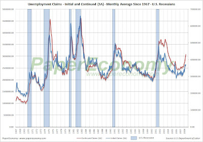
Historically, unemployment claims both “initial” and “continued” (ongoing claims) are a good leading indicator of the unemployment rate and inevitably the overall state of the economy.
The following chart (click for larger version) shows “initial” and “continued” claims, averaged monthly, overlaid with U.S. recessions since 1967 and from 2000.
As you can see, acceleration to claims generally precedes recessions.
Also, acceleration and deceleration of unemployment claims has generally preceded comparable movements to the unemployment rate by 3 – 8 months (click for larger version).
In the above charts you can see, especially for the last three post-recession periods, that there has generally been a steep decline in unemployment claims and the unemployment rate followed by a “flattening” period of employment and subsequently followed by even further declines to unemployment as growth accelerated.
This flattening period demarks the “mid-cycle slowdown” where for various reasons growth has generally slowed but then resumed with even stronger growth.
So, looking at the post-“dot com” recession period we can see the telltale signs of a potential “mid-cycle” slowdown and if we were to simply reflect on the history of employment as an indicator of the health and potential outlook for the wider economy, it would not be irrational to conclude that times may be brighter in the very near future.
But, adding a little more data I think shows that we may in fact be experiencing a period of economic growth unlike the past several post-recession periods.
Look at the following chart (click for larger version) showing “initial” and “continued” unemployment claims, the ratio of non-farm payrolls to non-institutional population and single family building permits since 1967.
One notable feature of the post-“dot com” recession era that is, unlike other recent post-recession eras, job growth has been very weak, not succeeding to reach trend growth as had minimally accomplished in the past.
Another feature is that housing was apparently buffeted by the response to the last recession, preventing it from fully correcting thus postponing the full and far more severe downturn to today.
I think there is enough evidence to suggest that our potential “mid-cycle” slowdown, having been traded for a less severe downturn in the aftermath of the “dot-com” recession, may now be turning into a mid-cycle meltdown.
The Arlington Artifice: April 2008
This recurring monthly post tracks the latest results of the housing market seen in Arlington Massachusetts.
I choose Arlington as a result of the Boston Globe’s recently published and absurdly anecdotal and ludicrous farce about the town’s “hot” housing market.
The ridiculous tone and outright mishandling of the housing data by the Boston Globe “reporter” would almost be comical if it weren’t for the fact that the Globe’s editor, Martin Baron, ALSO blundered seriously when he responded to my email about the discrepancies.
Baron attempted to justify the articles contents and in so doing, he disclosed his disgracefully poor and obviously unsophisticated abilities with even the most basic economic data.
The March results again confirm that Arlington is by no means a “stand out” amongst its neighboring towns as Baron suggested in his email and, in fact, is following along on a path wholly consistent with the trend seen in the county, state, region and nation.
Why would an editor of a nationally recognized newspaper think that a single town would continue to function as an isolated bubble amongst a backdrop of the most significant nationwide housing recession since the Great Depression?
As I have shown in my prior posts, this data when charted and compared to other towns in the region proves there are absolutely no grounds to call Arlington’s market exceptional.
The most notable feature of the April results is unquestionably the low number of home sales with only 57 sales for the entire year to date, the lowest readings since the recessionary period of 1991.
Another important point to remember is that when sales decline dramatically the median selling price can jump wildly up or down since the small number of sales provides a small set with which to determine the “middle” selling price.
For example, for April the Cambridge median selling price of a single family home fell substantially, resting just a few thousand dollars above the median single family selling price for Arlington, an obvious distortion.
The following chart (click for much larger version) shows a history of Arlington’s April median sales price since 1988 along with the annual outcome.
Notice that the latest result declined substantially, dropping from last month’s $540,000 to $460,000 in April.
Again, the low sales count is clearly impacting the median selling price and April may end up being a little misleading as the total home sales count (larger collection of sales to determine the median from) continues to pick up later this spring and summer.
The next chart (click for much larger version) shows that home sales in Arlington have been essentially flat during the last 15 years, a result that is generally to be expected when looking only at the sales of one town in isolation. That being said though, Arlington has seen only 57 home sales this year, the lowest result on record since 1991.
The final chart shows how the year-to-date median sales price and combined sale count for Arlington, Bedford, Belmont, Cambridge and Lexington has changed since 1988. Notice again that because of the low sales count the current median price data is very volatile jumping radically up or down for each of town.
In review, the data shows that there is nothing exceptional about Arlington’s housing market proving clearly that the claims made in the Boston Globe article and later endorsed by its editor Martin Baron were entirely erroneous.
Wednesday, May 28, 2008
Countrywide Foreclosures: April 2008
In February Countrywide Financial (NYSE:CFC) announced that they planed to discontinued publishing their monthly operational status report limiting insight into their internal status to what they termed a more “industry standard” quarterly frequency.
Clearly, this was a move intended to thwart transparency and prevent concerned onlookers from completely understanding the enormity of their troubles.
In order to continue monitoring the Countrywide Financial foreclosure and delinquency status with at least some level of monthly insight I have built a simple model (simple linear extrapolation from actual data reported from 2005 – February 2008) to estimate the monthly numbers.
I will update the model with actual data when and if it ever becomes available in their quarterly reports.
Today, the estimated results for Countrywide Financial show that delinquencies and foreclosures are continuing their climb to troubling levels with delinquencies jumping over 61% on a year-over-year basis to 6.94% of total number of loans or over 83% on a year-over-year basis to 7.49% of total unpaid principle balance while foreclosures jumping over 73% on a year-over-year basis to 1.19% of total number of loans and soaring 105% to 1.70% of total unpaid principle balance.
Prior to January 2007, Countrywide reported foreclosure data as a percentage of the total number of loans serviced which obviously lacked complete clarity.
Below, are charts of both measures; delinquencies and foreclosures by total number of loans serviced and by percentage of unpaid loan principle (Click for larger versions).
Be sure to check out the Countrywide Financial Foreclosures (REO) Blog’s Inventory Tracker for some more startling evidence that foreclosures are skyrocketing over at Countrywide Financial as well as some excellent REO tracking features.
Ticking Time Bomb?: Fannie Mae Monthly Summary April 2008
With the federal bailout now well underway and seeing that the battered massive “linchpin” mortgage enterprises of Fannie Mae (NYSE:FNM) and Freddie Mac (NYSE:FRE) will, with the help of the “temporary” increase of the conforming loan limits, the brazen lowering of their capital requirements and other even more novel actions, ride to the rescue of the nation’s housing markets!
But who will rescue them when the time comes?
I suppose you and me, our children and their children too…. It’s a real shame since these enterprises seemed to be doing so well recently, short of that stint in 2004 where Fannie Mae executives fleeced the company of over $100 million in fraudulent bonuses and the like…
Oh well, how’s another socialized bailout of private swindlers going hurt a country so deep in debt that dollar amounts on the order of billions just don’t seem to sting anymore… even trillions of dollars now seem a bit passé.
It’s important to note that all the recent changes are taking place with no required modifications to the GSEs operational practices and no additional powers granted to their Federal regulator the Office of Federal Housing Enterprise Oversight (OFHEO).
Given the sheer size of these government sponsored companies, with loan guarantee obligations recently estimated by Federal Reserve Bank of St. Louis President William Poole of totaling $4.47 Trillion (That’s TRILLION with a capital T… for perspective ALL U.S. government debt held by the public totals roughly $4.87 Trillion) and the “fuzzy” interpretation of their “implied” overall Federal government guarantee should they experience systemic crisis, these changes are reckless to say the least.
One key to understanding the potential risk that these entities face as the nation’s housing markets continue to slide lies in considering their current lending practices.
Although it’s been widely assumed by many that Fannie Mae and Freddie Mac have utilized a more conservative and risk averse standard for their loan operations, it now appears that that assumption is weak.
Whether it’s their subprime loan production, low-no down payment “prime” lending practices, or their conforming loan-piggyback loophole, the GSEs participated as aggressively in the lending boom as any of the now infamous bankrupt or near-bankrupt mortgage lenders.
Additionally, it’s important to understand that Countrywide Financial has been and continues to be Fannie Mae’s largest lender customer and servicer responsible for 28% (up from 26% in FY 2006) of Fannies credit book of business.
To that end, let’s compare the performance of Fannie Mae’s operations with that of Countrywide Financial.
NOTE: Since Countrywide Financial (NYSE:CFC) discontinued reporting their monthly operational status in February the CFC data supplied below is based on a estimates generated by a simple linear extrapolation of the actual data supplied between 2005 – February 2008. I will update the data when and if Countrywide ever provides data on its internal state.
The following chart (click for larger) shows what Fannie Mae terms the count of “Seriously Delinquent” loans as a percentage of all loans on their books.
It’s important to understand that Fannie Mae does NOT segregate foreclosures from delinquent loans when reporting these numbers and that should they report the delinquent results as a percentage of the unpaid principle balance, things would likely look a lot worse.
In order to get a better sense of the relative performance of Fannie Mae as compared to Countrywide Financial, the following chart (click for larger) compares Fannie Mae’s “Seriously Delinquent” loans (which include foreclosures) to Countrywide Financials loans in foreclosure.
Finally, the following chart (click for larger) shows the relative movements of Fannie Mae’s credit and non-credit enhanced (insured and non-insured) “Seriously Delinquent” loans versus Countrywide Financials delinquencies as a percentage of total loans.
Reading Rates: MBA Application Survey – May 28 2008
The Mortgage Bankers Association (MBA) publishes the results of a weekly applications survey that covers roughly 50 percent of all residential mortgage originations and tracks the average interest rate for 30 year and 15 year fixed rate mortgages, 1 year ARMs as well as application volume for both purchase and refinance applications.
The purchase application index has been highlighted as a particularly important data series as it very broadly captures the demand side of residential real estate for both new and existing home purchases.
The latest data is showing that the average rate for a 30 year fixed rate mortgage increased 6 basis points since last week to 5.96% while the purchase application volume increased by 0.1% and the refinance application volume decreased 8.9% compared to last week’s results.
It’s important to note that the average interest rate on an 80% LTV 30 year fixed rate loan remains just below the range seen throughout 2007 while the interest rate for an 80% LTV 1 year ARM remains elevated now resting 96 basis points ABOVE the rate of an average 80% LTV 30 year fixed rate loan despite all the herculean efforts by the Federal Reserve to bring rates down.
Also note that all application volume values reflect only “initial” applications NOT approved applications… i.e. originations… actual originations would likely be notably lower than the applications.
The following chart shows how the principle and interest cost and estimated annual income required to cover the PITI (using the 29% “rule of thumb”) on a $400,000 loan has changed since November 2006.
The following chart shows the average interest rate for 30 year and 15 year fixed rate mortgages over the last number of weeks (click for larger version).
The following charts show the Purchase Index, Refinance Index and Market Composite Index since November 2006 (click for larger versions).
Tuesday, May 27, 2008
Crashachusetts Existing Home Sales and Prices: April 2008
Today, the Massachusetts Association of Realtors (MAR) released their Existing Home Sales Report for April again showing the truly dismal and deteriorating circumstances that have befallen the Bay State’s housing market.
Whether it was a slow depression brought on by a local economy that has been eroding for over eight years, well over two years of steadily declining home sales and prices, the credit crunch, a looming recession, a palpable increase in inflation of necessities like food and fuel or just simply a change in attitudes toward the notion of a house as a vehicle for untold wealth, the regions housing market has now crossed a dangerous tipping point.
It appears that we have actually now entered into the “price freefall” phase of the housing decline where mounting inventory, declining sales, and negative sentiment all combine to result in plunging home prices which, quite possibly, may continue to decline substantially even through the rest of the spring and summer months which are typically strong periods in any selling season.
With the report the Massachusetts Realtor leader Susan Renfrew makes another attempt at a self interested spin of the horrendous results by suggesting that the month-to-month decline was not a large as prior years apparently indicating “stabilization” to her.
“Despite the fact that sales of single-family homes were down in April compared to last year, there were still some small, but positive signs … The monthly decline was not as great as in each of the first three months of the year, while on a month-to-month basis, sales experienced significant increases and stabilizing prices.”
MAR reports that in April, single family home sales slumped 15.8% as compared to April 2007 with a 1% decline in inventory translating to a truly massive 12.2 months of supply and a median selling price decline of 8.7% while condo sales plunged 26.6% with a 6.0% decline in inventory translating to a lofty 12.1 months of supply and a median selling price increase of 0.1%.
The S&P/Case-Shiller Home Price Index for Boston, which is the most accurate indicator of the true price movement for single family homes, showed accelerating prices declines (prices are falling faster) with Boston declining 5.92% as compared to April 2007 leaving prices now 13.10% below the peak set in September 2005.
To better illustrate the drop-off in home prices and the potential length and depth of the current housing decline, I have compared BOTH the normalized price movement and peak percentage changes to the S&P/Case-Shiller home price index for Boston (BOXR) from the 80s-90s housing bust to today’s bust (ultra-hat tip to the great Massachusetts Housing Blog for the concept).
The “normalized” chart compares the normalized Boston price index from the peak of the 80s-90s bust to the peak of today’s bust.
Notice that during the 80s-90s bust prices took roughly 46 months (3.8 years) to bottom out.
The “peak” chart compares the percentage change, comparing monthly Boston index values to the peak value seen just prior to the first declining month all the way through the downturn and the full recovery of home prices.
In this way, this chart captures ALL months of the downturn from the peak to trough to peak again.
As you can see the last downturn lasted 105 months (almost 9 years) peak to peak including 34 months of annual price declines during the heart of the downturn.
The final chart shows that the Boston housing market has been, in a sense, declining steadily since early 2001 when annual home price appreciation peaked and the intensity of the housing expansion began to wane (click on following chart for larger version).
It appears that that the main thrust of the housing expansion occurred “in-line” with the wider economic expansion that was fueled primarily by the dot-com bubble and that since the dot-com bust, the housing market has never been quite the same.
As in months past, be on the lookout for the inflation adjusted charts produced by BostonBubble.com for an even more accurate "real" view of the current home price movement.
April's Key MAR Statistics:
Whether it was a slow depression brought on by a local economy that has been eroding for over eight years, well over two years of steadily declining home sales and prices, the credit crunch, a looming recession, a palpable increase in inflation of necessities like food and fuel or just simply a change in attitudes toward the notion of a house as a vehicle for untold wealth, the regions housing market has now crossed a dangerous tipping point.
It appears that we have actually now entered into the “price freefall” phase of the housing decline where mounting inventory, declining sales, and negative sentiment all combine to result in plunging home prices which, quite possibly, may continue to decline substantially even through the rest of the spring and summer months which are typically strong periods in any selling season.
With the report the Massachusetts Realtor leader Susan Renfrew makes another attempt at a self interested spin of the horrendous results by suggesting that the month-to-month decline was not a large as prior years apparently indicating “stabilization” to her.
“Despite the fact that sales of single-family homes were down in April compared to last year, there were still some small, but positive signs … The monthly decline was not as great as in each of the first three months of the year, while on a month-to-month basis, sales experienced significant increases and stabilizing prices.”
MAR reports that in April, single family home sales slumped 15.8% as compared to April 2007 with a 1% decline in inventory translating to a truly massive 12.2 months of supply and a median selling price decline of 8.7% while condo sales plunged 26.6% with a 6.0% decline in inventory translating to a lofty 12.1 months of supply and a median selling price increase of 0.1%.
The S&P/Case-Shiller Home Price Index for Boston, which is the most accurate indicator of the true price movement for single family homes, showed accelerating prices declines (prices are falling faster) with Boston declining 5.92% as compared to April 2007 leaving prices now 13.10% below the peak set in September 2005.
To better illustrate the drop-off in home prices and the potential length and depth of the current housing decline, I have compared BOTH the normalized price movement and peak percentage changes to the S&P/Case-Shiller home price index for Boston (BOXR) from the 80s-90s housing bust to today’s bust (ultra-hat tip to the great Massachusetts Housing Blog for the concept).
The “normalized” chart compares the normalized Boston price index from the peak of the 80s-90s bust to the peak of today’s bust.
Notice that during the 80s-90s bust prices took roughly 46 months (3.8 years) to bottom out.
The “peak” chart compares the percentage change, comparing monthly Boston index values to the peak value seen just prior to the first declining month all the way through the downturn and the full recovery of home prices.
In this way, this chart captures ALL months of the downturn from the peak to trough to peak again.
As you can see the last downturn lasted 105 months (almost 9 years) peak to peak including 34 months of annual price declines during the heart of the downturn.
The final chart shows that the Boston housing market has been, in a sense, declining steadily since early 2001 when annual home price appreciation peaked and the intensity of the housing expansion began to wane (click on following chart for larger version).
It appears that that the main thrust of the housing expansion occurred “in-line” with the wider economic expansion that was fueled primarily by the dot-com bubble and that since the dot-com bust, the housing market has never been quite the same.
As in months past, be on the lookout for the inflation adjusted charts produced by BostonBubble.com for an even more accurate "real" view of the current home price movement.
April's Key MAR Statistics:
- Single family sales declined 15.8% as compared to April 2007
- Single family median price decreased 8.7% as compared to April 2007
- Condo sales declined 26.6% as compared to April 2007
- Condo median price increased 0.1% as compared to April 2007
- The number of months supply of single family homes stands at 12.2 months.
- The number of months supply of condos stands at 12.1 months.
- The average “days on market” for single family homes stands at 166 days.
- The average “days on market” for condos stands at 162 days.
New Home Sales: April 2008
Today, the U.S. Census Department released its monthly New Residential Home Sales Report for April showing continued deterioration in demand for new residential homes across every tracked region resulting in a startling 42.0% year-over-year decline and a truly whopping 62.13% peak sales decline nationally.
It’s important to keep in mind that these dramatic declines are coming on the back of the significant declines seen in 2006 and 2007 further indicating the enormity of the housing bust and clearly dispelling any notion of a bottom being reached.
Additionally, although inventories of unsold homes have been dropping for thirteen straight months, the sales volume has been declining so significantly that the sales pace has now stands at an astonishing 10.6 months of supply.
The following charts show the extent of sales declines seen since 2005 as well as illustrating how the further declines in 2008 are coming on top of the 2006 and 2007 results (click for larger versions)
Look at the following summary of today’s report:
National
- The median price for a new home was up 1.48% as compared to April 2007.
- New home sales were down 42.0% as compared to April 2007.
- The inventory of new homes for sale declined 16.9% as compared to April 2007.
- The number of months’ supply of the new homes has increased 43.2% as compared to April 2007 and now stands at 10.6 months.
- In the Northeast, new home sales were down 58.0% as compared to April 2007.
- In the Midwest, new home sales were down 39.7% as compared to April 2007.
- In the South, new home sales were down 41.7% as compared to April 2007.
- In the West, new home sales were down 37.8% as compared to April 2007.
S&P/Case-Shiller: March 2008
Today’s release of the S&P/Case-Shiller home price indices for March continues to reflect the extraordinary weakness seen in the nation’s housing markets with now 19 of the 20 metro areas tracked reporting year-over-year declines and ALL metro areas showing substantial declines from their respective peaks.
Readers should take a moment to carefully reflect on the charts below as this level of price decline occurring simultaneously across the whole of the U.S. is not only unprecedented but is probably the purest expression of the fundamental collapse of wealth and well being for our nations typical home owning household.
The 10 city composite index declined a record 15.30% as compared to March 2007 far surpassing the all prior year-over-year decline records firmly placing the current decline in uncharted territory in terms of relative intensity.
This report indicates that we have now firmly entered the serious price “free-fall” phase (look at the charts below) of the housing bust.
Topping the list of peak decliners was Las Vegas at -27.89%, Phoenix at -26.58%, San Diego at -25.92%, Miami at -25.63%, Detroit at -24.78%, Los Angeles at -24.40%, Tampa at -23.45%, San Francisco at -22.89%, Washington at -19.41%, Minneapolis at -16.88%, Cleveland at -13.82%, Boston at -13.10% and Chicago at -10.82%.
Additionally, both of the broad composite indices showed accelerating declines slumping -17.78% for the 10 city national index and 16.64% for the 20 city national index on a peak comparison basis.
Also, it’s important to note that Boston, having been cited as a possible example of price declines abating, has continued its decline dropping -5.92% on a year-over-year basis and a solid -13.10% from the peak set back in September 2005.
As I had noted in prior posts, Boston has a strong degree of seasonality to its price movements and with both the seasonal drop in sales and the recent stunning new decline to sales as a result of both the looming recession working to erode confidence and the continued lack of affordable Jumbo and Alt-A loans, Boston may continue to decline even through the traditionally strong spring selling season.
To better visualize the results use the PaperEconomy S&P/Case-Shiller/Futures Charting Tool as well as the PaperEconomy Home Value Calculator and be sure to read the Tutorial in order to best understand how best to utilize the tool.
The following chart (click for larger version) shows the percent change to single family home prices given by the Case-Shiller Indices as compared to each metros respective price peak set between 2005 and 2007.
The following chart (click for larger version) shows the percent change to single family home prices given by the Case-Shiller Indices as on a year-over-year basis.
Additionally, in order to add some historical context to the perspective, I updated my “then and now” CSI charts that compare our current circumstances to the data seen during 90s housing decline.
To create the following annual charts I simply aligned the CSI data from the last month of positive year-over-year gains for both the current decline and the 90s housing bust and plotted the data with side-by-side columns (click for larger version).
What’s most interesting about this particular comparison is that it highlights both how young the current housing decline is and clearly shows that the latest bust has surpassed the prior bust in terms of intensity.
Looking at the actual index values normalized and compared from the respective peaks, you can see that we are only eighteen months into a decline that, last cycle, lasted for roughly fifty four months during the last cycle (click the following chart for larger version).
The “peak” chart compares the percentage change, comparing monthly CSI values to the peak value seen just prior to the first declining month all the way through the downturn and the full recovery of home prices.
In this way, this chart captures ALL months of the downturn from the peak to trough to peak again.
As you can see the last downturn lasted 97 months (over 8 years) peak to peak including roughly 43 months of annual price declines during the heart of the downturn.
Notice that peak declines have been FAR more significant to date and, keeping in mind that our current run-up was many times more magnificent than the 80s-90s run-up, it is not inconceivable that current decline will run deeper and last longer.
Monday, May 26, 2008
More Pain, Less Gain: S&P/Case-Shiller Preview for March 2008
As I had highlighted in a prior post, because of their strong correlation, the home price indices provided daily by Radar Logic can be effectively used as a preview of the more popular monthly S&P/Case-Shiller home price indices (released this Tuesday).
The current Radar Logic data reported on residential real estate transactions (condos, multi and single family homes) that settled as late as March 21 appears to indicate that price declines accelerated in many of the worst hit markets while markets that typically experience a seasonal lift this time a year are either trending lower or appear muted.
Miami, San Francisco, and Los Angeles are clearly continuing their historic price slide as sales remain in decline and inventory mounts.
Denver and Chicago both appear to be following the typical seasonal pattern of increasing prices during the high transaction months of the spring and early summer but it is important to note that the pricing rebound is coming off the a far lower base value reached during the fall and winter resulting in an overall trend of declining prices.
Washington DC is an nearly perfect example of a market that has broken down under the strain of the housing bust showing price declines even well into the early spring where it’s strong seasonal pattern typically brings increasing prices.
Boston is at a cross roads with the Radar Logic data indicating that an interim low point for prices has been reached during February and that March essentially stayed flat at a point in the year when it’s strong seasonal demand usually drives prices higher.
What’s next for Boston?
We won’t know for sure for another couple of months but given March’s weakness, it’s very possible that Boston will start to look more like Washington DC with price declines occurring even during the spring and summer months.
Subscribe to:
Posts (Atom)